Many ice cream lovers around the world are familiar with the unique taste of Häagen-Dazs products. Founded by Reuben and Rose Mattus in 1960 in the Bronx, as a family business, the company started small – making and selling ice cream in only three flavors – vanilla, chocolate, and coffee. Over the years, the small shop in New York State has grown into a globally recognized brand, with many branches located in many countries. Today, the company’s assortment is represented by several dozen types of frozen sweets, each of which provides an opportunity to choose from a wide range of options. Despite the widespread demand for products worldwide, the changes that are taking place today have required changes in the familiar iconic image of Häagen-Dazs.
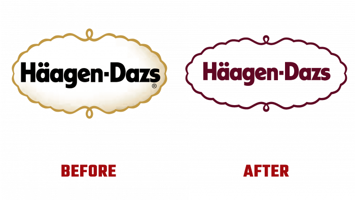
The time has come for the old brand’s luxurious but somewhat outdated minimalism to give way to the equally luxurious but more individually expressed new one. The new generation of consumers has different preferences when it comes to choosing products of certain brands. And more often than not, quality is not the first point. An important role for them is played by compliance with values and historical fame, distinguished by its success.
The creative team of the Chase Design Group successfully coped with this task, creating a new visual identity for the ice cream manufacturer, filled with rich colors, playfulness, and energy while maintaining smooth lines and color transitions. The signature cartouche logo is accented with gold accents against a pure white background using burgundy. Moving away from the classic visualization of luxury in gold and black has significantly improved the brand’s visual experience. Gold and burgundy are a way to take a fresh look at the understanding of luxury and aristocracy.
Each taste of the company’s products has acquired its unique palette and composition, hand-made. They have significantly expanded the visual awareness of the consumer while creating an original effect of the stained glass art performance.
The logo font is a proprietary development of the design company, called “Dazs,” which, in combination with handwritten text, very effectively creates a harmony between the classics of the past and an innovative future. The logo itself represents the company’s name, framed in a playful frame typical of mid-century invitations.


