


![]() Halifax Logo PNG
Halifax Logo PNG
“All roads lead to our bank,” says the Halifax logo. “If you are looking for the best in your business, this is the place for you.” The emblem shows that the institution can solve financial issues and stands out from other companies.
Halifax began in December 1852, when civic leaders in the Yorkshire town discussed creating a building society. Its rules were approved in February 1853, and the Halifax Permanent Benefit Building and Investment Society was registered. According to tradition, early meetings took place in a room above the Old Cock Inn. Jonas Taylor, a 24-year-old solicitor’s clerk, became secretary and held the post for nearly 50 years.
The model was built around pooled savings. Members deposited money, earned interest, and others used the fund to buy or build homes. Halifax grew mainly through branch expansion rather than takeovers. It opened 3 branches in its first year, reached 12 by 1862, and became Britain’s largest building society by 1913. In 1928, it merged with Halifax Equitable Building Society, then the country’s second-largest society. The new Halifax Building Society had assets of £47 million.
Financial liberalization in the 1980s allowed Halifax to add current accounts, credit cards, insurance, and estate agency services. In 1993, it opened Banco Halifax Hispania in Spain. In 1995, Halifax announced a merger with Leeds Permanent Building Society and a plan to demutualize. On June 2, 1997, Halifax plc joined the FTSE 100. In 2001, Halifax merged with Bank of Scotland in a £10.8 billion deal, creating HBOS. In 2007, Halifax plc’s assets moved to Bank of Scotland plc. The 2008 financial crisis exposed HBOS’s risky property lending. On January 19, 2009, the Bank of Scotland, including Halifax, became part of Lloyds Banking Group.
Meaning and History
![]()
A brand with more than a century and a half of history strives to become relevant and modern; therefore, it regularly revises its visual identity. This approach to his image allows him to stay afloat amid competing fintech startups.
The famous “X” symbol associated with Halifax is relatively recent. Earlier logos focused on the company name and did not contain additional decorative elements. Wolff Olins designed the original version of the enlarged X, which has become one of the UK’s most iconic emblems. Modern designers have slightly updated the brand’s appearance to make it more appealing to both younger and older generations.
What is Halifax?
Halifax is a division of the Bank of Scotland and a leader in mortgage lending in the United Kingdom. The company was established in 1853, initially as a building society. Since then, the range of its services has significantly expanded, as has the number of operating branches.
1925 – 1933
![]()
A year after opening the London office, Halifax adopted a new logo that mentioned its name. The word “HALIFAX” was at the top of the line and in large print. The second row occupied the phrase “BUILDING SOCIETY,” which used smaller capital letters. The color was dark, something between black and brown.
1933 – 1965
![]()
The designers changed the characters’ widths and the letter spacing, so the inscription on the bottom line began to take up more space. The word “HALIFAX,” on the other hand, has visually diminished. Small depressions appeared at the ends of the letters, although the style did not change in general. Black was chosen as the main color, and the background remained white.
1965 – 1977
![]()
In 1965, the font was slightly adjusted so that the two lines were equal in length. The letters in the phrase “BUILDING SOCIETY” became thinner, and the letters in the word “HALIFAX” became larger.
1977 – 1985
![]()
After another redesign, the bottom inscription was removed. The letter “X” looked non-standard, like an uneven hand-drawn cross.
1985 – 2019
![]()
In 1986, the building cooperative gained more financial freedom. Before expanding the business, he adopted a new logo with blue ‘HALIFAX’ lettering surrounded by the same blue stripes. The horizontal lines above and below formed a shape that resembled the letter “X” in outline.
2019 – today
![]()
The Halifax brand was relaunched on April 5, 2019, with the “Making It Happen” strategy. The corporate identity renewal was designed to make the brand more competitive against Starling, Atom, and Monzo. The visual identity was developed by London-based creative agency Rufus Leonard, which is also responsible for the Lloyds Banking Group’s identity.
The current Halifax logo looks laconic. The letters are thinner, and the many horizontal stripes have been replaced with four colored blocks. Carlo D’Alanno, one of Rufus Leonard’s leaders, drew inspiration from the aesthetics of other fintech companies. Perhaps this is why CEO Monzo accused Halifax of plagiarism.
Font and Colors
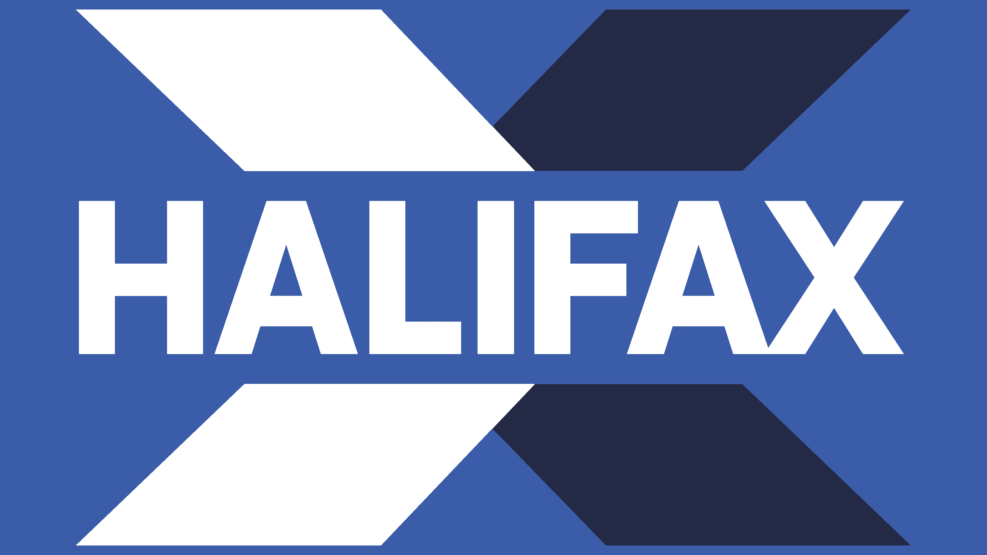
The striped “X” looked like an IBM symbol. Moreover, the lines were erased in the digital space, contradicting the company’s desire to enter the market of modern financial technologies. The new interpretation of the emblem solved this problem: the revised “X” consists of four large parallelograms visible at any scale.
Rufus Leonard’s agency did not make global changes but only slightly simplified its identity. The designers said that Halifax has “nothing broken,” so there is no need to relaunch the brand completely. From their perspective, modernizing the style a little was enough to attract new clients, first of all, young people.
The new font is thinner than the previous ones. The letters are thinner because they are elongated vertically. This is an almost exact copy of the typeface Falling Sky Blk developed by the printing studio Cannot Into Space Fonts.
The base color, as before, remains blue. The palette has two shades: one darker (#011747) and the other lighter (#005EB9, similar to Honolulu blue). Against a white background, they look soothing because the designers wanted to create a welcoming atmosphere that would not be too strict or official.