The Hama brand, which offers accessories for various entertainment electronics, has changed its image to a more modern and simple one. Founded in 1923 in Dresden (Germany) as Hamaphot by German photographer Martin Hanke to produce laboratory equipment and photo printing supplies, the company is successfully celebrating its centenary. The development of the audio and video direction became the basis for the reorganization of the enterprise in the 80s of the last century, changing the list of products offered and changing the appearance.
In 1993, the brand took the name known to everyone today – Hama GmbH & Co KG. From the end of the 90s to the present day, today’s brand has not only significantly changed and expanded the list of its offers, keeping up with the times in its field. He expanded his sales area opened a large logistics center in Monheim in 2006, organizing prompt deliveries of goods to Europe, America, and the Middle East. Today, after more than 20 years since the last visual changes, the brand, which is on the threshold of its century, again feels the urgent need for change. To meet modern requirements, to always be in the leading positions, the company paid attention to its visual identity, starting with the logo and emblem on the packaging.
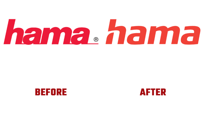
Applying the achievements of modern digital technologies, the company has acquired a brighter and more saturated corporate red color, which somewhat gravitates towards an orange tint. This contributed to its selection among the huge variety of color solutions of similar offers in the distribution network. Against this background, the brand name was applied in contrasting white (in cases where there is no color on the substrate, the font is made in the same red) in beautiful lowercase letters. To provide a visual historical connection of the updated brand with its well-deserved past, the execution of the font retained the previously adopted style, which was formed with the help of italics. But it did not retain an absolute identity to demonstrate important features in today’s brand.
First of all, this affected the shape of the letters, which became more direct. Connections that were previously made in the horizontal plane are completely surprised by the new design. The letter “h” – the first in the name, was composed of two elements, which formed a visual accent on it, highlighting the letter against the general background. The free space that appeared between the two segments is a symbolic demonstration of the independence of the brand and the infallibility of the path it has chosen.


