


![]()
Hannover Re, a global leader in reinsurance, has unveiled a new visual identity featuring a redesigned logo created by wirDesign. This update reflects the company’s commitment to modernization while honoring its core values of collaboration, innovation, and reliability. The refreshed branding highlights the organization’s ability to adapt to the evolving challenges of the reinsurance industry while maintaining its strong reputation.
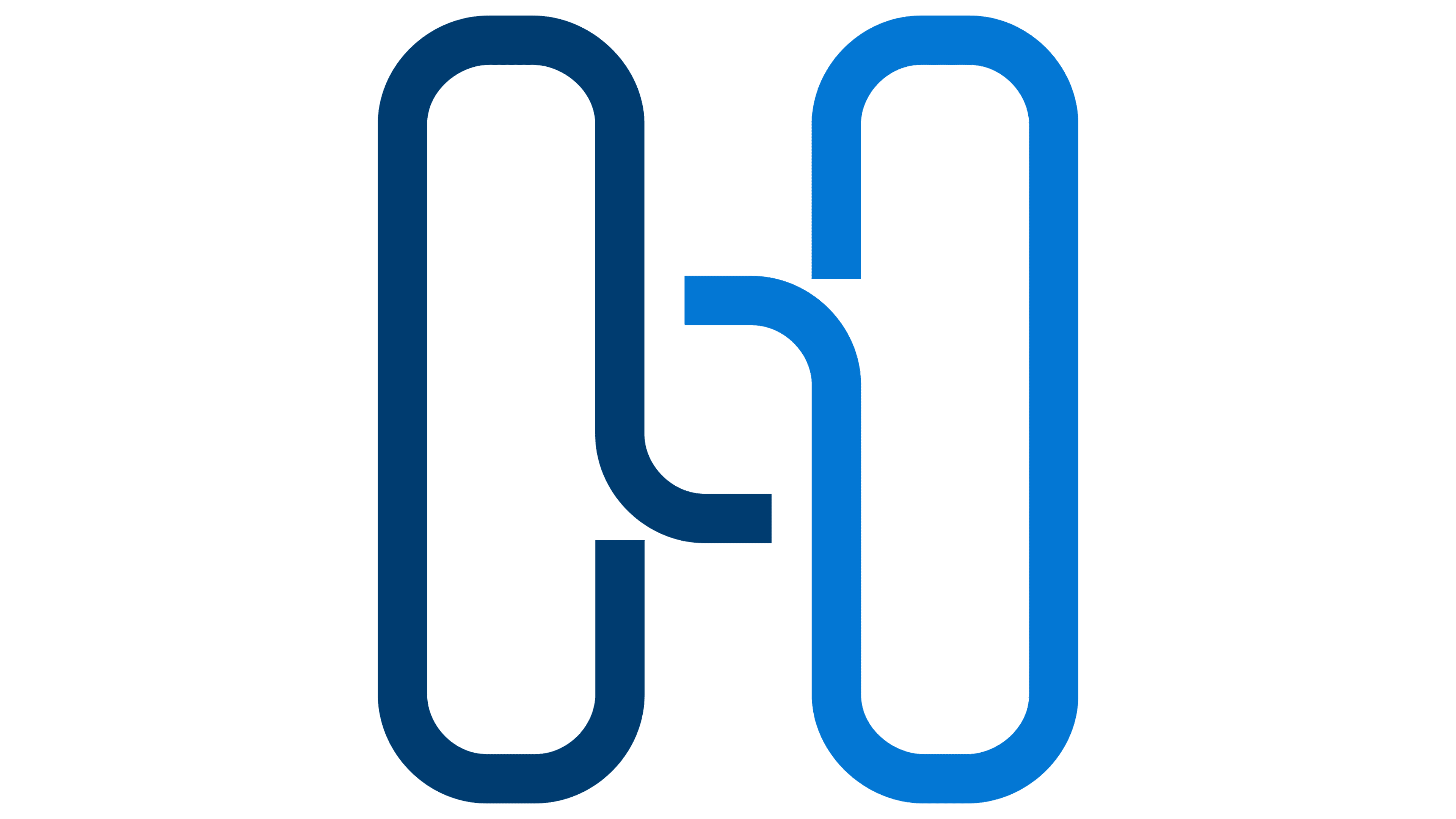
The new logo’s center is a stylized “H,” composed of two interconnected rectangular shapes. This design symbolizes connection, partnership, and support—key principles in the reinsurance sector. The geometric elements convey a sense of stability and trust. At the same time, the modern design suggests adaptability and progress, aligning with the company’s focus on forward-thinking risk management and insurance solutions.
![]()
The updated color palette retains its foundation in shades of blue, symbolizing trust and transparency, with the addition of a gradient effect. This subtle shift introduces depth and movement, reflecting the company’s dynamic approach to addressing industry changes. The enhanced colors create a contemporary yet dependable image for the brand.
Typography is a standout feature in the refreshed design. The clean, modern typeface ensures readability and projects professionalism. Separating “Hannover” and “Re” emphasizes the company’s German heritage and reinsurance expertise. The precise lines and balanced proportions of the text add to the polished and professional feel of the logo, ensuring visibility across digital and physical mediums.
Compared to the previous version, the new logo provides a more engaging and symbolic representation of the company’s mission and values. While the older design was text-focused, the updated logo incorporates visual elements that make the brand more distinctive and memorable. This evolution strengthens the organization’s presence in a competitive market, ensuring it remains recognizable and relevant.
The rebranding extends beyond the logo, integrating the new design into all company operations areas. Corporate communications, marketing materials, and digital platforms now feature the updated identity, creating a cohesive and modern brand representation. This comprehensive approach underscores the company’s position as a leading global partner in reinsurance.
![]()
The new visual identity embodies the company’s dedication to building strong partnerships, fostering innovation, and maintaining its leadership in the industry. The redesigned logo captures the essence of its vision for the future, showcasing the ability to evolve while continuing to deliver trusted and high-quality services worldwide.