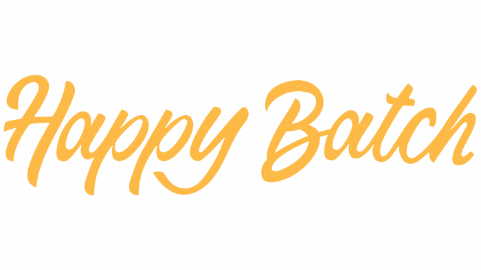
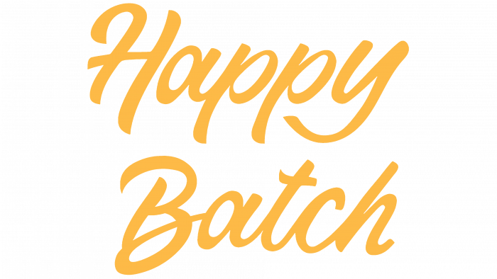
US nationwide food delivery company Metabolic Meals has unveiled the logo for its new Happy Batch gluten-free cookie. The company turned to the lead design agency, Atomic Dust, to develop a visual identity for the new product. The creators of this tasty and healthy product, Lesley and Jason Barbour, decided to think over and implement the recipe for such cookies due to the not particularly tasty and pleasant offers on the market. This led to many months of experimenting with pure ingredients to obtain the desired blend.
The result exceeded all expectations. The resulting gluten-free cookies were distinguished by their softness, pleasant taste, and excellent elastic properties. Tested by Barbour friends and acquaintances and Metabolic Meals customers, the bakery has received only rave reviews from them. As a result, the creators of a tasty and healthy delicacy decided to form their brand based on a unique visualization and a new platform for its promotion.
Creating a new trademark, branding, and the formation of an original design for future plastic packaging became a task for professionals from Atomic Dust. Getting started, the agency decided to start with the most important thing – creating a name. An attractive name for a culinary and tasty product will provide the required attention to it and, therefore, a successful implementation. This process turned out to be the longest. Studying the history of culinary development, comparing the names of competitors, elaborating punitive phrases – all this contributed to the emergence of the only successful option that now accompanies a new product.
The result of active brainstorming was a shortlist of original options that do not duplicate the existing ones. With the help of the mood board, the design team provided themselves with the ability to visualize the resulting combinations. The name Happy Batch became the winner of this race. The main reason was that the sounding of the combination, when pronounced aloud, created almost the same sensation as the first bite of this wonderful cookie.
Two “fun” fonts have been merged into a vibrant color palette to enhance the logo’s appeal. This provided the logo with friendliness, fun, and pleasing appeal. Together with the slogan “Get Happy,” the composition acquires visual carelessness, responsiveness, and wit. The brilliant orange color on the packaging against the background of high-quality full-color images of the product reinforced such an original identity of the new brand.


