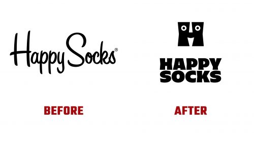
Happy Socks, a Swedish company renowned for its colorful and creatively themed socks, recently launched a new logo and brand identity designed by Paris-based Yorgo Tloupas and his studio, Yorgo&Co. This update represents a significant shift from the brand’s previous visuals, aiming to embody its playful and innovative ethos further.
The original logo, which utilized House Industries’ Sign Painter Casual font, featured tall, bouncy letters that mirrored the brand’s fun appeal. Although this design was lively, it lacked the unique characteristics needed to stand out in a competitive market. Specifically, the script style, while engaging, didn’t capture the full essence of Happy Socks’ diverse offerings.
The new logo introduces a major change, moving from a script to a more distinctive and memorable design. The highlight of this redesign is the clever adaptation of the letter “H,” now stylized to include a smiley face. This transformation cleverly uses the upper and lower parts of the “H” to create the nose and mouth, infusing the logo with a playful and original vibe. The facial features in the “H” include subtly flared details, adding asymmetry that enhances the dynamic feel of the design. However, the eyes in the logo, designed straightforwardly, could benefit from more expressive styling to elevate their impact.
The updated wordmark complements the monogram, incorporating unexpected pinches in the center of the letters that echo the stylistic elements of the “H.” This effect is particularly successful across various letters, adding to the typeface’s uniqueness. However, the letter “S” may appear too rounded and could benefit from integrating some of the monogram’s flare or chisel effects to achieve a more cohesive look.
The new branding also introduces a mascot, though its reception has been mixed. Designed to embody the brand further, the mascot features stiff legs and droopy socks, which may not fully capture the lively spirit associated with Happy Socks.
Happy Socks developed a custom-type family that diverges from typical design norms. Termed a “humanist stressed sans,” this typeface takes inspiration from Carter Sans and offers a fresh approach that aligns well with the new wordmark. Available in Black, Light, and Regular weights, this typeface is used effectively on the brand’s website, creating a distinctive typographic voice. A complimentary script typeface adds casual elegance, returning to the original logo while enhancing textual approachability.
Happy Socks’ new brand identity marks a strategic shift towards more personalized and iconic branding elements. This redesign boosts the brand’s visual appeal and reinforces its position as a creative and joyful product market leader.


