


![]() Haribo Logo PNG
Haribo Logo PNG
The Haribo logo represents the brand’s renowned status as the original creator of gummy bears. Founded in Germany, Haribo is recognized for its commitment to fun, flavorful gummy candies that appeal to people of all ages. The logo captures the brand’s playful and joyful essence, symbolizing its dedication to quality and innovation in candy-making. This emblem helps Haribo maintain its position as a leader in the confectionery industry, known for delighting consumers with its products.
In 1920, Hans Riegel Sr. started Haribo in Bonn, Germany. He came up with the company’s name using his name and hometown. Together with his wife, Gertruda, they began making candies in their kitchen. Gertruda was in charge of packaging.
Hans created the Dancing Bear two years later, a fruity gummy candy. This candy would later become the famous Goldbears and was very popular, helping Haribo grow.
By the 1930s, Haribo had opened more factories in Germany and was selling candies in Denmark, the Netherlands, and France.
World War II made it hard for Haribo because ingredients were scarce, but the company quickly bounced back and continued to grow.
In the 1960s, Hans Riegel’s sons, Hans Jr. and Paul, started leading the company. They opened new factories and entered new markets around the world.
1981 was important because that’s when Haribo introduced Goldbears, gummy bears made with fruit juice, which became very popular worldwide.
Haribo continued to grow in the following years, opening factories in Europe, Asia, and South America. By the late 20th century, you could find Haribo candies in over 100 countries.
In the 2000s, Haribo introduced new candies such as Sour Goldbears and Fruity Pasta and collaborated with other brands to create limited-time specials.
Haribo is a major name in candy, generating over $3 billion in sales. It’s still run from Germany but has factories and offices worldwide.
Meaning and History
![]()
What is Haribo?
Haribo, a distinguished German confectionery company, is celebrated for its high-quality sweets, including gummy candies, licorice, and other confections. The brand is committed to using only natural, premium ingredients to deliver tasty, wholesome treats. With a wide variety of flavors and product types, Haribo caters to diverse taste preferences, making it a favorite among children and adults alike.
1922 – 1979
![]()
The Haribo logo, used from 1922 to 1979, showcases the impact of simplicity in design as a strong branding tool. The logo featured the brand name in large black letters on a white background, making it striking, memorable, and highly recognizable. The name “Haribo” is a blend of the founder Hans Riegel’s name and Bonn, the city where the company was founded. It tells the company’s origin story and reflects the founder’s dedication to its roots.
The choice of black letters symbolizes the company’s confidence in the quality of its products and a stable future, while the white background stands for purity and reliability. Together, these elements create an image of a dependable and confident manufacturer.
1979 – 2015
![]()
When Haribo expanded into the American market, the company aimed to create an appealing image for its products. In 1979, they revamped their emblem, moving away from the simple black-and-white design. The new logo featured shiny, jelly-like letters that mimicked the appearance of their gummy candies.
This design was intended to convey celebration and fun, making it memorable and broadening their consumer base. It especially targeted children with its bright, playful look. The logo’s primary red color added energy and highlighted the variety of fruit flavors Haribo offers.
Introducing this emblem was part of Haribo’s strategy to establish itself as both a candy manufacturer and a creator of enjoyable, memorable experiences.
2015 – today
![]()
The brand’s modern emblem, designed like a children’s sticker, shows how design can be visually appealing and meaningful. The updated logo’s playful, cute style reflects the company’s goal of connecting deeply with its young audience. The sticker-like design aims to make the brand a familiar part of children’s environments, such as room decorations and toys, and to become a cherished symbol of joy.
The emblem looks appealing and carries significant symbolism related to the company’s history. With the last family member leaving management, the new logo marks a new chapter while honoring the founders’ legacy. It serves as a bridge between the past and the future, highlighting both change and continuity in the brand’s core values.
The logo’s slogan, “Happy World of Haribo,” underscores its mission to bring joy to children and adults worldwide through its products. Haribo products are a treat; they invite users into a world of fun, happiness, and freedom.
Haribo Emblem (mascot)
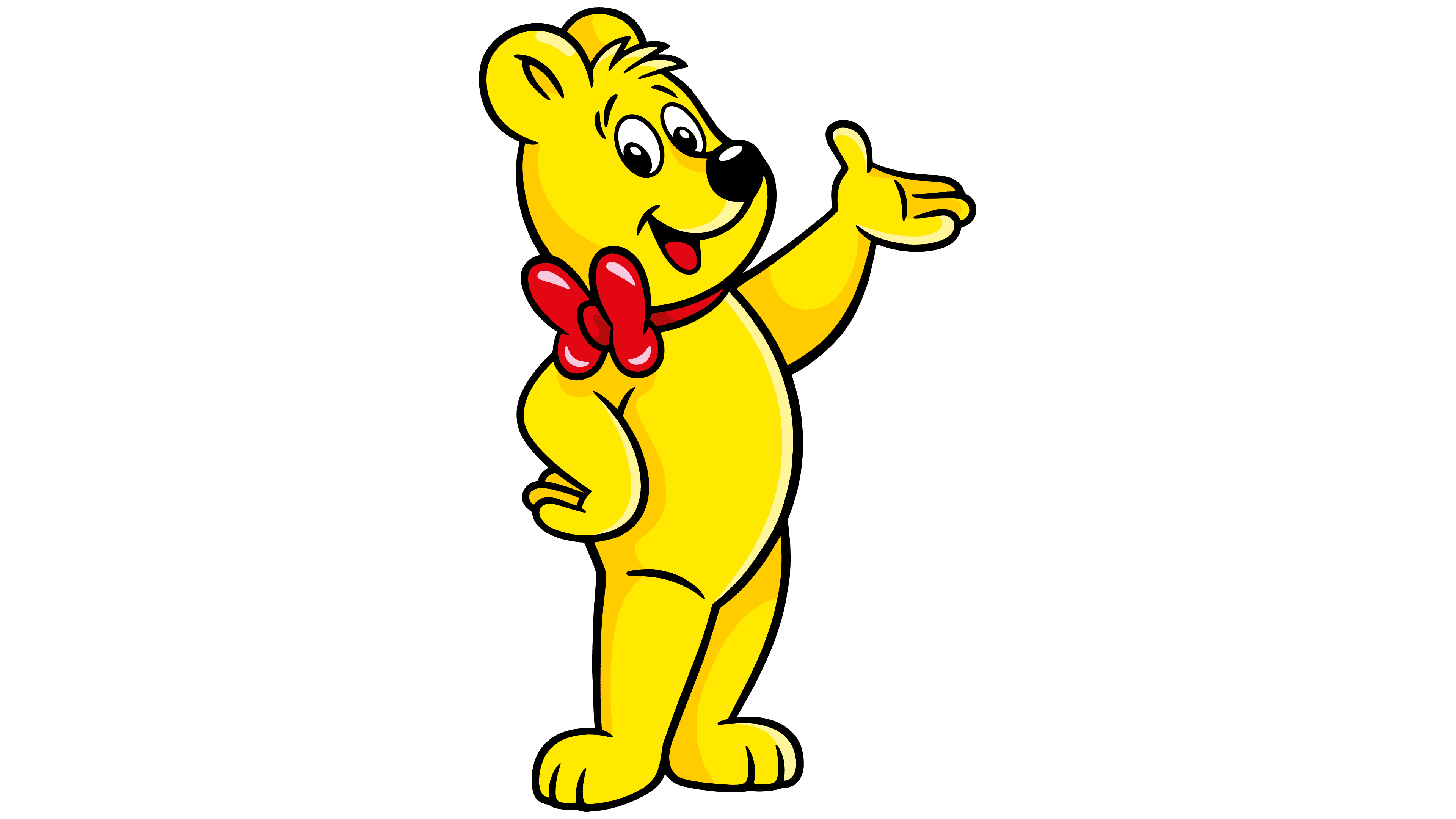
Haribo, known for its gummy bears, is loved worldwide, and its mascot, the Haribo Kid, also called “Goldbär” in Germany, is a big part of this affection. Always looking playful and ready for fun, this golden bear wears a bowtie and sometimes a red hat. He stands for the happiness Haribo’s sweets bring everyone, young and old. This fits perfectly with Haribo’s slogan, which says their candies delight children and adults alike. The Goldbär has helped shape Haribo’s reputation for creating joyful and nostalgic treats for years.
Font and Colors
The HARIBO logo is a striking example of modern design, featuring a bold sans-serif with rounded forms, similar to fonts such as VAG Rounded or Arial Rounded. These fonts are characterized by their bubbly contours and uniform tone, making the logo fun and appealing. The wide, clean lines of the font ensure excellent readability from a distance or when reduced in size, which is critical for packaging and advertising materials.
The logo’s uniform font creates a friendly, contemporary look that appeals to children and adults. The use of uppercase letters enhances visual impact and brand recall. The font is simple and consistent, lacking unique features or unusual details, which lends clarity and visual consistency. A shadow effect adds volume to the letters, creating a 3D appearance and making the text livelier and more dynamic.
The logo’s color palette plays a key role in its appeal. Red, chosen for its associations with energy, passion, and attention-grabbing properties, is ideal for a brand aiming to evoke joy and pleasure from its products. A white outline around the text enhances contrast and adds dynamism, improving the logo’s visual appeal. Together, these elements make the HARIBO emblem instantly recognizable and associated with playfulness and fun, which is crucial for success in the candy category.
FAQ
What is the name of the HARIBO bear mascot?
The HARIBO bear mascot, Goldbear, represents the HARIBO brand known worldwide for bringing happiness. Goldbear is linked to HARIBO’s Goldbear gummy candies, which everyone loves for their great taste and quality. Goldbear is important at HARIBO events because he interacts with guests, making their time enjoyable. He only shows up at HARIBO’s events, keeping a unique bond with the brand and its fans.
What does HARIBO stand for?
HARIBO’s name combines its founder’s name, Hans Riegel, with the city of its origin, Bonn, Germany. The name is HA from Hans, RI from Riegel, and BO from Bonn. Established in 1920, the company is named after its founder and highlights its roots in Bonn, which are crucial to its success. Now, HARIBO enjoys global recognition for spreading happiness through its sweets.
How many HARIBO products are there?
HARIBO makes over 1,000 kinds of candy. Their Goldbears gummy bears are well-loved, and many other sweets are available for different tastes and occasions. HARIBO is dedicated to creating new, enjoyable treats. They aim to make people happy with their candies. With a history of candy-making that spans over a hundred years, HARIBO continues to please customers of all ages with its expanding range of candies.
What makes Haribo special?
HARIBO is a standout candy company for its wide variety of candies and unique shapes. They use a special high-pressure method to ensure each candy shape is perfect. Their candies, known for bringing joy with fun fruit gummies, start as simple sketches. These sketches become plaster prototypes, which then turn into stamps for making lots of candies. This method highlights HARIBO’s commitment to creativity and quality, and to bringing customers happiness through delicious flavors and entertaining shapes.
Can vegans eat Haribo?
Vegans often struggle to enjoy Haribo candies because they contain gelatin. This ingredient, derived from boiling animal parts such as cows, pigs, and fish, gives gummies their chewy texture. As vegans do not consume animal products, they find most Haribo candies unsuitable for their diet. Despite Haribo’s wide variety of candies, finding vegan-friendly options remains challenging.
Why is Haribo so chewy?
People love Haribo gummy candies because they’re chewy. This chewiness comes from gelatin, made from animal bones and skin. Gelatin does a lot for these candies. It ensures they’re just the right amount of chewy, don’t melt too fast, and keep their shape.
Eating a Haribo candy is a special experience. The gelatin makes the candy dissolve slowly in your mouth. This makes the candy’s sweetness last longer and makes eating it more enjoyable. Slowly chewing can even help you relax. While chewiness isn’t ideal in all foods, it’s perfect for gummy candies.