The Harwell brand is originally from the UK and is an innovative science campus. This is a unique community of scientists, engineers, and other innovative technologists who work together to solve the planet’s problems every day. In its 75 years of existence, over 700 acres of beautiful Oxfordshire countryside has created over 3 million gadgets and facilities, over 6,000 events, and workgroups, all thanks to hard work and dedicated science reformers.
The brand’s main mission is to give an understanding, that is, a special place for the implementation of scientific and technological experiments that can transform human lives without harming the environment. Harwell is the epicenter of scientific culture, innovation, and validation of technical discovery.
The brand cooperates with such large companies as Airbus, Jaguar, Siemens, Honda, BAE Systems, and the University of Cambridge, University of Oxford, medical companies, and other well-known brands.
Dn & Co became the most proactive creative agency, which was chosen as the ideological inspirers of the new visual image of Harwell. Without resorting to stereotypical and stereotypical images of science, such as a microscope, test tubes, and interplanetary ships, the creatives managed to catch a wave of inspiration and successfully implement a project of a new identity for the community of scientists. In a cheerful mood, the brand consultancy and design studio have developed a corporate identity for Harwell, Britain’s leading science and innovation city, which looks unconventional and easy to follow.
Initially, the idea was based on the feeling of a large-scale grasp of science not only on the campus itself but also on the scientific community as a concept as a whole. The global scale of science, which its visual frame must understand not only for professionals but also for users, must be obvious and not leave behind a trail of clichés, routine, and illogicality.
Therefore, we decided to avoid any complicated graphic elements in the logo design.
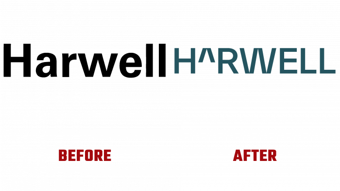
After analyzing the old version, one can understand that a clothing brand, a household appliance store, and the name of a Moscow newspaper can be decorated with the same black font logo – whatever you want, if only it was readable and could be easily presented. But there was no hint of scientific or creative innovation in the old logo – only black sharp geometric shapes of letters in regular font.
Today the logo looks quite extraordinary. First, the small letter A makes an impression, which is the carriage symbol (^), accepted in mathematics by the written exponent or degree. The letter W is made in the same manner; only it is not as small as A. It fits perfectly into the concept of innovation and creativity of scientists. Moreover, such attention to the letters does not deprive the general graphic structure of the logo of sympathy, does not make it comic or “rote.” The noble dark green color inspires confidence and clarifies that science is a phenomenon that connects creativity and technology; therefore, the logo is very expressive and accurate and conveys what the public wants to broadcast.
Adequately selected font, color scheme, and the very impression of the new graphic identity element will inspire community members and contribute to brand development, awareness, and communication for cooperation with other companies.


