The renowned Hay Festival, a beacon for storytelling, ideas, and exploring new possibilities, has unveiled a fresh global identity symbolized by the Hay Festival Global logo. This marks a significant milestone in the festival’s journey, reinforcing its mission to connect diverse voices in discussions that address our time’s most pressing political, social, and environmental issues. Since its inception in Hay-on-Wye, Wales, in 1987, the Hay Festival has evolved into a global charity running events and projects worldwide, from Colombia to the USA, reaching millions of participants yearly.
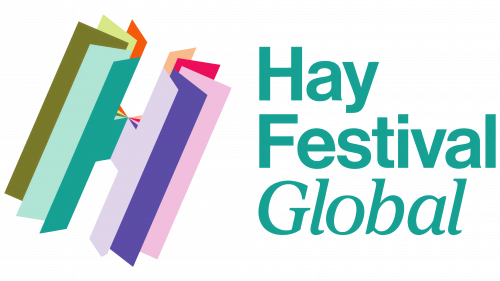
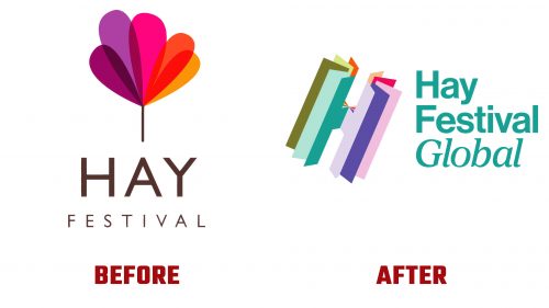
The new logo, designed by Marina Willer of Pentagram and a departure from its 2019 predecessor, introduces a dynamic “H” monogram that captures the essence of pages turning around a central spine. This creative design choice highlights the festival’s literary foundations and adds a layer of engagement through its static and animated renditions. The monogram’s slight tilt evokes the movement of the Earth’s rotation axis, adding a conceptual depth to the visual identity.
Accompanying the monogram, the wordmark utilizes Neue Haas Grotesk, presenting a clean, if somewhat conventional, typographical choice that contrasts with the bold creativity of the “H.” Each Hay Festival location is distinguished through an italic serif, providing a visual distinction while maintaining a cohesive brand identity across the various international editions. Despite its subtleties, this combination contributes to a versatile branding system capable of adapting to different contexts and sub-brands, including the “Anytime” series, which cleverly integrates the primary logo’s style.
The new identity system’s simplicity belies its effectiveness, with the “H” monogram serving as a versatile cornerstone for diverse applications. From promotional materials to digital platforms, the logo’s adaptability is showcased through various color combinations and configurations, embodying the festival’s spirit effortlessly. Integrating photography within the logo’s pages offers an additional layer of narrative depth, enhancing the brand’s visual appeal across multiple touchpoints.
While some may express reservations about the choice of Neue Haas Grotesk and the accompanying italic serif, the overall design achieves a thoughtful balance between innovation and tradition. This rebranding reflects the Hay Festival’s ongoing commitment to fostering a global dialogue through literature and ideas, positioning the festival as a dynamic and inclusive platform for cultural exchange.


