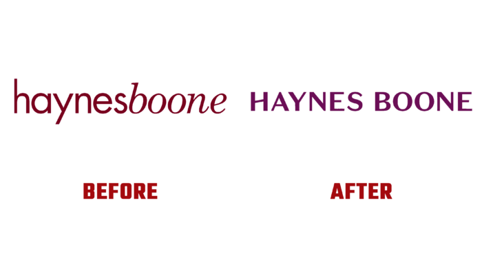
For more than fifty years, Haynes and Boone, LLP, an international corporate law firm, have served on behalf of a wide range of clients worldwide. Founded back in 1970 by Richard Haynes and Michael Boone in Dallas, Texas, and headquartered in the One Victory Park building, the company has expanded to include offices in Texas, New York, California, Charlotte, Colorado, Illinois, Washington, D.C., Shanghai, London, and Mexico City. Today it is a strong and respected company that successfully competes with larger and more well-known enterprises in its region. In its quest to expand beyond the regional player, the brand is looking to boost its reputation to meet its five-year growth plan. The company has developed a new strategy characterized by aggressiveness in its implementation to do this. One of the ways to achieve these goals was the recent deep rebranding of the company, which filled the updated brand with sophistication, energy, and humanity. These characteristics complement the firm’s modern vision of building a model based on trust and warm relationships. By changing the look to a more appropriate depth of experience, Haynes and Boone gain the ability to compete more effectively and apply their talents anywhere in the world.
The update takes into account the company’s growing international profile. At the same time, the identity is characterized by sincere warmth, commercialization, and devotion to society, which has always been characteristic of the brand. The logo was designed based on emblems created for luxury car brands. It evokes a subtle sensuality in the viewer, connecting him with the deep essence of the word “premium.” This moment became one of the anchors of the company’s strategic action. This is achieved with the help of graphics and the original execution of text elements – the company’s full name in the logo. Created thin, upwardly inclined cross-sections of the letters H and B fill the image with a double semantic load. An important one is the idea of constantly striving to “raise the bar.” This motif is very effectively used in the drop-down menu in the transitions between screens in images. This effect is enhanced by the Haynes Boone signature: HB Plum and a sophisticated and privileged color that instantly sets the company apart from the competition.
The color palette has become a central feature of the strategy, providing manageability. Bright and saturated colors, sharp typography, asymmetric layout formation, and the individuality of the diversity and activity of photographs create a unique voice that emphasizes the company’s desire, ambition, and focus on achieving a positive result.


