The idea of mass production of objects providing a comfortable existence for women suffering from urinary incontinence was born a long time ago by the designer Aubrey Hubbell. After meeting with financier Steven Cruz, she was able to realize it in 2022 by launching a joint venture with him, Hazel. Several thoughtful and innovative products have been established, including disposable sealed panties, a special chafing and rash soothing and crotch irritation relief device, and inconspicuous washable wipes. These products give women back their self-confidence and allow them to feel great at any age without shame or alienation. Like the brand itself, the offerings have acquired a beautiful and appealing identity, which has been supported by elegantly laid out descriptions like Luxurious, feminine care for an ever-evolving world. The original brand identity and packaging resulted from creative work by Denver-based design studio Mast.
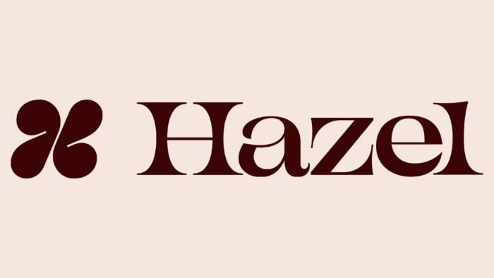
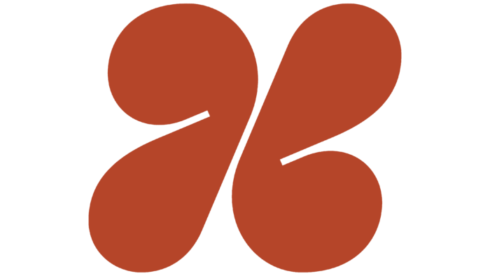
In shaping the identity for such an original and neat brand, the important message was that no two bodies are alike and no two women are alike. But for each user, the offering should provide the most comfortable experience possible. The hazelnut symbol used as the main mark reflects a deep love for individuality, beauty, and strength. In its structure, the symbol is represented by an expressive but abstractly executed letter “H,” whose task is to support the core mission of the brand for years to come. The letter offers an entirely new perspective on how it can be used to convey a visual interpretation of one of the brand’s products.
The logo’s wordmark was also intended to showcase the uniqueness of each woman. It is dramatic and vivid in its execution in a serif font with high contrast in thickness. Its expressive curves, reminiscent of the attractive shapes of the female body, encapsulate the idea of uniqueness and the simultaneous commonality of all of this consumer category. The extra-high lowercase letters reject accepted conventions, and their “gentle” touch evokes a touch of tenderness and pleasant associations. At the same time, the letter “a” adds spice to the sign, defying all expectations.
The developed system of templates – three separate forms, provides for their independent use, as well as in groups or abstract application – in various ways, preserving the basic essence of the brand. The set of illustrations has been created in close harmony with the template’s elements. The expressiveness of the figures creates an atmosphere of joy, excitement, and humanity. The effect is strengthened by the cohesive color palette, which looks especially spectacular on the original packaging, where lighter, almost airy ones synchronously balance the colorful and saturated moments.


