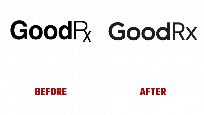
GoodRx Interactive Platform – Empowering Millions of Users to Find Reliable Health Information and Great Discounts on Health Care and Medicines has updated its look. Its office is located in SANTA MONICA, CA. For almost ten years, the brand has provided more than 30 billion in savings to its users annually, constantly expanding its capabilities and offerings. To help find convenient and affordable medical care, quality, and inexpensive drugs, the brand presents various solutions for consumers, employers, manufacturers, insurance organizations, and those who support the company’s efforts to provide the population with affordable prescriptions.
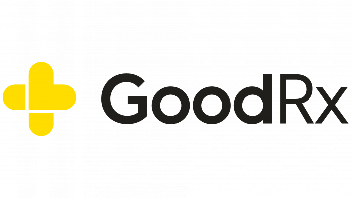
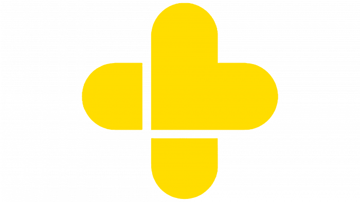
The update is driven by the development of the electronic health market and the need to create a more attractive and informative identity. The new logo reflected the requirements of both digital display technologies and the peculiarities of the visual perception of information by a modern consumer. The clarity of forms, the richness of the color range, the expansion of its shades in the formation of a new style – are some of the main typographic moments that made it possible to create a new identity in its performance. The logo uses a new sign – across, in the shape of the symbol of a medical sign, but made in a bright yellow shade and from several segments – a central square and four rays separated from it by small problems, having a stylized form of halves of medicines made in the form of capsules.
The sign, which has become a powerful identifier, and used on all virtual icons and fashion products, is followed by text – the name of the brand, made in clear black font. Various types of fonts were used for its execution. Good is performed by a bold type of Bambino New Bold by Mindburger Studio, distinguished by its seriousness and gentleness of perception. Rx – thin and “fragile” Soho Gothic Std Regular hints at the fragility of health and the need to maintain and monitor it constantly. Both fonts are crisp and legible at any scale, on any background, whether printed or digitally. Such a creative solution visually divides the image into three parts, making each element accent in this group, symbolizing the main directions of the platform – information, medical services, medicines. At the same time, the composition is perceived as a single whole, moving the gaze from the cross to the letter “x” in a sequence that unites everything under the auspices of the brand itself.


