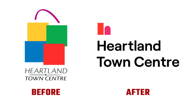
Canada owns one of the largest outdoor malls in the world, the Heartland Town Centre. Located in Mississauga, Ontario, it features more than 180 retail stores and specialty services. The center occupies about 200,000 square feet. The owner, Orlando Corporation, decided this year to update the visual identity of its brand. The objective of the new visual identity was to revitalize one of the city’s most iconic neighborhoods; it would encourage the expansion and development of the community, stimulating its growth, creating opportunities for more tenants, and increasing comfort and convenience for visitors.
A newly developed brand identity, typographic system, modern color palette, and original graphic language were all designed to work with various outlets and applications. Paying tribute to its successful past, the brand kept the name, reflecting all the important values in graphic design. The wordmark was the main element of the logo, typed in a straight, round, bold, sans serif font. Its design instills in the viewer confidence in every transaction carried out here and formed the buyer a sense of complete safety and transparency. Graphically, the name combines favorably with the symbol sign, which is an abstract shape based on the structure of the lowercase letter “h.” In its architecture, the sign resembles the structure of shop windows, bearing the architectural motifs characteristic of Heartland.
The area, known for its open concept and variety of outdoor outlets, forms its unique visual language based on these two elements. With large corporations, flagship stores, medium-sized enterprises, and conceptually new stores, the brand has acquired a new message for the area, inspiring a wide audience to visit and use it. It has created a unique space with a welcoming atmosphere for all visitors and customers. He expressed his philosophical concept in a short, concise slogan – It’s all here, a message for the entire neighborhood. With it, the brand emphasizes Heartland as an outstanding destination.
The new color palette brings back the brand’s inherent brightness and energy through the original combination of a clever spectrum of multiple colors. The designers managed to attract the attention of new visitors and not lose old ones with a flexible system of bold color solutions and expressive, memorable compositions. The palette provides room for expansion, which is used advantageously to create uniqueness in each available offering, ensuring the perception of unity and the overall presence of the core brand.


