The Hershey logo rises as if poured from chocolate, showing the scale of the sweet empire. The company’s sweets are known and loved in many countries. “If you haven’t tried the brand’s products, then you don’t know what real chocolate is,” the emblem claims.
Hershey’s: Brand overview
Hershey is an American sweet chocolate empire. Hershey’s sweets are so popular that their history began in the 1890s and gained momentum in the second century. Empire founder Milton S. Hershey immortalized his name in the brand’s name and imprinted it in the name of the whole city that gradually arose around the factory. As if looking into the distance, the businessman and philanthropist claimed there would always be chocolate. And I wasn’t wrong. The firm gradually grew, acquiring new brands and companies:
- sweets H. B. Reese Candy Company (1963)
- pasta factories San Giorgio and Delmonico Foods (1966)
- liquorice empire Y&S Candies Inc. (1977)
- Confectionery Cadbury Schweppes PLC (1988)
- small chocolate firms Scharffen Berger, Joseph Schmidt Confections, Dagoba Organic Chocolate
- Leaf Candy Company (1996)
- fruit chocolate manufacturer Brookside Foods Ltd (2011)
- Shanghai Golden Monkey confectionery factory (2014)
- snack companies KRAVE Pure Foods (2015) and barkTHINS (2016)
- popcorn and chips manufacturer Amplify Snack Brands (2017)
- Pirate Brands, developer of healthy children’s sweets from B&G Foods (2018)
Hershey’s journey began in 1886 when Milton Hershey founded the Lancaster Caramel Company in Lancaster, Pennsylvania. Initially focused on caramels, Hershey quickly became fascinated with the potential of chocolate. This fascination led to a significant shift after he witnessed chocolate-making machinery at the Chicago World’s Fair in 1893, prompting him to purchase the equipment and start experimenting with milk chocolate.
By 1900, Hershey had sold his caramel business to fully dedicate himself to chocolate, founding the Hershey Chocolate Company. This decision sparked the development of a state-of-the-art factory in Pennsylvania, which would later become the town known as Hershey.
The company’s first major success was the launch of the milk chocolate bar in 1907, renowned for its delicious taste and affordability. This early triumph set the stage for future expansion and the introduction of now-famous products like Hershey’s Kisses in 1907, Reese’s Peanut Butter Cups in 1928, and Hershey’s Syrup in 1926.
During World War II, Hershey contributed to the war effort by supplying over a billion chocolate bars to troops and operating a dried milk plant to support the military. Post-war, the company continued to grow, opening new facilities in the 1950s and 1960s and introducing brands like Twizzlers and Jolly Rancher.
The 1970s marked the beginning of Hershey’s international expansion, reaching into markets in Canada, Mexico, and Europe. By the 1980s, Hershey’s products were available in over 90 countries. The portfolio expanded through acquisitions and partnerships, notably the purchase of Leaf North America in 1996, which added Jolly Rancher and Twizzlers to its brand family and increased its footprint in the non-chocolate confectionery segment.
In the 2000s and 2010s, Hershey continued acquiring brands and broadening its product range, with significant acquisitions like Krave Jerky and Amplify Snack Brands. It also added premium snack brands such as SkinnyPop and Pirate’s Booty to its portfolio.
Meaning and History
The company logo is associated with the name of its founder. And not for nothing. Milton Hershey was distinguished by kindness, determination, disinterestedness, and charity. He believed that business is service. He created the best conditions for his workers during his lifetime and cared for the local community and children from disadvantaged families. It is this philosophy that underlies the company’s activities today. The persistence of purpose through the years has made Hershey’s logo one of the most consistent and least changed. The brand name has always been the name Hershey’s. Only the background color, letters, and font changed.
What is Hershey’s?
Hershey’s (The Hershey Company) is one of the world’s leading chocolate producers. He also makes cakes, cookies, milkshakes, and more. The company was founded in the late 19th century by Milton S. Hershey and was a chocolate factory in the early years but gradually expanded. Its headquarters is located in Hershey, Pennsylvania. Now the strict Hershey’s logo is known in 80 countries where it supplies its products.
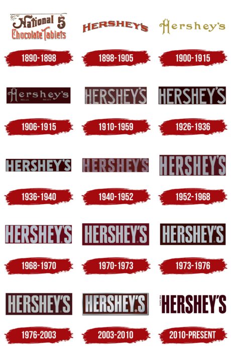
1890 – 1898
Before becoming Hershey, this company was called National Chocolate Tablets, the basis for the text logo. Emphasis was placed on the unusual shape of the letters – spreading like hot chocolate. The inscription occupied two lines. At the top was the first word of the brand name and the number “5”. They were painted brown and outlined in red. Everything was the opposite in the bottom row: the characters were red and had a brown border. The shadows made them look three-dimensional. Above the inscriptions was a thin line with curls at the edges.
1898 – 1905
Hershey began making milk chocolate in 1894. But at that time, it was a small division of his caramel production. However, the mild taste of the milky delicacy appealed to consumers. Hence, the department gradually grew into a separate brand with its logo, which appeared in 1898 and represented the manufacturer’s name. It was written in an arched line; its letters were large and voluminous. Such an uneven and convex style was typical for the logos of the 19th century. It showed a desire to stand out against everyday life’s “flat” background. At the same time, the inscription as a visor demonstrated the protection of what is in the company’s sphere of influence. The burgundy color of the inscription emphasized nobility, confidence, experience, and stability. All of this represented the great future that Hershey saw in chocolate.
1900 – 1915
In 1900, the company developed and sold its chocolate bars. By 1905, a new, super-modern, and largest factory was built. The comfortable city of Hershey appeared to accommodate all who worked there. Both the factory and the city grew rapidly. By the 15th year, the enterprise produced about 45 tons of chocolate products daily.
Rapid growth and sweeping changes were reflected in the new Hershey’s logo, rendered in gold and featured a much more refined typeface. The emblem seemed to emphasize that the company produces all the best and, at the same time, has rich resources. Initially, the background of the inscription was light as a symbol of a new beginning and pure intentions. However, gradually, the letters’ size and the background became darker, showing stability and gaining experience. Finally, the gold lettering on a dark brown background resembled an expensive, rich chocolate bar.
1906 – 1915
One of the options for rebranding the emblem was introduced in 1906. It changed the color and thickness of the letters from medium gold to thin silver. Below the main inscription, there is a small addition: reg. us. pat. off. Showed that the logo was registered with the US Patent Office. Silver on a red background meant joy, unity, hope, purity, and mercy brought into the world by Hershey.
1910 – 1959
In 1910, a logo was developed, which, with minor changes, was used by the company for almost the next 100 years. This is a clear silver inscription without ornate on a dark brown background.
1926 – 1936
In the 1930s (the time of the Great Depression), to support his business and community, Hershey started a great construction company that provided people with jobs. They built a theater, a hotel, a sports arena, and many other buildings in the city. During this period, the contrast of the background and lettering on the logo became brighter, as if showing that the brand continues to shine and show the way even in difficult times. Letters eliminated massive luxury, became thinner, and acquired smooth lines.
1936 – 1940
On the 36th, the logo changes again. The inscription thickens and shortens, symbolizing the growth of prosperity. Such transformations were connected with the fact that in 1935, Hershey formed a fund in his name to help factory workers and residents of the community. His activity as a philanthropist made it possible to maintain a high standard of living in the city.
1940 – 1952
The difficult period of World War II was reflected in the change in the color of the letters on the company logo. They turned dirty pink from interspersed with red dots, like droplets of blood. But even in wartime, the company did not stop making people’s lives sweeter. Hershey offered a special bar with nutritious oatmeal and vitamins, which became part of the soldiers’ special rations.
1952 – 1968
In 1952, the logo returned to its tall and light lettering. However, they are no longer silver but simply light gray. This brought the brand closer to the people of the post-war period, who had no opportunity for special luxury.
1968 – 1970
Starting in 1964, the company needed changes and a second wind to fight competitors. Hershey modernized production and acquired three other companies. Two of them produced pasta. Therefore, in 1968, it was decided to rename the company to Hershey Foods Corporation. The logo during this period became more contrasting, symbolizing a new heyday. Under the apostrophe, a ® sign appeared, denoting a registered trademark.
1970 – 1973
The logo’s letter R has changed style, becoming more ornate. This served as a nod to Rowntree’s 1969 license to manufacture its brands. The letter R distinguishes this company’s logo with a curved leg.
1973 – 1976
In 1973, a huge complex, “Chocolate World,” was founded to entertain tourists. This makes the giant more recognizable and popular. The logo also gains more luxury and stability with a dark brown background. It is significantly darker than chocolate, just like Hershey is now much more than a firm. The hue also reflects the long history of the company.
1976 – 2003
In 1976, the range was expanded. Chocolate was diluted with other products, which by the year 82 brought 30% of total revenue. The logo changed from chocolate to more reddish. Now, it looked more like not chocolate but a noble symbol of prosperity. The background size has also become larger, as has the output produced.
2003 – 2010
In 2005, the giant was returned to its former name, The Hershey Company, because the pasta factories spun off into their firm. However, three more chocolate companies were acquired. This growth and deepening into the usual production area are reflected in the logo, which has gained three-dimensional letters due to the shadow.
2010 – today
The inscription remained unchanged, changing only the color scheme. Now, it is written in chocolate on a white background. This demonstrates Hershey’s core products and the integrity of its goals and aspirations throughout its history. To the right of the inscription, as a reminder of the oldest and most beloved brand by customers, there is an image of Kisses candy with a paper train, on which the company logo has always been located. This choice demonstrates Hershey’s long history and experience.
Font and Colors
Throughout history, the Hershey logo has combined various shades of brown, reflecting the company’s main product—chocolate. The light color of the inscription changed from gold and silver to simple light gray. It showed prosperity, pure ideals, and the company’s desire to bring good to the world. The typeface of the inscription has always gravitated toward simplicity and clarity, with a slight element of finesse. The latter version is most reminiscent of the Impact font.
The Hershey logo features bold, compressed letters with tall, sans-serif glyphs crafted in a sturdy typeface designed to make a strong visual impact. This typeface resembles popular fonts like CG Triumvirate Extra Compressed and Swiss 911 Std Extra Compressed but has been slightly modified to give the logo a unique twist. These modifications help the logo maintain a classic yet distinctive look, enhancing its recognition and reinforcing Hershey’s presence in the competitive marketplace.
FAQ
What was Hershey’s original logo?
Milton Hershey, the founder of the Hershey Chocolate Company, decided he needed a unique symbol to reflect the quality of his chocolate. He created a logo combining the letters’ H,’ ‘C,’ and ‘Co.’ to represent “Hershey Chocolate Company.” This logo symbolizes the company’s commitment to producing high-quality chocolate.
The logo promised customers the excellence of Hershey’s chocolate. Brands were gaining importance due to the rise of packaged goods, so having a distinctive logo was crucial. Hershey’s logo achieved this, ensuring customers recognized their chocolate as premium.
This initial logo laid the groundwork for Hershey’s current status as one of the leading chocolate brands globally. Despite changes to Hershey’s and its logo over the years, the original logo remains a significant piece of the company’s history. It highlights the company’s beginnings and development into a chocolate industry giant cherished worldwide.
Did Hershey change their logo?
In 2014, Hershey changed its logo to make the brand look more current. The new logo was designed to be simple and easy to recognize everywhere, and Hershey aimed to appeal to modern customers through it.
Despite these efforts, the logo did not receive the positive feedback Hershey hoped for. By 2022, people on TikTok began to mock the logo because it resembled a certain emoji, turning it into an online joke. This reaction was far from what Hershey intended, as they wanted the logo to symbolize their reputation for quality chocolate straightforwardly.
This shows the challenges companies face when updating their logos. They try to make their brands appear modern and uncomplicated. However, how the public and internet culture react can be hard to predict. Hershey’s attempt to modernize its logo is a clear example of how such efforts can unexpectedly become the subject of humor on social media.
What font is Hershey’s logo?
When Hershey’s Chocolate decided to refresh its brand image, it chose a unique route by creating a custom font called Milton, after the company’s founder, Milton Hershey. This decision enhances the brand’s appearance and reflects the founder’s legacy.
By adopting the Milton font, Hershey emphasizes the importance of its heritage and desire to maintain a connection with its history while adapting to current styles. This font, named for the company’s founder, signifies Hershey’s respect for his original vision and contributions to the brand. This strategy aims to make Hershey stand out by highlighting its history and core values.
What makes Hershey unique?
Thanks to its use of fresh milk, Hershey’s chocolate has a distinct taste. This choice sets Hershey’s apart from many other brands, often opting for milk powder or condensed milk. The fresh milk contributes to the chocolate’s smooth texture and rich flavor, with a slight tanginess that enhances its overall taste. This method improves the chocolate’s flavor and maintains its high quality.
Hershey’s chocolate stands out for its superb flavor and devotion to maintaining high standards and honoring traditional methods, primarily through its use of fresh milk. This combination of quality flavor and commitment to tradition is why chocolate enthusiasts worldwide cherish Hershey’s.
What candy is not made by Hershey?
Hershey is famous for its wide selection of candies. However, some well-known candy bars come from another company. Snickers, Twix, and Milky Way are Mars, Inc. products. These candies are popular worldwide. Snickers combines nougat, caramel, peanuts, and chocolate, making it a favorite for its rich flavors and textures. Twix offers a unique experience with its biscuit base, caramel, and chocolate, serving as a crunchy snack many enjoy. Milky Way is a smoother option with chocolate, nougat, and caramel, offering a different taste from Snickers. Mars candies are known for their distinctive flavors and are loved by many, showing the diverse choices available in the candy market and ensuring a treat for every preference.
What is the meaning of the Hershey’s Logo?
The Hershey’s logo stands for the company and its key product, chocolate. It shows the high quality and happiness that chocolate eating brings. The logo is about Hershey’s effort to make great chocolate by using the best ingredients in the right amounts. Its design, shaped like a chocolate bar and using a specific color scheme, aims to remind you of the experience of opening and eating a Hershey’s chocolate bar. The design targets your senses, imagining the look and taste of the chocolate.
You’ll also find the logo on Hershey’s chocolate wrappers, helping customers quickly identify them. It features the name of Hershey’s founder, Milton S. Hershey, linking the brand to its roots and the ideas of its creator.
What does the logo symbolize Hershey’s Logo?
The Hershey logo reflects the company’s focus on chocolate. It uses specific colors, shapes, and fonts to show who the company is and its approach to chocolate making. The logo’s brown color represents cocoa beans, which are key to making Hershey’s chocolate bars taste good. When you see this color, you immediately think of delicious Hershey’s chocolate.
The logo is shaped like a chocolate bar, which is smart because it makes it stand out and reminds you of how great it feels to eat Hershey’s chocolate. The font in the logo is bold and uses capital letters, signaling that Hershey’s is serious about their chocolate. It shows they care about quality at every step, from picking the best ingredients to how they package their chocolates. This strong font also positions Hershey’s as a trustworthy leader in the chocolate world. Every logo element, color, shape, and font reflects Hershey’s long history and reputation as a leading chocolate manufacturer.
What was Hershey’s logo before 1968?
Before 1968, Hershey’s logo was simpler, with low, wide letters covering a rectangular background. This design showed the brand’s straightforward chocolate-making approach. A classic apostrophe added a subtle detail, making the logo easy to read and recognize.
In 1968, Hershey’s updated its logo, making it slightly taller for a more balanced and noticeable appearance. This new design included a frame around the text for a modern look. The apostrophe evolved into a diagonal stroke, resembling a small parallelogram, which added a contemporary twist. The evolution from the simple pre-1968 design to the modern post-1968 logo marks important moments in Hershey’s branding history.
Why did Hershey change their logo?
Hershey updated its logo to make it easier for customers to recognize its products. The company wanted a design that immediately caught the eye, ensuring all Hershey’s items looked consistent. This change aimed to maintain a connection with Hershey’s history while appealing to modern consumers. The new logo uses colors associated with Hershey’s most famous products.
These logo colors help customers spot Hershey’s products quickly and pay tribute to its long history of making sweets. The new logo symbolizes Hershey’s ongoing journey, blending its traditional heritage with fresh ideas to continue being a beloved brand worldwide.
What is the hidden message in the Hershey Kisses logo?
The Hershey Kisses logo has a clever feature that ties it directly to the brand and the joy of chocolate. In its chocolate color, the logo represents Hershey’s main ingredient: cocoa beans. What’s special about the Hershey’s Kisses design is its hidden element in the wrapper. When you look closely between the ‘K’ and ‘I’ in “Kisses,” there’s a hidden silhouette of a Hershey’s Kiss. This detail is subtle, but once noticed, it brings added depth to the logo.
This design element cleverly incorporates the product’s shape into the logo itself, serving as a symbol of love for chocolate. It combines the name “Hershey’s” with “Kisses” to convey a message of affection and enjoyment. The secret in the Hershey Kisses logo illustrates the brand’s inventive spirit and dedication to connecting with chocolate enthusiasts.
What is Hershey’s current slogan?
Hershey’s slogans highlight the brand’s values: joy, sharing, and authenticity. One famous slogan, “There’s a smile in every Hershey Bar,” shows how each piece of chocolate is meant to make you happy. “The Great American Chocolate Bar” ties Hershey’s to American culture and chocolate traditions, celebrating the company’s history and special place in people’s hearts. The phrase “Hershey’s is mine, yours, our chocolate” emphasizes that Hershey’s chocolate brings people together in shared enjoyment. Slogans like “Pure Hershey’s. Pure happiness” and “Hello, happy. Hello, Hershey’s” connect the brand with joy and satisfaction, suggesting Hershey’s products are designed to bring delight. For products like ice cream, slogans such as “Real Ingredients. Real Ice Cream. Real Smiles.” underline the quality and authenticity of Hershey’s ingredients, underscoring the brand’s commitment to providing genuinely happy experiences. Each slogan contributes to Hershey’s reputation as a provider of enjoyable chocolate experiences.
