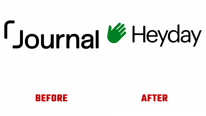
In 2016, Heyday magazine appeared in print, which later became an effective tool for increasing effective productivity and expanding the capabilities of browsers. The app automatically collects, links and processes all user-conducted research. By using it, the tedious work that the user had to do manually is minimized. The application allows you to do several dozen studies simultaneously and keep many tabs open without overloading the browser. Using Heyday frees up time for other more important tasks, keeps you organized and free to act.
Brand visualization is based on a simple and recognizable concept, the so-called “helping hand.” The palm sign symbolizes the green helping hand. Green is always a security and utility identifier. The palette becomes recognizable almost immediately as an anchor in the system. The choice of typefaces is Commercial Type’s Graphik sans-serif, which especially resonates with the geometry of the hand. The fonts are designed in such a way as to create a single composition. The letters are in black, making the text readable in any form – both printed and digital. Each letter is executed very delicately, which clearly distinguishes each letter. The letters “H” and “d” have something in common in height, creating a kind of symmetry convenient for visual perception.
When it comes to apps, Graphik looks great. Including the “hands” icons are effectively changing. They are well received regardless of scale or with different text. The dynamics of the “hands” are very effective – they grab things or elements and put them aside, bringing them back into focus.
The overall design impression is very pleasant while demonstrating an understanding of the essence of the brand’s objectives. They convey what is needed – goals and objectives. At the same time, everything is done in a very pleasant aesthetic way.


