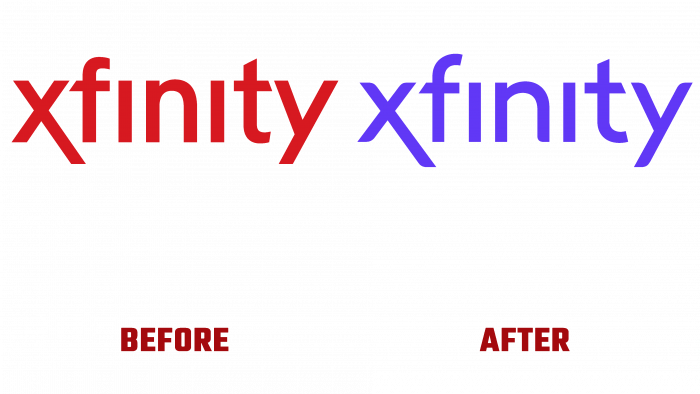
TM Xfinity, the provider of quality Internet and cable TV at Comcast in the USA, announced the completion of the company to create a new visual identity. British design agency Venturethree was commissioned to develop the new look. Xfinity was established in 2010 as a subsidiary of Comcast. The brand immediately expanded its offerings, including telephony, wireless communication, security of houses and apartments in this list. Today, Xfinity has 33 million cable subscribers and is one of the largest Gigabit Internet providers in the country. The company has already covered more than 58 million points of home and business Internet with its services. And all these achievements are the merit of the team of brands, despite the negative attitude of the American consumer to the poor quality of services from Comcast.
The new logo has undergone dramatic changes only in the formation of the TM mark. The first letter of the brand name “X” was taken in his capacity, on which the designers “worked.” As the supreme symbol of connection, this element provides a fresh look at the brand’s activities, gives new meaning, and demonstrates the presence of a huge charge of vital energy necessary for further development. The “X” in white was placed on a constantly changing background, where only bright ultra colors were applied. The combination of white, stable with them provided a sharp contrast, emphasizing the sign itself. A gradient “fog” was applied around the letter to soften the color combination and which created the effect of its glow. Its variable brightness in interactive advertising served its primary purpose – drawing attention to this supreme symbol of communication.
Keeping unchanged the text image marker – the full name of the company Xfinity virtually unchanged, the designers paid special attention to creating additional bright advertising forms and image elements. They became the ones that formed the required visual impact, reflecting the new philosophical concept of the brand. And first and foremost, providing complete distancing from the parent Comcast. Venture three managed to create a completely new strategy that turned the foundations of the brand, instilling, with its help, the confidence in the potential consumer of Xfinity that it was ready to go with the company to a new and better future.


