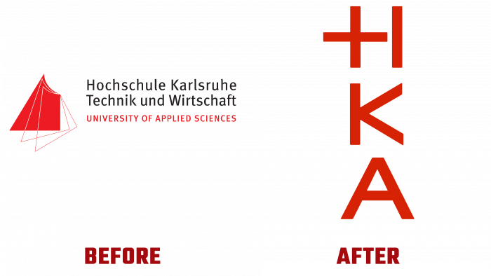
The world-renowned German University of Applied Sciences Karlsruhe has announced its rebranding and name abbreviation. Founded back in 1878, it was called the Großherzogliche Badische Baugewerkschule. Today it is a leading university providing certified knowledge in architecture, electrical and information technology, computer science and systems for business, information management and media, mechanical engineering, management, and engineering. The name change associated with some rethinking of the image philosophy of the university caused a desire to approach the issue of rebranding creatively.
Modernity dictates new requirements not only for science but also for its reflection, which led to the need to make changes in the formation of the style of even such a respected university. Today, conciseness and vivid visual appeal are relevant without unnecessary overload. A characteristic feature of Generation Z is the fragmented thinking, in which “many letters” are practically not perceived. In this regard, the university leadership decided to apply only the abbreviation – NCA. The solution was discussed among staff and students, receiving their full support. The problem of creativity was solved quickly enough. We settled on the original proposal to form an abbreviation using mathematical symbols. The design company from Berlin, Capitale, finalized and implemented this idea.
Today’s new image of such a serious institution is represented by an emblem consisting of three letters placed horizontally, one under the other, executed in bright red, whose shade is somewhat different in its saturation from that used in the previous version. The letters are assembled from several mathematical signs each, which provides a visual understanding of the main direction of the university – applied sciences. “H” consists of a “+” sign, to the right of which there is a perpendicular line. The next letter, “K,” is the connection of the vertical bar and the “< “sign. The letter “A” is a joint at the apex of two slanting fraction symbols, connected in the center by the crossbar of the “-” sign. In addition, for each faculty, a sign was thought out with the preservation of the main one, but in an individually selected color – green, blue, pink, etc., which provided colorful graphics, the perception of independence, and a variety of training courses. On the left, at the level of the first letter’s height, the faculty profile is indicated.


