The Hoka logo soars over vast expanses. The emblem conveys a sense of freedom, speed, and lightness of movement that the brand’s footwear guarantees. The brand is made for leaders and runners who secure top positions; the emblem emphasizes this.
Hoka: Brand overview
The origins of Hoka can be traced back to 2009, when two ardent runners and former Salomon employees, Nicolas Mermoud and Jean-Luc Diard, decided to develop an entirely new category of running shoes. Their original aim was to create shoes that would offer long-distance runners, particularly those who run on trails, the most comfort and support possible.
The company was established in 2009. Drawing on their background in the sports footwear business and their love of running, Mermoud and Diard started experimenting with novel ideas for shoe design. They created a special sole with more cushioning, which turned into a brand icon.
The Maori term for “to fly over the earth” is “Hoka One One,” the brand’s original name. The name aptly represented the brand’s mission to make shoes that enable runners to feel light and comfortable even over long distances.
The Mafate, the first running shoe type, was released in 2010. This model’s unique design, which had an extremely thick sole, immediately attracted attention. Many people initially questioned this design because they thought it was bulky and awkward. However, runners who tested the Mafate were astounded by how supportive and comfortable the shoes were.
The company became well-known in the world of ultrarunning in 2011. The brand’s awareness among professional athletes increased when several elite runners chose these shoes for their contests.
2012, the company added several models to its lineup to accommodate different running styles. These featured shoes for road running, trail running, and even triathlons. Each model was customized for a particular set of circumstances while maintaining the renowned maximal cushioning.
In 2013, Hoka One One experienced a pivotal moment in its history. Deckers Outdoor Corporation, a significant footwear producer, purchased Hoka One One. This acquisition gives the brand greater access to resources and more opportunities to grow its production and distribution.
The company aggressively increased its market share abroad in 2014. The firm expanded into markets in Europe and Asia, where its avant-garde style also won admirers.
The brand released the Tor Ultra Hi WP, their first walking shoe, in 2015. This product launch proved that the company’s technology could be effectively used in other product categories besides running shoes.
The firm debuted the J-FrameTM technology in 2016, offering more foot support without stiff materials. This invention enhanced the brand’s standing as a company prioritizing support and comfort.
The company kept growing its product lineup in 2017. The business demonstrated its readiness to expand outside the running market by releasing its first fitness and gym training shoe.
The brand’s first global marketing campaign, “Time to Fly,” debuted in 2018 and reflected its mission to support athletes in pursuing personal growth.
The business debuted the Hoka Sky range in 2019, with models intended for daily use. This was a big step toward broadening the brand’s target market beyond the sports community.
In 2020, the company kept expanding despite world problems. The firm broadened its product offering by releasing new road and trail running models. Running enthusiasts and industry insiders gave the Clifton 7 model many great evaluations, making it successful.
The brand released the Rocket X, its first running shoe featuring a carbon plate, in 2021. This was a big move in the direction of high-performance running shoes for enthusiasts and elite athletes looking to improve their performance. Expanding its reach in the sports apparel industry, the firm debuted a range of running and activewear that same year.
The Kawana model, partially composed of recycled materials, was introduced in 2022, marking a significant step towards sustainability. This action demonstrated the company’s increasing dedication to environmental responsibility. In addition, the firm opened other flagship locations in well-known American and European cities, greatly increasing its retail footprint.
The company released a unique anniversary collection in 2023 to commemorate its 14th anniversary, which the most well-liked models inspired in its past. Additionally, the corporation increased its visibility in professional sports by supporting multiple elite triathlon and track teams.
Meaning and History
What is Hoka?
This company, founded in France, is a renowned sports shoe manufacturer known for its original sneakers. The brand has gained popularity among runners and athletes for its unique approach to shoe design, featuring an enlarged midsole and signature “Meta-Rocker” geometry. The sneakers are designed to provide maximum cushioning, stability, and a smooth ride, making them popular among professional athletes and fitness enthusiasts. The company has expanded its product range to include running shoes for different conditions, hiking boots, and recovery sandals. The company’s uniqueness in performance, comfort, and advanced technology has helped it carve a significant niche in the competitive athletic footwear market in the United States and worldwide.
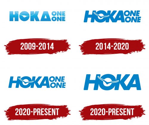
2009 – 2014
The first emblem features stylish lettering with a blue gradient. Inside the letter “O,” a bird spreads its wings. White and blue shades create an association with the sky. Each element has a mist at the top as if dissolving into a white cloud, soaring ever higher. The brand has reached such heights that it soars among the birds.
The letter “A” is transformed into a triangle with a cut-off top, hinting at an orthotic that provides a soft touch for the heel and protects it from impacts. The company succeeded in developing a unique sole with enhanced cushioning, which became its innovation.
This element also resembles a winner’s podium. The idea is reinforced by the double word “one,” indicating first place, highlighting the best of the best.
The brand name is derived from the Maori word meaning “to fly over the land,” which is why a bird was chosen as the symbol, and all advertising campaigns revolve around the theme of flight.
2014 – 2020
The brand changed ownership. The new owner, Deckers Brands, slightly updated the logo. A richer blue font with thin, elongated glyphs suited the running theme perfectly. The rightward slant of the lettering demonstrated movement.
The inner hole in the “O” became larger, giving the bird finer, lighter features. The blue color and white outline made the image sharp, drawing attention. The image embodied the phrase: running in Hoka is like flying.
The slight offset of the two “ONE” elements from each other added dynamism to the emblem. The words, like footprints, hinted at the footwear theme.
2020 – today
The lines of the emblem, while maintaining the full composition, became even thinner to represent the ultra-light shoe models that are barely felt on the feet.
2020 – today
The brand was founded when the market for athletic footwear saw increasing demand for innovative and high-tech solutions for runners and athletes. The logo was designed to convey the products’ unique characteristics and highlight their advantages over competitors.
The modern emblem features the word “HOKA” in large, uppercase blue letters. Inside the letter “O,” a bird’s silhouette in flight is placed, adding dynamism and symbolism to the logo.
The bird silhouette inside the letter “O” symbolizes the lightness and freedom of movement experienced by athletes using the company’s products. The bird in flight represents the pursuit of new heights and speed, perfectly fitting a brand that creates high-quality athletic footwear.
The logo’s meaning is to ensure comfort and protection for athletes’ feet. The emblem creates associations with the lightness and speed of using the brand’s shoes.
The trademark font is clear and simple. The uppercase letters without serifs create a sense of strength and reliability. The minimalist style emphasizes the focus on the product’s functionality and efficiency.
The primary color is blue, which symbolizes reliability, stability, and trust. Blue is also associated with the sky and flight, further reinforcing the symbolism of lightness and speed.
