Independent brand Holistic London is a cozier lifestyle company with aromatic home products. The brand was founded in 2019, thanks to the couple Jules and Adrian. The duo creates delightful home scents that fill the space with pleasant notes of sandalwood, coconut, citrus, or jasmine.
The first line of products – scented candles – appeared in 2019. They consisted of 100% natural ingredients. Now the brand has expanded and offers candles and home sprays, aromas for bath procedures, morning and evening rituals, various mixtures and bath salts, and diffusers for rooms. For example, the bath salt set contains 84 minerals and oils, which contribute to the deep relaxation and detoxification of the tired customer after a hard day’s work.
The main ideas that the brand is filled with are the transformation of the thinking style of connoisseurs of comfort, cleanliness, and environmental friendliness, mental and somatic well-being of people who need rest, and creating a warm atmosphere at home. It’s not just a company that creates a series of flavored home products that can be said to have been put in a corner and forgotten. This brand makes sure that there is a reminder that home is his fortress, reliable protection, and a native place where he can feel like himself in every corner of the consumer’s home. Holistic London was created to carry people into the world of pleasant dreams, joyful awakenings, bright moments, good meetings in comfortable conditions. Creating a mood and transforming a simple room into a microcosm is what the creators of delicate fragrances want to achieve.
The candles are handcrafted using ingredients such as soy wax and high-quality oils, making them affordable for vegans. No animals are involved in product testing, so the idea of harmless testing of materials is also broadcast. And all packaging materials are biodegradable or recyclable.
We can say that the brand is the personification of the idea of aromatherapy, which carries humanity, integrity in the study of personality, transparency, and positiveness.
The rebranding was necessary because the creators wanted to raise the bar and present the brand differently to add more luxury and creativity.
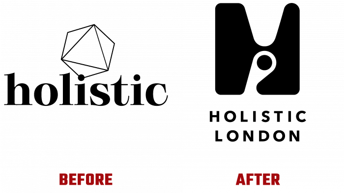
Previously, the logo consisted of a geometric pentahedron, made in black, with an outlined outline. And the font is selected with serifs, no capital letters. Above I” was the precious pentahedron as a symbol of preciousness and completeness.
They have created an interesting shape of the capital letter H; they placed a black dot in the gap. It symbolizes mystery, secret, and something enchanting, hypnotic. The company’s full name appears at the bottom in plain, plain type.
This new logo attracts the viewer much more. Because everyone sees the image H differently – a precious stone, a spot with a central circle, a candle, arrows. It looks more like an undefined abstraction of a letter without specific symbols.
But this well-chosen style for rebranding perfectly matches the brand’s philosophy and reflects mystery, luxury, privilege, and integrity.


