


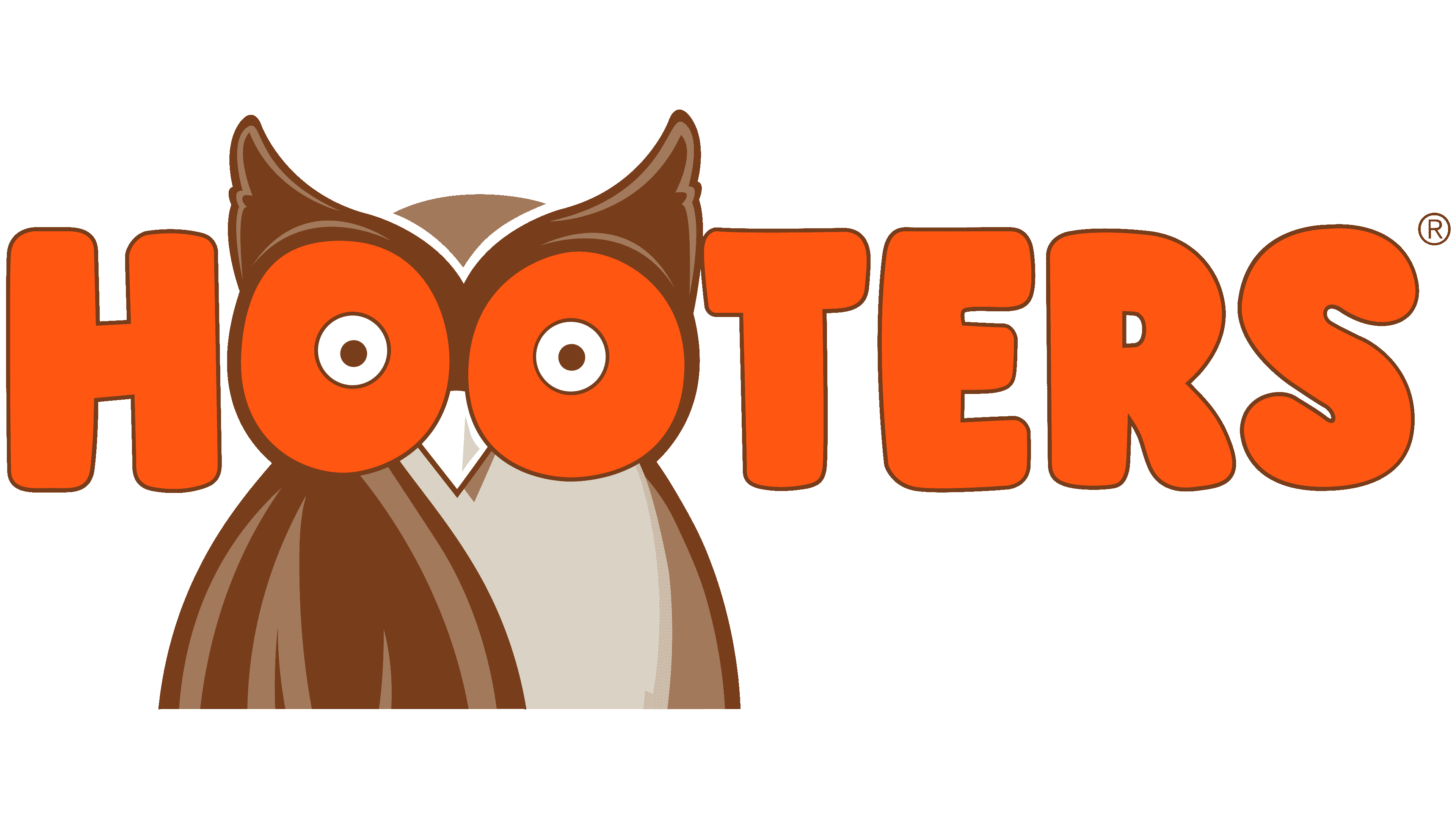
![]() Hooters Logo PNG
Hooters Logo PNG
Nightlife is in full swing in the company’s hotels, casinos, and restaurants. The Hooters logo shows a willingness to serve customers at any time and demonstrates an extraordinary approach and intelligent entertainment for midnight visitors.
Hooters began in Clearwater, Florida, in 1983, when six friends, Lynn D. Stewart, Gil DiGiannantonio, Ed Droste, Billy Ranieri, Ken Wimmer, and Dennis Johnson, opened the first restaurant. Even the founders treated the idea like an April Fools’ joke and did not expect much interest. The first location opened on October 4, 1983, with a beach-bar format, casual food, and a playful service style.
The name Hooters carried dual meanings, referring both to the owl on the logo and to a slang term tied to the brand’s marketing. The concept worked quickly. The restaurant drew locals and tourists with wings, burgers, sandwiches, and salads, as well as a relaxed sports-bar atmosphere. The Hooters Girls, known for white tank tops and orange shorts, became the most visible part of the brand image.
By 1987, the chain had grown to eight restaurants. By 1993, it had reached 100 locations. The rights to the brand were later acquired by investors led by Robert Howell Brooks, forming Hooters of America, Inc. A separate company, Hooters, Inc., continued to operate under the same trademark. Hooters expanded outside the United States, opening restaurants in Asia, Europe, South America, and South Africa.
The brand also tried new formats, including Hoots and Hooters Express, aimed at a wider customer base. Growth came with criticism over sexism and gender roles. In response, Hooters adjusted parts of its image, updated the menu with healthier options, and made small changes to uniforms. The chain later counted more than 420 locations in 29 countries, while remaining one of the most debated names in American casual dining.
Meaning and History
![]()
Hooters, a food and entertainment brand, has become famous worldwide for its unusual concept, built on a friendly atmosphere. Guests of establishments can order chicken wings and chat with the so-called Hooters Girls – waitresses who should smile cheerfully and support any conversation. They wear the same uniform: white T-shirts with the franchise logo and short orange shorts. The beach mood always prevails in restaurants because of their appearance and the beer, sandwiches, salads, and seafood menu. It is not surprising that whole families go there to eat and relax.
Despite the lack of overt vulgarity, the Hooters brand image is built on ambiguities. Even in her name, a subtext can be noticed if you know the North American slang: the word “hooters” disparagingly refers to a woman’s breasts. As the brand owners admitted, this is reflected in the logo. The designers added black dots to make the letters “O” look double. The main meaning of the term (“whistle”) is also interestingly played: in the background, there is an owl known for its ability to hoot loudly.
What is Hooters?
Hooters is a restaurant brand that employs waitresses in skimpy attire. It belongs to two organizations: Hooters, Incorporated, based in the Florida city of Clearwater, and Hooters of America, Incorporated, based in Atlanta. The history of the trademark began in 1983 when six acquaintances decided to start an unusual business.
1983 – 2013
![]()
As Dave Henninger, who oversees marketing strategy for Hooters of America, admitted, the franchise’s first logo was once an illustration in the dictionary. The artists copied the finished drawing of a long-eared owl with striped brown-and-white feathers. Given the source, the image is detailed. But the bird’s eyes were not visible: they were covered by two large orange letters “O” from the word “HOOTERS.” Only small dots-pupils were shown from the in-letter gaps. Thanks to the bold bubble font, the lettering stood out in the foreground and looked unusual.
2013 – today
![]()
On July 18, 2013, the brand owners presented a new owl version. The redesign coincided with the 30th anniversary of the opening of the first Hooters restaurant. Sky Design hosted the event and was tasked with attracting millennials to the catering chain. Experts preserved the franchise’s legacy but changed its presentation: the bird now looks less realistic and smoother.
Two letters “O” and sharp brown ears together seem like a carnival mask. The teardrop-shaped wing is set forward. It resembles the bristles of an art brush. The detailed feathers were replaced by colored spots: brown and gray in several shades.
The modern logo reflects Hooters’ transformation. Surveys have shown that customers rated the new brand image highly and selected it 9 out of 10 times. The transformed symbol gradually appeared on all signs, banners, uniforms, digital platforms, products, and restaurant menus. It became part of a massive campaign because even the food changed with the owl. The network wanted to attract women’s attention, but how effective its methods were remains unclear: the iconic bird’s-eye view still looks ambiguous.
Font and Colors
The Hooters brand name is “Hootie”. It has been criticized more than once for double associations, but the brand owners do not see anything wrong with it. They are confident that a little provocative irony will not harm the restaurant’s image but will only increase customer traffic. The company has redesigned Starbucks and Wendy’s to showcase its modernity. This move allowed her to catch up with competitors such as Tilted Kilt and Twin Peaks. As a result, the old scruffy owl became younger and more streamlined, while the ambiguity of the bird’s eyes was preserved.

The iconic emblem is combined with the ‘HOOTERS’ lettering. Designers used cartoon typography for its design, a bubble-bold sans-serif font. The word’s color is also very bold because orange is closely associated with pop culture and the freedom-loving hippie movement. It reflects an atmosphere of happiness, ease, and good humor. The owl, in turn, is depicted in several shades of gray and brown.
FAQ
Did Hooters change their logo?
Hooters recently updated its logo for the first time in 30 years. This change is a step toward refreshing the brand and giving its stores a more contemporary look. The main focus was to give “Hootie,” the famous owl in the logo, a fresh, modern design. Dave Henninger, the chief marketing officer at the time, mentioned in USA Today that the goal was to refresh the image of the mascot and the restaurants.
By updating “Hootie,” Hooters aims to breathe new life into its brand. It wants to continue appealing to loyal customers while also attracting new ones. The new logo is part of a broader effort to keep the Hooters brand up to date, emphasizing the company’s commitment to growth without losing its beloved features.
Why is Hooters famous for?
Hooters is well-known for its delicious wings, beer, and bar food, but what sets it apart is its fun atmosphere and the famous uniforms of its waitresses, called “Hooters Girls.” This chain has over 400 locations across more than 30 states, and it’s not just the food that’s made it famous. It’s also known for providing a special dining experience that combines good eating with entertainment.
The “Hooters Girls” play a key role in creating this experience. They wear eye-catching outfits that are a big part of the Hooters identity. These uniforms and a lively restaurant atmosphere attract customers who want something extra from their dining experience.
Hooters takes great care to maintain the appearance of its servers, keeping a consistent, professional look that’s easily recognizable. This emphasis on branding and the servers’ appearance has helped Hooters stand out as a place that offers great food and drinks in a memorable setting.
Why is Hooters a meme?
Hooters became famous partly because it hired attractive women as waitresses, known as “Hooters Girls,” creating a unique dining experience. This aspect has made it the subject of many jokes.
A new joke, “Femboy Hooters,” emerged when people online started talking about wanting a version of Hooters with masculine-looking men instead of women as waitresses. This idea became popular, sparking many fun discussions about gender and attractiveness.
Even Hooters noticed this trend, showing how internet jokes affect real businesses. Their acknowledgment helped make the joke even more widespread.
The “Femboy Hooters” joke is popular because it’s funny, prompts people to think differently about society, and challenges Hooters’ usual image. It shows how internet humor can change how we see a brand and spark important discussions.
Who is Hooters’ target audience?
Hooters focuses on men aged 18 to 35, considering them its primary audience. This choice fits the brand’s personality and offerings. The company cleverly targets people based on location, especially those who have visited Hooters or similar places. This method helps Hooters effectively connect with potential customers, boosting the likelihood that they will visit.
Additionally, Hooters aims to target individuals near its locations, capturing the interest of nearby potential customers. This approach is particularly effective for enticing people looking for a place to eat.
What does the Hooters logo mean?
The Hooters logo features an owl that plays on the double meaning of its name, which refers to both the sound an owl makes and, informally, to a woman’s breasts. This clever detail is highlighted by the two ‘O’s in “Hooters,” which represent the owl’s eyes, adding a playful twist that nods to the brand’s female waitresses and their uniforms.
The choice of an owl for the logo directly connects to the restaurant’s name, chosen for its simplicity and recognizability. This mix of imagery and wordplay gives Hooters a unique, memorable identity that reflects the fun, bold atmosphere of the dining experience. The thoughtful design plays a significant role in the brand’s recognition and is vital to its overall branding.
What is the font of the Hooters logo?
The Hooters logo uses a bold, bubble font with no small lines at the ends of the letters, known as serifs. This makes the logo look clean, modern, and easy to read. The font matches Hooters’ fun and laid-back image, suggesting a place where people can enjoy themselves and relax. The logo’s design captures what Hooters is about, offering a friendly and fun dining experience.
This font choice helps convey the brand’s playful, welcoming vibe. The memorable logo makes Hooters stand out and helps customers easily recognize the brand. This font is key to the logo’s design, helping Hooters discover its unique place in the busy restaurant market.
What does the Hooters logo symbolize?
The Hooters logo combines two meanings of its name into one clever design. It features an owl, highlighting the word “hooters” as the sound owls make. The owl’s large eyes show this at the center of the logo. Additionally, “hooters” is a playful term for women’s breasts, and the logo subtly alludes to this with the owl’s large eyes, whose pupils are shaped like the letter “O” in the brand’s name, connecting to both meanings.
The logo’s design captures Hooters’ fun and casual vibe. It’s meant to be playful and cheeky, mirroring the restaurant’s atmosphere. With its dual symbolism, the logo effectively represents Hooters’ brand and is easily recognizable.
Why is the Hooters logo an owl?
The Hooters logo includes an owl to playfully reference the restaurant’s name, which doubles as slang for female breasts. This clever play on words aligns with the brand’s lively and bold marketing strategy. The owl symbolizes the night, which fits the brand’s goal of creating a relaxed, enjoyable atmosphere for fun and entertainment.
The owl’s eyes in the logo mimic the two ‘O’s in “Hooters,” creatively integrating the brand name into the design. This feature emphasizes the name and adds a playful element, highlighting the word’s dual meaning.
The logo is distinctive, with its bold orange bubble font that grabs attention and makes the brand stand out. Combining the owl motif, the integrated brand name, and the striking font and color vividly conveys what Hooters represents: a unique dining and entertainment destination in the competitive restaurant industry.
Who created the Hooters logo?
The original Hooters logo featured an owl taken from a dictionary, creating a simple yet realistic look. When Hooters first launched, they added the brand name to this image, aligning with their straightforward, fun approach.
In 2013, Hooters refreshed its logo to reflect its evolving identity. They hired Sky Design, a creative agency, to create a new logo that would be distinct and embody Hooters’ unique character. The new design shifted from a realistic owl to something more Hooters-specific, making it more recognizable.
Despite these changes, the redesigned logo retained key elements like the ‘O’s in “Hooters” resembling the owl’s eyes, complete with little dots. This maintained the logo’s playful connection to the slang meaning of “hooters” while demonstrating the brand’s ability to update its image without losing its iconic look.
When did Hooters change their logo?
In 2013, Hooters updated its logo for the first time as part of a broader effort to modernize the restaurant’s appearance, including the menu and exterior signs. This change aimed to make Hooters more attractive to contemporary customers. A significant alteration was made to the logo’s owl, an iconic element of Hooters’ brand. The original owl, detailed and realistic with feather textures, was redesigned in a simpler, more contemporary style with smooth, rounded lines, limited to brown and beige for easier recall.
This update reflects Hooters’ goal of staying relevant and appealing in today’s market by adopting a simpler, more modern look. The intention was to attract more customers while maintaining the brand’s identity.