Hostess Brands Inc. (NASDAQ: TWNK) was founded in 2013 to produce a variety of goodies, including sweet snacks. Today, the brand is engaged in developing and producing, marketing, official sales, and distributing products and various “goodies” in North America. The company sells its products under several brands – Hostess and Voortman. Its best-known products are the iconic Hostess® Donettes®, Twinkies®, CupCakes, Ding Dongs® and Zingers, a variety of biscuits, Voortman waffles, as well as a host of classics and brand new and constantly evolving treats. Constantly developing and expanding its range, the brand seeks to cover more and more consumers with products. Innovative changes and a change in the priorities of the modern consumer in the field of perception of visual information have become the basis for the company’s rebranding.
The main task of the new visualization is to highlight the company’s name, create individual appeal in a huge environment of similar offers, and form the basis for future development, which will increase the number of categories of snacks. The created identity very well captured the brand’s spirit, bringing joy to the lives of a huge number of people who prefer sweet offers. At the same time, the unique corporate character of the exterior design was conveyed, characterized by dynamism, warmth, and stability. Emphasis was placed on self-confidence and strong assets, both today and in the future. The development was based on communication with the management of the enterprise and audit and decoding of the semiotics of corporate colleagues. It is necessary to understand the existing competitive environment and the prospective strategy of Hostess.
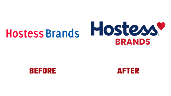
The company’s strategic vocabulary has been recoded with new visuals and design elements. The created sign was rethought in such a way as to reveal the dual feature of the company’s brand, which reflects not only joy and pride, but also focuses on stability and dexterity. At the same time, the structure was based on the adopted corporate cult form in the form of a heart, which is a symbolic reflection of the company’s essence. The use of rich contrast and a charming text ending of the double “ss” at the end of the title managed to create a subtle reference to the image of the main product of Hostess CupCakes. This little detail, along with some of the awkwardness of the logo created by the drooping crossbar of the “H” and the subtle two-tone transition separating the heart, adds to the logo’s appeal. This property is enhanced by the off-center symmetry of the word Brands and asymmetrical font plates and the feeling of a completely random choice of the color palette. All this is aimed not only to attract attention and ensure brand awareness but also to demonstrate the presence of hidden powerful potential for future development.


