Howard Payne University, based in Texas, recently started rebranding itself. A big plus for the leadership of the educational institution is that they decided to refresh the university’s brand and make its visual design more attractive. Learning is boring when your alma mater is just a faceless building with a completely inappropriate symbol that does not reflect the organization’s values and mission.
In America, they are very attentive to the image of schools, colleges, and universities, so the bar should not be lowered to those who have risen to the top thanks to their active work and the quality of educational service.
The local HPU design community was given a challenging task, which they handled at a high level. In the early spring of 2021, a focus group appeared to help shape the verbal portrait, or rather, the university logo. The team included both the student body and the teaching staff; all the participants shared their thoughts on how the brand should look in our time. At the beginning of the fall semester, the creative team of designers, led by Jarvis Green and HPU VP Kyle Mize, presented the final designs of the logos.
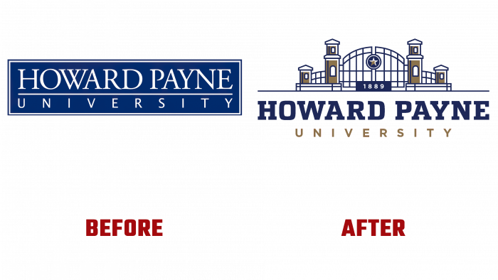
Previously, the logo was rectangles with the name, and the emblem expressed a deep meaning, depicting Wilson’s Gate with the year of the foundation of the university – 1889. The depth of the idea of the old logo prevents it from being pushed into the “attic.” The fact is that the gate is a symbol of greeting new students, the entrance to the campus, the beginning of a new life. On the other hand, this is a farewell ceremony for their families, a place that provides them with knowledge and practical skills. The font is a serif, and the traditional colors are dark blue and gold.
The Intercollegiate Athletics Department logo received the same color palette as the logo. The insect depicted, which has long been the university’s mascot, conveys the spirit of competition, enthusiasm, energy, and enthusiasm. It is with this mood that young people should start their studies. Now the sports uniform will look the same – bright, juicy, confident. The yellow and striped Buzzsaw character, rendered in a separate illustration, looks comical and fun. This cute wasp, adopted by the mascot in 1996, is still recognizable and beloved among university representatives.


