


 H&R Block Logo PNG
To grow a business, you need a strong foundation, as the H&R Block logo suggests. And the company is ready to provide it. The emblem’s symbols represent fairness before the law, taxes on new profits, and growth and expansion, supported by the organization’s expert assistance.
H&R Block began in 1946 in a small Main Street office in Kansas City. Henry Bloch, a former B-17 navigator in World War II, and his brother Leon started United Business Company with a $5,000 loan. The firm handled bookkeeping, payroll, and small-scale tax preparation. After Leon left for law school, Henry brought in his younger brother Richard. By early 1955, the brothers had almost dropped tax services because the work took time and paid little. Kansas City Star ad manager John White pushed them to run two tax-return ads.
The first ad appeared in late January 1955. The next morning, calls flooded the office, and within weeks the company earned over $20,000. The timing helped. In 1955, the IRS stopped providing free tax preparation assistance, leaving millions of Americans seeking paid help. In July 1955, United Business Company became H&R Block, Inc. The Bloch name was changed to Block to avoid mispronunciation in advertising.
In 1956, the brothers opened seven New York offices, then sold the operation, accidentally creating the first franchise unit. By 1962, H&R Block had 206 offices and nearly $800,000 in revenue. That year, it went public at $4 per share. By 1969, the network had 3,286 offices in the U.S., Canada, and Puerto Rico, with revenue above $56 million. In 1978, one in nine US tax returns was prepared by H&R Block. Later purchases included Personnel Pool of America, Hyatt Legal Services, Path Management Industries, and CompuServe.
In the 1990s, TaxCut pitted H&R Block against Intuit’s TurboTax, while Option One Mortgage expanded into lending in 1997. Henry Bloch died in 2019, when the firm served about 20 million clients a year.
Meaning and History
The business began after World War II, when Air Force Navigator Henry W. Bloch considered working and starting a family business. He saw a brochure that described the bright future of firms serving small businesses. In 1946, he and his older brother Leon took out a $5,000 loan to start an accounting service in his hometown.
But things were not going well, and after four months, the brothers had too few clients to pay off the loan. Then Leon decided to pursue specialized education, and Henry asked for help in the newspaper. Support came from the mother, who called and asked to take on another brother, the younger Richard.
The brothers assumed joint management of their firm, United Business Company, focusing on accounting, income tax, and payroll. When real money appeared, the owners immediately advertised in the local newspaper, informing the public about their service. The appeal was successful – more people learned about them and began applying for services.

This event took place in 1955, which became the company’s official founding year. The founders rebranded the firm as H&R Block. To do this, they used the first letters of their first and last names. For convenience only, the brothers replaced the final “h” with “k” to pronounce the word firmly and clearly. The first logo was a simple advertising plaque indicating the name and types of services.
A year later, the brothers decided to expand and chose New York City as their destination. But they didn’t want to take everything with them, so they agreed to sell the local branch to anyone who wanted to buy it. So they laid the foundation for the franchise. By 1962, the H&R Block logo was well recognized.
In 1980, the company acquired the Internet service CompuServe to expand in that direction. After six years, the brothers processed 10 million tax returns annually and opened their own offices in Australia and Canada. In 1986, the organization also collaborated with the Internal Revenue Service to implement electronic document management. Over time, the company has used three logos.
What is H&R Block?
H&R Block is an American company that simplifies tax return preparation. It was founded in 1955 and named after its founders, the Bloch brothers. H&R Block not only prepares tax returns but also teaches taxpayers how to complete them independently. To do so, it offers consultations and develops software.
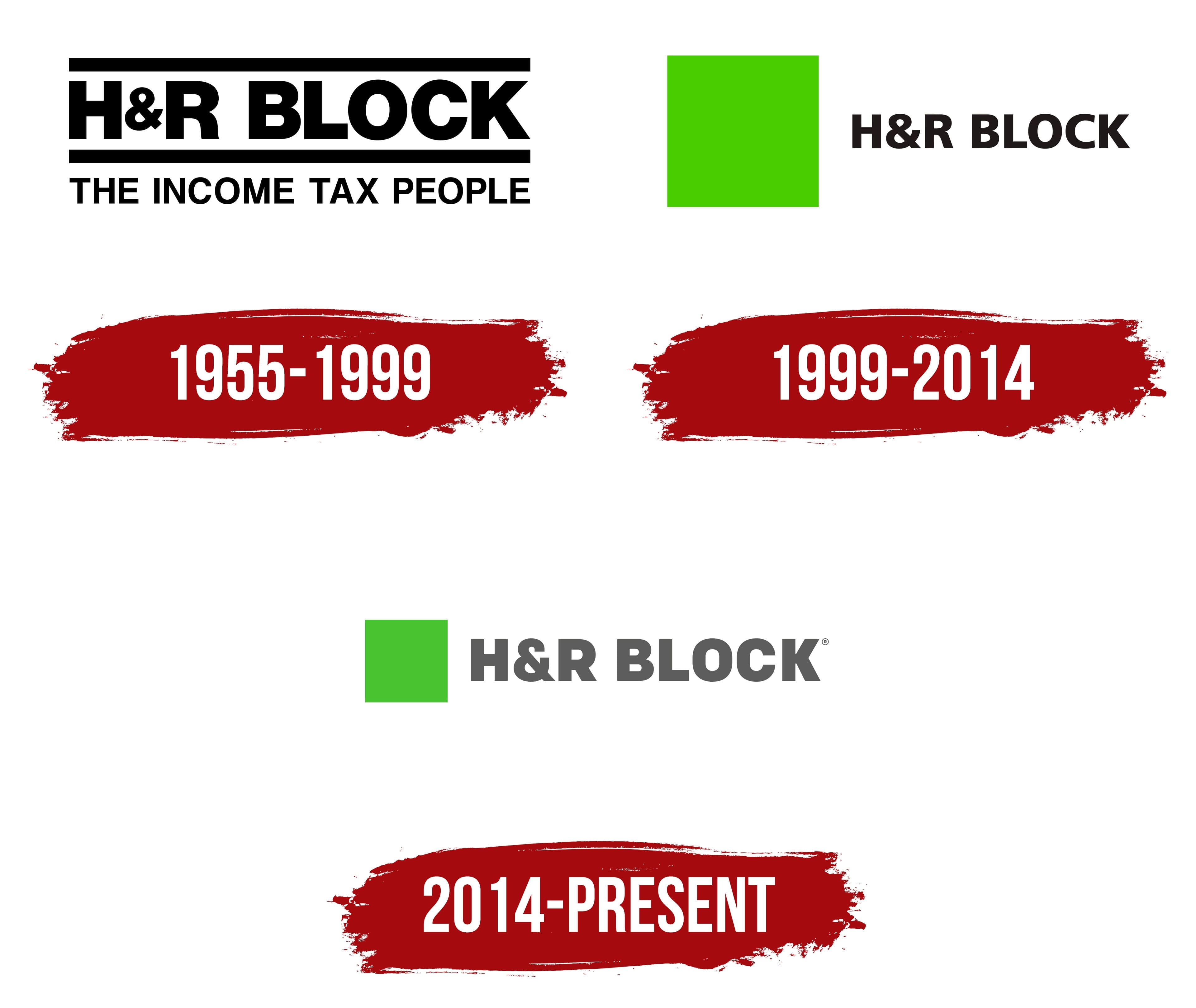
1955 – 1999

The period’s emblem features the company name in classic block letters. The phrase “H&R Block” is in bold uppercase and centered between two equal-width lines. Below the bottom line is the advertising phrase “The income tax people.” The characters in it are slightly thinner and smaller than those in the top line. Traditional monochrome color scheme. It consists of black (all elements) on a light background (base background for the labels). The ampersand (&) connecting “H” and “R” is made small and depicted exactly in the middle – it seems to hang between two letters.
1999 – 2014

During this period, the logo transitioned from an advertising mark to a graphic sign. To this end, the designers removed all inscriptions unrelated to the brand name. They placed the phrase “H&R Block” to the left of the large light green square. The black text effectively contrasts with the lime hue.
2014 – today

Before approving the new version, the designers corrected the logo. They changed the proportions and colors of all elements. Now the logo uses a small light green square, which balances perfectly with the text. It now aligns with the inscription, creating a harmonious look. Look: The letters are graphite, so they look dark gray rather than black.
Font and Colors

Throughout its existence, the company’s logo has contained the same details. The authors changed their proportions and corrected the color. The key elements were and still are the brand name text and the classic green square. However, it didn’t appear immediately because the main inscription was the text, not the image. So the tax and consulting service gradually moved away from the information version of the logo.
For a business and serious logo, the designers have chosen a geometric sans-serif typeface – flat, smooth, austere- which reflects the company’s style as much as possible. The font is called Coflax Black. Eric Olson created it in 2012, and Process Type Foundry released it.
The emblem palette is two-part: aside from the white background, it uses only lime and black. H&R Block chose green during the reboot, when it expanded its activities and sought to attract attention. Bright green helped with this because it is associated with novelty, freshness, and confidence.