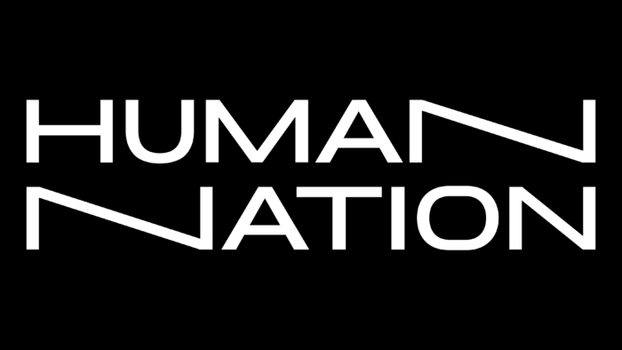
German fashion brand Human Nature has unveiled its logo. Owned by the Wormland brand and part of The House of LR&C, the brand has declared its commitment to leadership in its field since its inception. Wormland was founded in 1935. It has gained immense popularity in Germany by offering stylish and trendy casual and smart casual clothing. The new brand is represented by just a huge number of stores located worldwide. The brand’s products are distinguished by their versatility, taking into account the features and differences of the human body, which provides the opportunity to choose clothes for any person. This production is based on the important concept of creating a brand that can positively affect the lives of a billion people. This is achieved by using radically inclusive innovations, which are reflected in the visual identity and logo of the company.
The company identity was conceived as a flexible and systematic visualization. It was based on the principle of compliance with product features. The main element is a verbal sign, which, like the clothes themselves, it is in a constant variable state – it moves and changes stretch. At the same time, it retains its forms adapts, always remaining easily recognizable. The logo has become a successful visual metaphor for a brand that makes clothes. The graphic design of the brand name made it attractive and easy to remember. A special role in this was played by the originally applied various expansion of letters, carried out in radical ways. The created composition acquired its visual advantages due to the harmonious combination of letters and their original execution. So the letter N brings a dramatic effect with its shift of the oblique line with its expansion to the left. At the same time, the applied animation, with its simplicity, only focused attention on the minimalism of the execution of the entire logo, opening up wide opportunities for its further graphic development.
The developed applications have their distinct personality. But each of them demonstrates the commonality and unity of its belonging to a common brand. In the manufacture of printed materials, thin typography was used on a smooth black background. A wide range of templates has been developed to fully reflect all the information and features that have cardinal differences among themselves. In this way, the designers were able to achieve the desired direction of visual perception, helping to convey the true atmosphere of the brand and its fashionable focus profitably and accurately.


