Hungry Harvest, a fruit and vegetable food and beverage company, has announced an overdue rebranding as it moves to the next level of development. Founded on May 5, 2014, by Evan Lutz and John Zamora to provide healthy and nutritious food with minimal waste, it has adopted its slogan: “Cooking everything – from stem to root.” By processing second-class farm products or a lost marketable company, the company reduces waste, lowers the cost of production, and provides additional income to farms by “bringing the power of plants to people.” At the same time, a unique recipe is used that allows you to prepare healthy parts of plants for eating but is not accepted for use in traditional cuisine. As a result, original and very tasty semi-finished products and ready-to-use dishes and drinks are created. The company’s activities, which are especially important in today’s conditions, requiring savings in the use of natural resources, reducing the negative human impact on the environment, were appreciated by its clients, whose number is steadily growing. This led to the need for rebranding.
Delivering its products directly to its customers’ homes, the company uses special packaging of various types, designed for convenience and safe transportation, with a corporate design. Also, an important tool for the company’s effective functioning is the company’s website – convenient and easy to use, with the help of which the assortment is demonstrated, and orders are placed. All these required visualization changes, which should provide the customer’s required perception of the company’s new image.
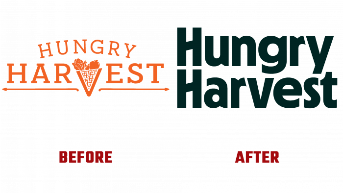
The past logo was not bad. Inspired by the pure and healthy natural energy, it had a cheerful orange color and was very attractive. But it fulfilled its task and became obsolete over the years of use. The company’s new corporate identity requires a demonstration of the solidity of the enterprise, its maturity with a particularly strong expression of individuality. Laconicism and lack of “playfulness,” the use of only the company’s name, in monochrome execution – strict black color, typed in MD Nichrome font of the text contributes to the formation of the required impression. Together with the elements added to the animation and being placed with images of various types of company goods on containers and packaging, the logo looks quite friendly without a repulsive effect.


