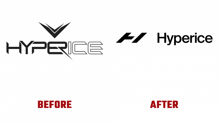
American manufacturer Hyperice is a leader in designing and manufacturing sports massage equipment. The year of the foundation of the brand is considered to be 2011, when the first innovative products were presented – massage instruments for professional athletes and amateurs. The devices are aimed at helping the muscles quickly recover from intense exertion. Also, the company’s products are used in the prevention of pathologies. The brand has entered into an agreement with the NBA as the official technology partner to recover the club’s professional athletes. In the fall of 2021, the brand expanded its range with five new devices, including an innovative meditation training device, and changed its development strategy. To reflect the new changes, a complete rebranding of the company was carried out, in which the Stockholm Design Lab took part.
The brand renewal expands its reach to its target audience, demonstrating new opportunities and goals expected to be achieved shortly. The rethinking of the corporate identity was carried out together with the launch of a new advertising campaign under the motto: “Do What You Love. More.” A modified strategy and a completely different marketing approach, tuned to continuous development and growth of the brand, taking into account the focus on the professional and amateur audience, should help fulfill all the needs that arise during the training process. The brand’s ambitions are also effectively reflected in the new visualization, finding freshness and energy that meet the tastes and preferences of the consumer. A wide variety of internal content is indicated, covering sports and life. A visual representation of the tasks and goals that the brand has set for itself provides an understanding that they are not just a statement but are being addressed in real-time today. This ensures that the consumer understands that he is already a direct part of Team Hyperice, regardless of their own goals – the desire to become the winner of professional competitions or to achieve the overall health of their body and mind.
The new logo is soft and visually clear. The typeface typed by Suisse from Swiss Typefaces is very well perceived visually in all formats of its reflection. Its eye-catching composition enhances that effect, making the logo memorable. Laconicism with minimal graphic saturation and a clear separation of the HI monogram, whose angle of inclination acts charming, and the text itself ensures ease of perception. The required attention is created by an accent element – an oblique monogram, which provides ease of further “control” of the viewer.


