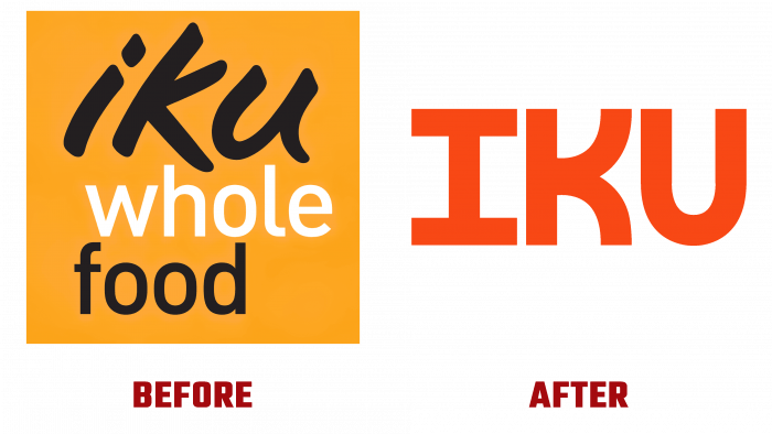
The company has been working in the manufacturing and delivery of food for almost half a century. IKU of Sydney, Australia, undertook a complete rebranding with Universal Favorite. Today, a herbal or vegetarian-only delivery service, the company started as a diner founded by then-famous Sydney chef Holly Davis and his partner Willem Venter. The peculiarities of today and the company’s development led to its expansion and transition to a hybrid business model, which included direct delivery of products to the customer and the preservation of three stationary points of sale. An interesting moment in the brand’s history was the foresight of its future since the name taken back in 1985 in translation from Japanese has two meanings – “food” and “to go.”
Starting to fulfill the task, Universal Favorite turned its attention to the fact that, unlike other brands related to food and delivery, IKU has slightly different goals. Given that the brand is vegan, it does not seek to prioritize traditional environmental and health benefits. This profile already embodies these benefits, giving vegetarian food an image of boring and limited. The new form reflected a rich history, making the visualization modern and relevant, maintaining the local atmosphere, raising it to the existing national level.
The decision was made to create a pleasant and friendly new essence for the brand, attracting attention to ready-made vegan dishes and making them especially desirable. Securing the desire to buy IKU products began with building a new strategy. With the help of the creative team at Untangld, a spectacular visual competitive advantage has been formed by moving away from the traditional emphasis on healthy and light, natural, which is characteristic of vegetarian food. Emotional overtones have been added based on appetite-raising and emphasizing that vegan food is a real help to the Planet.
The brand logo has become concise and easy to read. The abandonment of multi-element and the basic reliance on a single text sign – the company’s name has led to a positive impact on the viewer, attractiveness, and memorability. Each of the three letters of the text has been perfectly balanced, thanks to graphic design and modern digital technologies. Their clarity and precise vertical position facilitated visual perception. The letters, executed in capital letters in white on a bright red-orange background, stand out in contrast and effectively in their execution. The choice of the palette is directly related to the creation of a sense of appetite, to which the shade chosen as the background corresponds in its psychological characteristics.


