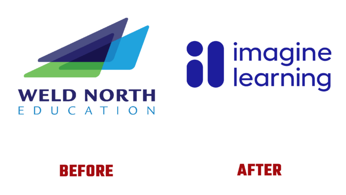
The new world of knowledge and learning created by Imagine Learning knows absolutely no boundaries. Here, each teacher has great opportunities and powers, each student is even more passionate and involved in the learning process, all families are united in a single learning community. Only Imagine Learning creates cutting-edge educational solutions that empower educators and improve student achievement. By bringing together its entire portfolio of products, the brand has created new ones, expanding its range of services providing an opportunity to apply creativity to create a more effective interaction between teachers and students. The use of innovative solutions made it possible to receive and apply new information in real-time effectively. The rebranding put the right accents on each element of the visual identity ensured the change of the name to a new one, which more broadly and accurately conveys the essence of the changes that have occurred at this stage of brand development.
Following modern trends – the desire for minimalism and simplicity of solutions, the brand has made important changes in its visualization, opening new opportunities for further restructuring. By placing people at the forefront of their strategy, the company has prioritized the need to reflect the concern shown for their teachers and students. The new name consists of two words, the first letters of which form a simple and easy remember sign that has become a symbol of promising online courses. Its simple graphic design made it easy to place the sign in both typographic and digital versions.
The sign, made with two bold and rounded letters, “i” and “I,” ensured its attractiveness and readability in combination with various other elements, signs, and images in the identity. The deeply saturated color of the letters, close to ultramarine, made them particularly noticeable and helped to focus attention on the case of using the logo among a variety of colors and shades. At the same time, ultramarine is the color of style, beauty, good luck, and concomitant success. The symmetrical placement of two words of the name above each other, respecting the upper and lower boundaries of the corporate symbol, ensured the convenience of visual perception of the logo, uniform filling of the space to the right of the symbol. The title text is created with a font like Lto.Polygon Poligon Regular by Letter Omega Typefoundry. It is distinguished by the absence of sharp corners, the clarity of lines, and the presence of optimal free space between each letter, making it convenient to read the text in any way it is placed.


