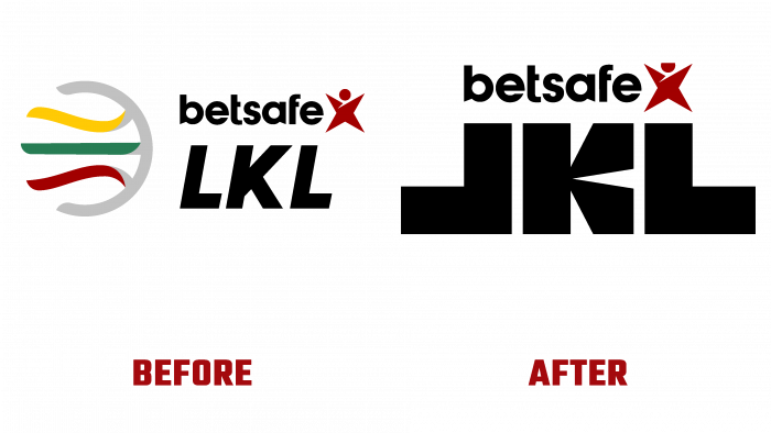
The sports brand Betsafe-LKL league decided to renew its identity exactly for the beginning of the new season, or rather, a month before the start of the tournament. Expanded the brand with visual solutions and audio and video materials to set the general tone of the championship series, share enthusiasm, and high expectations from match meetings. Appeared music track, a video clip, television graphics because, as the league’s public relations manager said, this is a new time and a new phase in the league’s development. The brand was waiting for the logo change and the emergence of new inspiring color combinations, style in general.
A big surprise awaits the audience because in the sports niche, in principle, everything is quite conservative: they attracted the audience, helped to remember the brand, sold merchandise, consolidated the success for several years or decades. But in our time, more and more sports organizations understand the importance of visual identity change, improvement, and rejuvenation. After all, modern society loves movement, boring images, contrasting symbols, and a powerful content message.
The authors of the rebranding state that there will be a lot of news for viewers in the new season. True, they are still hidden behind the scenes (literally and figuratively); nevertheless, the logo has already been presented to the public for judgment. The brand agency IMAGINE has just taken up visual solutions, emphasizing the need to associate basketball with icons and characters. They decided to find something laconic, loud-speaking, bright, and unexpected.
Simple meanings were reflected in the league abbreviation – symmetrical letters L, turned mirrored to each other, mean a fight between two teams. The shape of the capital letters indicates the chosenness – thanks to the created symbol of the award, the second meaning of the basketball game is acquired. Certain letter sizes have been chosen to express the importance, stability, trust, and authority of the Lithuanian league. They look like monuments, standing harmoniously with each other, as if forming a rise or steps of a pedestal, however, with only the first place outstanding. But it’s true, if there is only one winner, then who cares about the second or third place.
Continuing the description of the identity, the graphic stylization of the font should be noted. The shades of red and blue reinforce the team rivalry, adding a strong contrast to the brand image. The graphic language quickly becomes recognizable because it is unique and sharpened for a specific sports campaign. Communication is dynamic, attracts attention, and focuses on the semantic load transmitted by the logo.
In addition to the league logo, both LKL TV and LKL Academy have been updated, representing a new trademark from Betsafe LKL. To finally cut down on the spot for big sports fans, the audience will be presented with a thematic hit created by a famous Lithuanian producer.
Such a large-scale brand renewal suggests that spectators will soon expect sporting events rich in emotions and impressions. Be patient and expect the most interesting matches and the release of all branded products that will appeal to Lithuanian basketball fans.


