Founded in 1967, the basketball club from Indiana has a distinctive style reflecting its sports profile and close connection with the city. The passion of the city’s residents for movement and speed runs through the entire history, linking with the logo of the Indiana Pacers.
Indiana Pacers: Brand overview
| Founded: | 1967 |
| Founder: | Herbert Simon |
| Headquarters: | Indianapolis, Indiana, U.S. |
| Website: | nba.com |
In 1967, a group of investors from Indiana, among them one of the ABA’s founders, Richard Tinkham, and sports agent Chuck Barnes, took the initiative to create a professional basketball team. The future team’s name was chosen very carefully after discussing several possible options.
Indiana residents passionately love fast driving. The love for high-speed travel runs through the entire history of the state. For many years, horses were the best means of transportation for people. Therefore, various types of races were extremely popular all over the world. Over time, the popular animal was replaced by a full-fledged iron horse, giving birth to a new era of auto racing. The Indy 500 race became one of the most prestigious global competitions. The aforementioned factors determined the future club’s name – Indiana Pacers. Chuck Barnes was a passionate racing fan and an agent for famous people involved in auto racing. This person played a significant role in making the final decision on the team’s name.
It’s worth noting that the team’s geographical affiliation caused the founder to waver: whether to become a city team (Indianapolis Packers) or a state team (Indiana Pacers). To popularize basketball throughout the season, the idea of organizing exhibition matches in different cities of the state was put forward. This defined the final name of the club.
Meaning and History
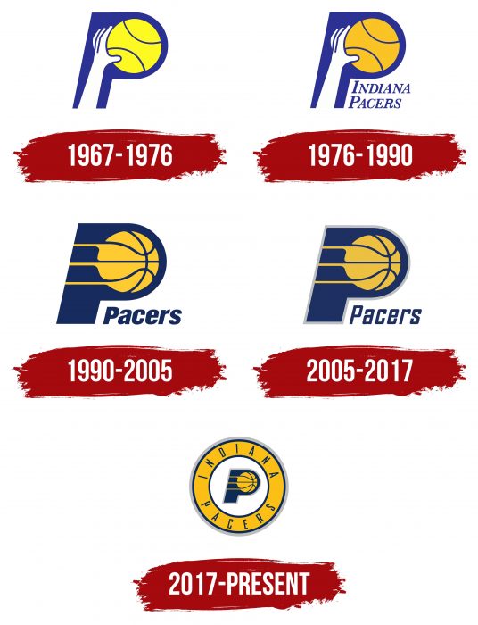
While some clubs completely change their style, others maintain previous colors, fonts, and shapes but come up with other variations. After the team’s appearance in 1967, it immediately received a personal logo consisting of two main elements: a hand and a ball. Over the more than 50 years of the club’s career, this emblem never changed drastically: it always had an original shape and reflected the main basketball attributes. Over the long period of Indiana Pacers’ existence, it has had five logos.
What is Indiana Pacers?
Indiana Pacers is a professional basketball team from the USA that competes in the National Basketball Association. It represents the Central Division and is a member of the Eastern Conference. The team was founded in 1967 and was part of the American Basketball Association. Its transition to the NBA occurred in 1976 after the merger of the old and new basketball organizations.
1967 – 1976
The debut version featured an extended hand throwing a basketball. Together, they formed the capital letter “P” – the first letter of “Pacers.” It was slightly tilted to the right – the main colors of the logo were white, lemon-yellow, and dark blue.
1976 – 1990
After the redesign, the emblem featured the inscription “INDIANA PACERS.” It consists of two lines and is located to the right, under the letter “P.” Artists also worked on the palette, changing it to a more muted side: lemon became simply yellow, and cobalt turned into neutral blue.
1990 – 2005
The previous logo was used for about another 15 years. In 1991, there were radical changes: instead of a hand, the emblem now featured extended stripes going from the left of the ball. The leg of the letter in this version is much shorter than before, the light blue color has almost turned navy black, and only the word “PACERS” remains under the “P.”
2005 – 2017
The updates during this period are minimal. Developers redistributed the colors and main elements. As a result, the modern version has the original letter with a laid-out ball and several rings surrounding it. In the center is a white background, followed by a wide yellow stripe with blue edges. Above it is written “INDIANA,” and below it is “PACERS.” A gray line unites everything.
2017 – today
The latest logo of the Indiana Pacers was introduced in 2017. It combines the blue capital letter “P” and the yellow basketball of its predecessor, placed inside a yellow circle, edged with the dark blue inscription “Indiana Pacers.” The circle has a dark blue and silver outline.
Indiana Pacers: Interesting Facts
- Early Wins: They were good in the ABA and won championships in 1970, 1972, and 1973.
- NBA Time: They joined the NBA in 1976 after the ABA and NBA merged.
- Reggie Miller: He was amazing at basketball, especially in tough moments, and played for the Pacers his whole career.
- Coach Larry Bird: Larry Bird, a famous basketball player, coached the Pacers to the NBA Finals in 2000.
- Home Games: They play at Bankers Life Fieldhouse, known for looking and feeling like old-time basketball.
- Name Meaning: The team’s name comes from Indiana’s love for basketball and the pacer horse, showing quickness and endurance.
- Big Fight: In 2004, a huge fight during a game against the Detroit Pistons got many players in trouble.
- Great Defense: The Pacers are known for their good defense, thanks to players like Reggie Miller and the Davis brothers.
- Paul George: He became the Pacers’ main guy in the 2010s and twice took them to the Eastern Conference Finals.
- Slick Leonard: He coached the Pacers to their ABA wins and loved to say “Boom, Baby!” whenever the team scored a three-pointer.
- Rivalries: They’ve had big rivalries, especially with the New York Knicks and Miami Heat, which have led to some unforgettable games.
- Helping Out: The Pacers, through the Pacers Foundation, work with kids and the community to make a positive impact.
The Pacers are not just a basketball team; they’re a big part of Indiana’s basketball love story, doing great things in games and their community.
Font and Colors
The current version follows the traditions of the Indiana Pacers club. It precisely replicates the design of the main element – the capital letter “P” with a ball instead of the inner gap. The only difference is the shape of the rondel, which appeared thanks to the combination of wide and narrow edging strips.
The modern logo uses a font reminiscent of Agency FB Bold Italic. Its authors are David Berlow and Morris Fuller Benton. The name is written in a simple, grotesque font with elongated characters. In 1977, a version with serifs was approved; in 1991 – with round characters; in 2006 – with chopped rectangular letters.
The official palette consists of three colors: gray PMS Cool Gray 5, golden PMS 123, and dark blue Pantone Color Matching System 282. White is also used, which is not mentioned in the club’s official documents.
Indiana Pacers color codes
| Navy Blue | Hex color: | #002d62 |
|---|---|---|
| RGB: | 0 45 98 | |
| CMYK: | 100 68 0 54 | |
| Pantone: | PMS 282 C |
| Gold | Hex color: | #fdbb30 |
|---|---|---|
| RGB: | 253 187 48 | |
| CMYK: | 0 29 91 0 | |
| Pantone: | PMS 123 C |
| Cool Gray | Hex color: | #bec0c2 |
|---|---|---|
| RGB: | 190 192 194 | |
| CMYK: | 0 0 0 29 | |
| Pantone: | PMS Cool Gray 5 C |
FAQ
What does the “Indiana Pacers” logo represent?
The “Indiana Pacers” have a simple logo. It features the letter P, consisting of a wide dark blue leg and a golden basketball with three white lines. It is located in the center of a white circle. It is bordered by a golden ring with the name of the basketball team, executed in a thin grotesque. This emblem has been used by the club since 2017.
When did the “Pacers” change their logo?
The emblem of the “Indiana Pacers” last changed in 2017. At that time, a wide golden ring with the name of the basketball team was added to the previous version (the capital letter “P” in the form of a ball). But the most radical changes occurred earlier – in 1990 when designers removed the extended hand from the emblem and replaced it with three horizontal stripes.


