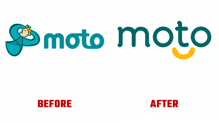
Branding agency BrandOpus announced the creation of a new brand identity for the British network of Moto gas stations.
The new design concept was based on the idea that gas stations are a place where people rush in the hope of quickly servicing the car and flying away on their business. The constant rush, time pressure, queues, service problems. But the most important factor in a successful service is the provision of services so that it brings a smile, pleases, and gives positive emotions.
We can say that this is the basis of business in any area where relationships between people are important. But it was the Moto brand that decided to put a special emphasis on this.
The creative group created a visual series, creatives, a logo, and in general, a small but bright world of kindness and pleasant communication. The mini-universe of the brand has its irrepressible energy, warmth, attention to detail.
Take at least the logo. Where can you find a soft arc of a smile, two circles? A toy store, a medical facility, or an educational institution for children? Entertainment center or playgrounds?
All this is true, but now Moto gas stations are also joining this list of places.
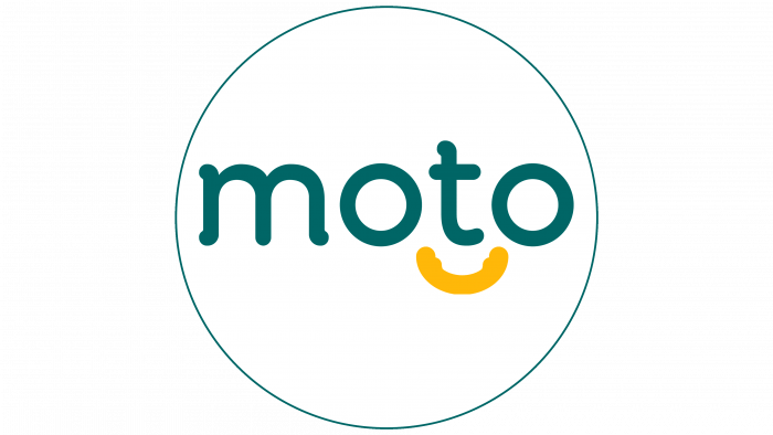
The whole essence of the logo is painfully simple: the chosen flowing font turns into a smiling face, where the two “o’s” are the eyes, and under the “t,” which means the nose, there is an orange-yellow smile. All other letters are in dark green. What about this kind of visual creativity? Only pleasant impressions cause a smile and a complete lack of association with the transport sector.
At a stretch, of course, you might think that the letters “o” resemble wheels, but this image is misleading because they primarily indicate facial features.
What is easy based on a creative concept does not cause any embarrassment. Suppose they want to build a business on good and strong communication with the target audience. In that case, this is exactly how the brand should be presented – simply, unobtrusively, accurately, and without frills.
The brand can be praised for its identity being so cute and close to the people. But the only drawback is still – it’s a playful tone. Analyzing the elements from the outside, the brand lacks seriousness and direct indication of the business profile.
Following the modern traditions of simplicity and conciseness, minimalism and simplification, and based on the main font logo, the brand has created a line of visual images that show the benefits of service at these gas stations.
For example, there is an icon for a dog with a bright yellow collar, which modifies the smile from the logo. This icon means that you can walk the dog around the territory. There is also an indicator of the refueling point of electric cars, and part of the cord is depicted in the form of a smile. There are also pictures of picnic areas, parking for people with disabilities, a place for children to entertain. And the leitmotif of all these icons is the smile sign, which has become the brand’s graphic symbol.
Moto’s approach stands out among competing brands for its kindness and customer care so that the audience will perceive it positively.


