


![]()
The newly unveiled logo for Invader, crafted by Brethren Design Co, showcases a bold transformation in the brand’s visual identity. Its striking design captures attention through distinctive typography and sharp graphic elements, embodying Invader’s adventurous and dynamic character.
The typography features a custom typeface, heavily modified from Brethren’s Xtra Funk font. The letters are thick and bold, with rounded corners that lend an approachable feel while maintaining a strong, commanding presence. A noticeable forward slant gives the wordmark a sense of motion, hinting at speed and progression—qualities fitting for a brand associated with dynamic sports activities. The tight kerning ensures the letters form a cohesive, compact unit, enhancing readability and impact.

A standout feature is the bold lightning bolt graphic beneath the wordmark. This angular line not only underlines the “Invader” name but also injects energy and movement into the design. The sharp, jagged edges of the lightning bolt contrast with the smooth curves of the typography, creating a dynamic interplay that adds visual interest. This graphic element also acts as an anchor, grounding the logo while emphasizing themes of power and momentum.
The color scheme is intentionally monochromatic, with a solid black set against a white background. This high contrast enhances visibility and ensures the logo remains impactful across various applications, from digital screens to merchandise. The absence of additional colors keeps the focus squarely on the design’s structural elements, allowing the bold typography and striking lightning bolt to take center stage.
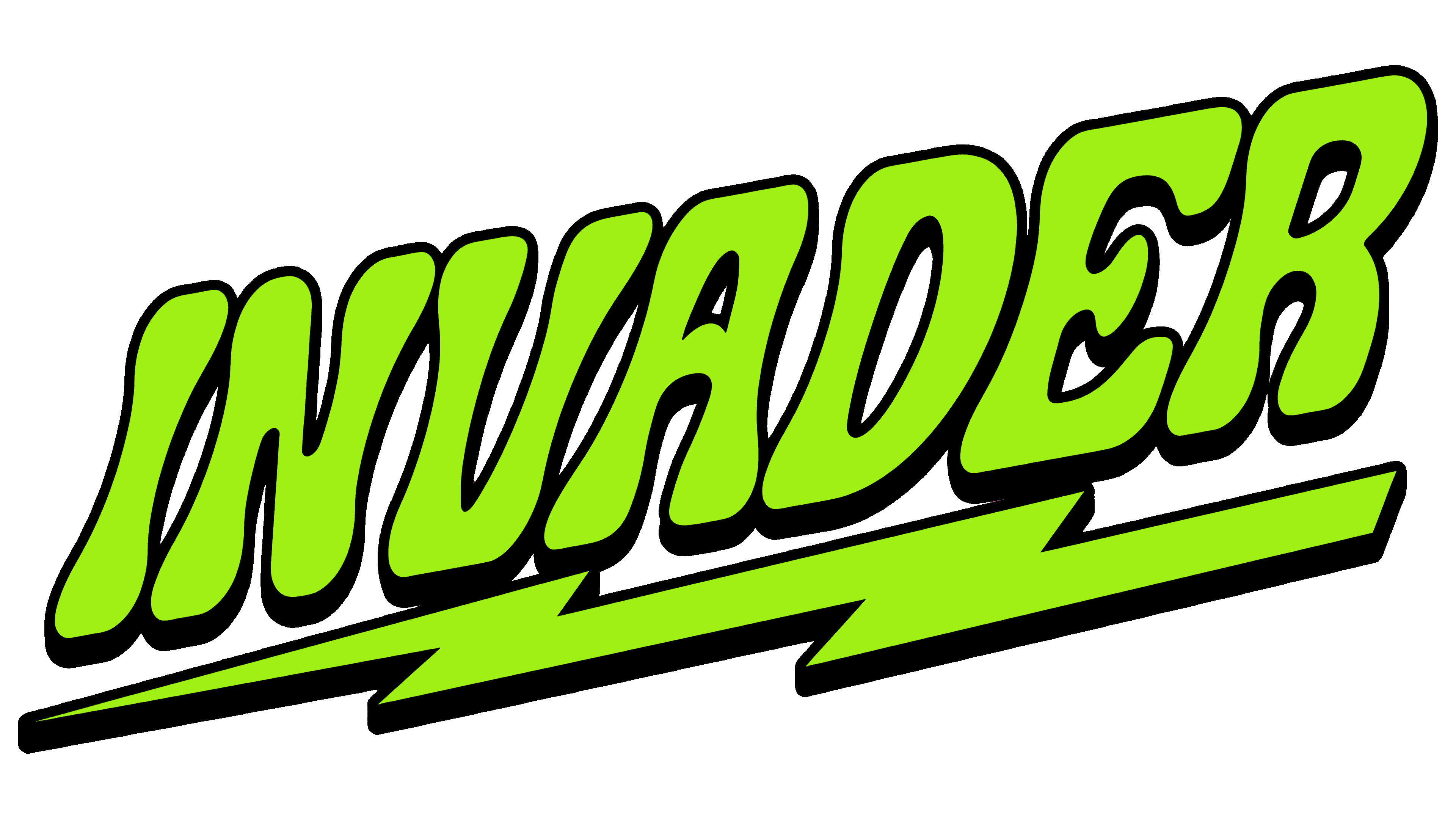
The overall composition balances expansiveness with compactness. The slanted typography stretches horizontally, suggesting forward motion, while the lightning bolt provides a stable, grounded base. This combination creates a harmonious balance, reflecting Invader’s brand identity—bold and innovative yet grounded in quality and performance.
Graphically, the logo employs thick, consistent line weights, contributing to a robust, sturdy appearance. The uniformity in line thickness across the typography and the lightning bolt ensures a cohesive aesthetic, reinforcing brand recognition. The interplay between the curved letters and the angular lightning bolt introduces a rhythmic visual flow, making the logo memorable and distinctive.
The Invader logo by Brethren Design Co is a thoughtfully designed emblem that encapsulates the brand’s essence through bold typography, impactful graphic elements, and a clean, high-contrast color palette. Its dynamic design and strategic composition establish it as a distinctive identity in the competitive world of sports branding.