INZMO, a growing insurtech startup in Europe, has introduced a new brand identity designed by Tabasco Agency. Known for its innovative zero-deposit solutions for EU renters, INZMO aims to transform the insurance market.
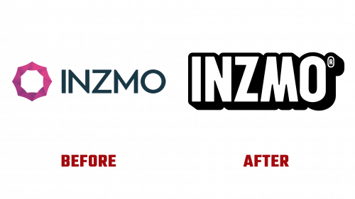
The old design had sharp points and a black-hole-portal-like icon, creating an ominous feel. The wordmark looked professional but lacked approachability.
The new logo features a friendlier wordmark with a drop shadow for depth. The quirky “M” and rounded semi-ink traps add a playful touch. The integrated “®” symbol matches the “O,” enhancing the logo’s cohesion. When animated, this element enriches the visual appeal.
The custom chunky condensed sans-serif typeface has a bold, modern look trending in 2024. It aligns with INZMO’s goal of projecting a contemporary image.
The color palette includes attention-grabbing hues that pair well with black, creating striking contrasts. This unconventional palette reflects INZMO’s innovative spirit.
Graphically, the identity uses abstract shapes representing household objects and possessions. These dynamic shapes work well in collages with silhouetted photography, highlighting various types of insurance INZMO offers. This strategy appeals to a younger, tech-savvy audience.
INZMO’s new identity positions it as a friendly, approachable alternative to corporate insurers. The modern typography, bold colors, and dynamic graphics create an attractive brand image. This new look supports INZMO’s mission to innovate and meet customer needs.
The rebranding aligns with INZMO’s growth and market recognition. With over 70,000 customers and a 400% growth rate in 2022, the company has earned investments from several European insurers. The European Commission recognized INZMO as the best fintech company in the 2017 StartUp Europe Awards and awarded it Insurance Shaper of the Year in 2019.


