The Innovation Park Artificial Intelligence (IPAI) was established in 2022 in Heilbronn, Baden-Württemberg. It aims to be a leading global hub for AI, supported by the state of Baden-Württemberg. IPAI focuses on the entire AI value chain, from training and research to the development and commercialization of ethical AI. It brings together companies, start-ups, research institutions, and public sector stakeholders. Key areas include production, logistics, trade, distribution, public services, and life sciences. The first phase of IPAI opened in September 2022, with the second phase planned for early 2024. An international AI campus is planned for Heilbronn.
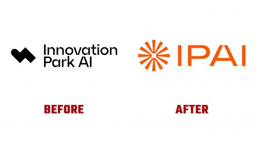
The new logo and identity for IPAI, designed by LIT, encapsulate the organization’s ambitious vision. The previous logo was unremarkable. The updated logo features a refined design that conveys IPAI’s essence.
The new logo’s central icon features four shapes converging at the center, symbolizing IPAI as a hub for AI innovation. This design draws together diverse elements of AI to a central point, reflecting IPAI’s mission. The icon combines abstract representations of the letters “A” and “I.”
The wordmark uses a custom typeface. The “A” in the wordmark features a curvy notch at the top, echoing the shapes in the icon. The wordmark maintains a clean and modern appearance.
The new identity includes circular icons representing various AI and corporate park themes. While abstract, these icons are engaging and effective when used together as a pattern. They provide a dynamic element to the visual identity, conveying complex AI and innovation themes.
The color palette is vibrant and warm, contributing to a humanist approach to AI. This selection of colors creates a friendly and approachable image. The typography used is GT America, an extended sans-serif typeface that adds a modern look to the design.
The visual identity extends to digital and physical formats. The primary icon, circular icons, and color palette work together to create a cohesive brand image. These elements ensure that IPAI’s identity is recognizable across different mediums.
The new identity does have some limitations. The design appears more suited to a software or digital platform, lacking cues that suggest human involvement or a tangible environment. This aspect may need to be addressed to ensure the identity fully represents IPAI’s physical and interactive nature.
IPAI’s new logo and identity reflect the organization’s vision and commitment to AI innovation. The refined design elements, including the central icon, custom typography, and vibrant color palette, create a professional and engaging visual identity. This rebranding positions IPAI as a leading hub for AI, ready to attract and unite various stakeholders in artificial intelligence.


