Cycling for Ireland is a whole business, with unforgettable emotions and impressions, and for some, it is even a way to spend life bright, healthy, and cool.
The Cycling Ireland brand (which sounds like Rothaíocht Éireann in Irish) is the working name of the island’s national cycling authority. It is technically a charitable company with limited liability for the Irish Cycling Federation. The organization works closely with the European Cyclists’ Union, being a member of various major sports organizations.
In terms of line-up, Cycling Ireland has four divisions: Cycling Connacht, Cycling Leinster, Cycling Munster, and Cycling Ulster. And he organizes road races, tracks races, off-road races or MTB, time trial, BMX, cyclocross, participates in the promotion of cycling entertainment events.
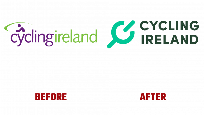
We recently changed the logo and created a new icon to follow modern design traditions in sports.
Initially, the logo was attractive on its own. The inscription was divided according to contrasting colors – purple and light green. The playful shape of the little man above the U gave the impression of a cyclist riding to the left. The letters C are quite rightly perceived as wheels. The word Ireland looks set apart with a blooming shade of green, gently hinting at the landscape of Ireland.
The logo looks interesting and logical. An unnecessary detail may have become a rounded curl near the figure of a man on a bicycle.
Today, the green tint in the type design has been enhanced, making it a dark swampy hue. The icon itself bears little resemblance to a wheel. Rather, it is a detail from a mechanism. However, the idea was to combine capital letters in the organization’s name and play it creatively.
There is a feeling that the logo looks incomplete, ambiguous, and incomprehensible. The font is nice, even, but the color is too dark. And the icon looks even somewhat ridiculous.
There is a chance that a rebranding will occur soon, and the logo will be changed again.


