Glide, a web, and app development company, has unveiled a revamped styling that looks more expressive and adds confidence to the brand in the marketplace.
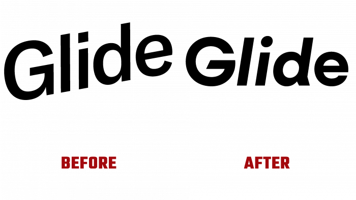
The main feature of the old logo was that the company had a type logo figuratively corresponding to the naming. This is an upward-going word that was both ascending and descending simultaneously; therefore, it showed very well the concept of the name – sliding.
But such an obvious association and a simple black font is not the best choice for taking a brand to the next level.
Therefore, the company took a course towards creativity and, in consultation with the In-house agency, made a more interesting design.
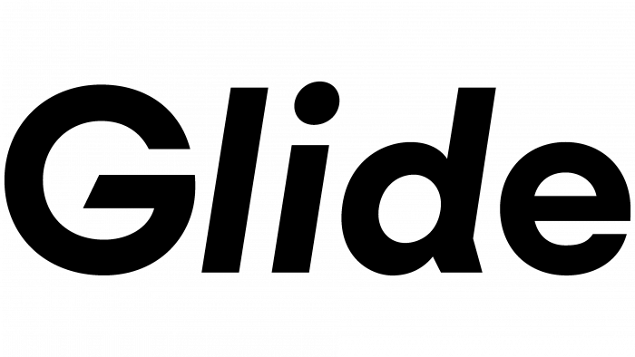
It is noteworthy that the logo remained in the black. Still, beveled details, such as the dash in the letter G, the tail at the bottom of the D, leave no doubt that the company is engaged in innovative technologies, offering bright solutions to its users.
In the corporate style, they decided to stick to delicate shades of blue, pink, lilac, and sand colors. In general, the new style is permeated with light notes of expression, indicating dynamics and uplift, stable movement.
The cool and unusual moment in creating the corporate identity was that an artificial intelligence photo generator was used to develop the appearance, making it possible to create pictures of people who do not exist.
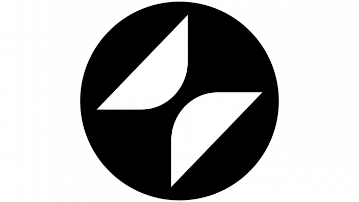
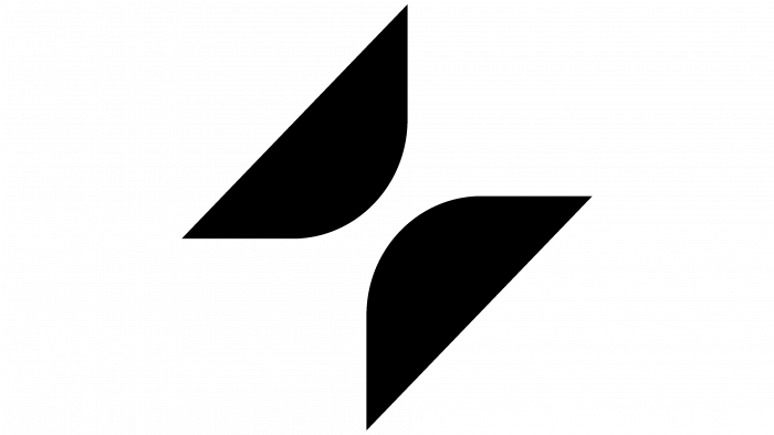
The company’s symbol is two interesting parallel figures that resemble parts of an hourglass. It looks like rounded triangles facing each other. And at the same time, at the angle at which they are located, they resemble the wings of a butterfly.
Positive forms, beautiful color options, a new font with accents look organic and do not burden the visual perception.
The great merit of the developers of the new design is that they followed the path not “to” but “from.” This means that they were not driven by the idea of what they wanted to show but determined what should not be in the new design.
This is the underlining of the capital letter of the title, often used uniform tones (black, blue, yellow, green), the use of photographs in motion.
Quite clearly, the new logo asserts itself as a self-sufficient, independent, solid visual identity. Even the symbol and favicon are not needed if such a temperamental font is indicated on the media. However, figuratively speaking, the icon of an hourglass speaks of creativity, the rise of energy, the desire for improvement, and prospects.
It is also the ease with which you can work with Glide products without fear of something going wrong in a technical sense. Positive changes in the external appearance, interesting design of the brand concept, selected graphic solutions only increase the interest in the company. This means that soon there will be many admiring users and new customers willing to share the brand’s values.


