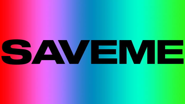
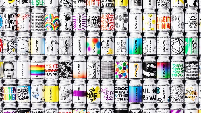
In 2021, the new SAVEME brand quickly burst into the market, offering mineral water sourced from the Austrian Alps and delivered straight to Belgium. This brand considers itself to be an adherent of an ecological approach. Based on the concept of “Save Mother Earth,” the founders gave the name of their company in capital letters. It is not for nothing that special cans, packed in 24 pieces, represent a kind of protest against the sabotage of the planet and give a message that people should take good care of nature and its resources.
The identity was handled by the creative agents of SKINN, whose office is located in Bruges. The designers took the connectedness as the basis of the concept, the community of people for a good purpose; one might even think, the modern tribal community. Therefore, the font logo is completely laconic but very clear and aligned, executed in black, produces such a wow effect. The very message that people do not ignore the problems of the Earth is the credo of the brand. Not so much with trivial products (it’s just water!), But with a noble idea to attract buyers.
Indeed, you will not surprise anyone with water from clean regions or special product composition in our time. Non-standard ideas, creativity, and uniqueness of a product or service are now paying off.
Noteworthy is the linguistic fact that the very phrase “Save me,” being a call for the salvation of nature, is duplicated in several languages and will be understandable both to English-speaking representatives of the target audience and in Germany, as well as Danes and French.
The designers also declare the following idea: our banks are our posters, our canvases. With the minimal design and font OGJ Type Design’s Sequel 100 Black, they wanted to emphasize by no means the emptiness of the future, the uncertainty for the planet… This is the purity of thinking, freedom from stereotypes, a willingness to create, not destroy. It is proposed to create something new for the sake of nature and the environment.
No matter how simple and modest we would like to present the brand, the logo still came out bright and attracted attention, contributing to the brand’s promotion in the global market.


