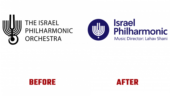
Eighty-five years is a significant age not only for humans. This is how many years the Israel Philharmonic Orchestra (IPO) has existed, founded in 1936 even before creating the Israeli state itself. At the time of its formation, it was called the Palestine Philharmonic Orchestra. Today it is the main symphony orchestra of Israel with its “headquarters” in the capital, where it constantly performs in the largest metropolitan hall – Heichal HaTarbut. Two years ago, in 2019, the brilliant and legendary orchestra conductor Zubin Mehta handed over the reins to Lahav Shani, prompting the need to revisit some of the IPO advertising elements and reflect the new spirit brought by the new leader. At the same time, it became necessary to adapt the well-known brand mark of the orchestra to the requirements of the present.
The main element of the IPO emblem is the important Judaic symbol – Hanukkiah. It was he who was and remained an accent figure of both the old and the new composition. Binding to the profile is ensured using a tuning fork on the image, harmoniously inscribed in the symbol. Striving for some simplification and greater convenience of visual perception, which requires modernity, the image of the note, which overloaded the picture, was removed from the logo. The symbol itself was reduced to 7 branches, which improved its visual perception. Chanukkiah was enclosed in a circle, which symbolized the eternal movement forward with the obligatory appeal to their roots.
The text has been slightly modified. Now to the symbol’s right is the abbreviated name – Israel Philharmonic, the words of which are right-aligned and located one under the other. Examining the archives of the IPO found a lot of interest in the design of old advertising posters and posters, which helped to make a direct connection between the future and the past thanks to the use of some old fonts and the order of the words of the name. For posters and posters of any kind – electronic or printed, the traditional hierarchy of text arrangement was applied – conductor, orchestra, date, start time, program. The Mandatory font was chosen, which looked impressive in both Hebrew and English.
Under this text, in a smaller print, there is an indication of the new music director – Music Director: Lahav Shani – in one line, which is especially necessary today to inform listeners about the opportunity to get acquainted with a new way of presenting masterpieces even 300 years ago, which can make you feel the whole their beauty even of Gen Z or baby boomers.


