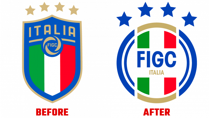
The age of change brings with it many changes in many directions. This also affected the FIGC – “Italian Football Federation,” which at the end of September 2021 presented its new visual image to the audience. Lapo Elkann, the founder of the creative agency Independent Ideas, was invited to be in charge of the current development. Always starting with a creative approach to any task undertaken, the agency finds the only right paths. The new logo, created by the agency, managed to combine traditions and innovations, which are important in the development of the country’s sports industry and its residents themselves. For every Italian, football is not just a hobby. It is practically the meaning of life.
Every detail of the new logo has been worked out, taking into account the features of the international level. Everything in it symbolizes national and historical sporting values, love for football, and pride in its achievements, which the Italian football teams have achieved. The logo itself is created in the shape of a soccer ball, reminiscent of the retroversion. At the same time, bright green, white and red central stripes are made in it in the form of central vertical seams – they are symbols of the colors of the national state flag. The accent element of the whole composition is the abbreviation of the name of the Federation – FIGC. It is executed in large letters of a blue lowercase font, under which the name of the country is placed in small gold letters.
Also highlighted in gold are the upper and lower half-arcs framing the flag’s stripes, which symbolize the winning level at the World Championships. The text is in the center of the logo, in the foreground. It overlaps the colored stripes, making it stand out in contrast. This makes the text memorable and easy to read. The most intrinsic part of the entire emblem is the four white stars that crown the logo. They symbolize the four unforgettable victories of Italian football teams at 1934, 1938, 1982, and 2006 World Cups.


