Known for its quality cuisine, Tiago Home Kitchen (THK) announced a change to its logo. Admirers of its various dishes prepared according to the Italian recipe, real gourmets, and those satisfied with the taste of the brand’s restaurant chain offerings will appreciate the new brand name today.
The THK retail chain also covers China, where several restaurants of the Italian brand are presented in Beijing. Changing the corporate identity provides for the simultaneous rebranding of not only the logo. Everything that forms the brand’s style and maintains the required spirit and atmosphere will be replaced. This includes changing packages, packaging, takeout bags, fashion products, menus, employee uniforms, branded souvenirs, and various applications. The lack of its interactive platform is made up for by close collaboration with Tripadvisor or Weibo, which will also carry out the required operations to change the look and style of the company.
Fundamental changes were justified primarily because the previous image did not correspond to the atmosphere and the required perception formed by the consumer. It is enough to visit any of the Tiago restaurants to immediately plunge into the atmosphere of home comfort, which will be especially appropriate against the background of the refined elegance of the entire corporate identity and the staff. An abundance of exquisite dishes distinguished by high taste and a real culinary masterpiece from experienced and unsurpassed restaurant chefs, who treat their work as art, complement the visual experience of visiting Tiago Home Kitchen. Together, this approach creates completeness for deciding whether to add this restaurant to your list of the most attractive places to visit.
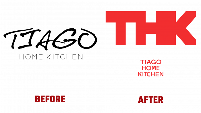
The past brand name did not correspond to such an atmosphere and form of presenting oneself and one’s product. Filled with aggressiveness, lack of warmth, and homeliness, with “prickly” and blurry type, executed with deliberate negligence in capital letters in black on a white background, it did not evoke appropriate associations.
In addition to the correctly selected color scheme, the new development is bright red on white, which certainly arouses appetite, and the desire has correctly placed accents. The central figure was the abbreviation of the restaurant chain, executed in bold print in a smooth flow of each subsequent letter from the previous one. Under this symbol, the company’s full name is executed in a smaller font in the same red design, where each word is placed symmetrically under each other. Such a logo does not cause rejection. It’s soft and attractive, easy to read and understand. It is also interesting to note the remarks of visitors and customers of THK products, noting that the new logo presentation contributes to a completely original perception. I receive an order in a package; everyone wants to protect their hands from the heat, the visual sensation created with the help of the logo placed on it.


