In the heart of the vibrant city of Nottingham, the It’s in Nottingham organization is emerging with renewed vigor, embodying the pulsating rhythm and vitality of the city. With the essence of Nottingham woven into its narrative, the organization recognized the need to more closely align its brand identity with the unique spirit of the city.
The catalyst for the transformation was clear: the previous branding, while professional, lacked the rhythm that truly reflected the vibrant life and community spirit of Nottingham. Introducing a ground-breaking phase of rebranding that aims to present the city in a light that resonates deeply with its residents and visitors.
At the heart of the refreshed brand is the theme of ‘Prosperity.’ More than just a word, it captures the essence of Nottingham’s ongoing development, creativity, and commitment to prosperity. This underlying concept now defines the meaning of the brand, evoking a sense of pride and ownership.
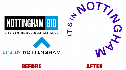
Central to this rebrand is the It’s in Nottingham logo. Designed to reflect the unique aura of the city, it serves as a seal of authenticity and a promise of an authentic Nottingham experience. Elements of the city’s rich history and modernity are intertwined in the design, evident in the contrasting fonts and color palette evocative of Nottingham’s iconic landmarks. The modern design blends with classic elegance, ensuring adaptability to different platforms and audiences.
Evaluating the journey of the brand’s identity allows us to trace its evolution. Although the previous BID logo was purposefully created, was it able to embody the overarching vision of the organization? On the other hand, the previous incarnation of the “It’s in Nottingham” symbol seemed lost among the vast number of city logos. The new logo, which is circular in shape, makes optimal use of space and elegantly conveys meaning. Its simplicity, refreshingly, opens up possibilities for future creative diversifications.
Typography becomes the brand’s trump card, adding depth and vibrancy to its visual presentation. The skillful combination of serif (Nantes) and sans serif (Helvetica) typefaces presents a dual narrative of tradition and modernity. This interplay is particularly evident and engaging in dynamic presentations that give the brand an energetic feel. Combined with illustrative vectors and authentic photographs of the city, the brand’s digital narrative, especially on platforms such as Instagram, creates a compelling story of Nottingham’s charm.
In conclusion, the refreshed ‘It’s in Nottingham’ brand emphasizes the dynamism and diversity of Nottingham. At the intersection of community sentiment and business confidence, the brand becomes an identity and tribute to the city’s heritage and future dreams.


