In early August, New Zealand agricultural producer T&G Global announced a change to the logo on its apple products. The decision to refresh only a narrow area among a wide variety of assortments was made as a need to highlight exactly our variety of apples, patented 25 years ago, belonging to the premium class among a large number of proposals.
The constant filling of store shelves with an ever-increasing list of apple varieties required adjustments to recognize their product. The outdated brand mark stuck on every apple from T&G Global began to get lost in this crowd of proposals. Time and peculiarities of the modern situation demanded changes in the visualization of the trademark, its presentation to the buyer, providing the product with attractiveness and catchiness.
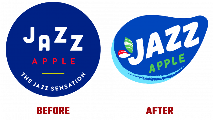
The old emblem did not stand out in anything special. The rather modest color background, on which the name of the variety was executed in white zigzag letters, with the trademark in the upper corners of the last letter and the executed word “APPLE” in a smaller red font did not allow the buyer to grasp and understand the essence of the image quickly. The word “apple” was lost against this background, and “Jazz” did not provide the required semantic load. Until the trade competition became so high, the sign satisfied the owner. But modern conditions, when the speed and cost of personal time have increased, when the buyer does not have the opportunity to spend a long time choosing the right product in a huge range of similar offers, it became necessary to create a new option for attracting attention, which would “shout” about itself, “call” the buyer to choose it.
The new trademark allowed for much-needed promotion. The very first impression about him – he became cheerful and “playful.” The use of bright colors in the image has become one of the most effective solutions that have changed the visual perception of the sign. The bright blue background provided the required contrast for the white letters of the trademark, executed with soft transitions around the corners using a hand-drawn font. Two droplets or leaves above the tail of the letter “J,” stylized in the colors of ripe apples with the use of bright red and green, add attractiveness and cheerfulness to the picture. The product’s name – “APPLE,” as in the previous version, is located under the white letters. But it is done in a larger font in bright green, especially attractive design.


