JCET Group is a major supplier in the integrated systems and technology industry that offers turnkey services, including design, semiconductor package definition, research engineering, and supply of technical base elements worldwide.
Home appliances, communications, computing, automotive, industrial – the spectrum of semiconductor applications covers significant areas of application. Therefore, the brand is considered a supply leader and makes every effort to provide quality materials to customers.
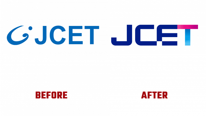
In mid-December, the company announced the launch of a new logo. The new look will allow the brand to develop at a higher level, increasing the interest of the audience and partners.
It is not so much the aesthetic aspect that is touched upon in the new identity, but rather the philosophical basis. A number of details in the design reflect the company’s prospects and far-reaching plans.
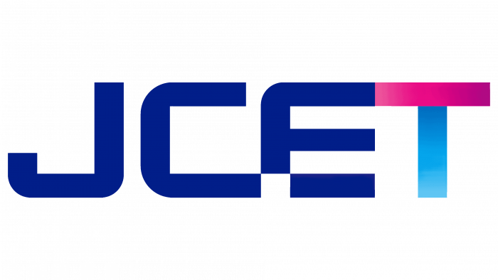
Speaking of the new logo, it is worth noting that it is the font version, which at first seems monotonous, but with a closer look, it becomes clear how unusual and diverse it is.
Each letter in the name has its own twist. For the most part, the logo has a dark blue hue.
The letter J in the gap has a rectangular shape, and the shape of the letter itself looks like a minimalist hook. The letter C is connected to the E, but the E part at the junction has a missed square element. This is a reference to the microchip, a commitment to technologization and manufacturing. It seems like the letters should complement each other, but they are not fully connected.
The letter T has a gradient in the vertical and horizontal bar, with a pinkish hue at the top and a blue hue at the bottom.
The color gradient of the letter “T” is an artistic reflection of the silicon wafer, which explains the company’s trend toward semiconductors. The gradient demonstrates that JCET can drive industry development, change, transform itself depending on current challenges, and use its resources to expand its reach.
Overall, the logo looks compositionally correct, the shapes are correct and at the same time individual. This visual solution helps to solve several brand tasks: to increase recognition, to become more modern and technological, to visualize the company’s line of business and to show loyalty to the target audience through color selection.


