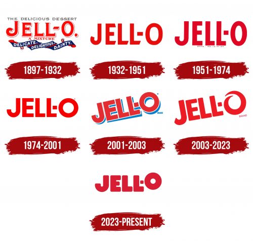
The Jell-O logo reflects the brand’s storied history as America’s favorite gelatin dessert since its introduction in 1897. Known for its ease of preparation and vibrant versatility, Jell-O is enjoyed in various flavors and forms by people of all ages. The logo captures the spirit of fun and creativity that Jell-O brings to American kitchens, making it a staple at family gatherings and parties and as an everyday snack. It symbolizes the brand’s commitment to delivering a delightful, colorful product that inspires culinary creativity.
Jell-O: Brand overview
Jell-O’s story doesn’t start with a tasty dessert but with an invention in 1845. That year, American inventor Peter Cooper got a patent for making gelatin from animal parts, a clever idea that people initially didn’t go for. Everything changed in 1897 when Pearl Wait from Le Roy, New York, mixed gelatin with sugar, flavors, and colors, creating something special she named Jell-O. Despite a promising idea, Pearl and her husband had a tough time making it a success.
Then, in 1899, they sold the Jell-O brand to Orator Woodward, a local food producer, for only $450. Woodward transformed Jell-O into a household name nationwide by producing it in large quantities and using smart marketing. He sent out millions of free Jell-O recipes, ran ads in well-known magazines, and even got celebrities like Ethel Barrymore and Mary Pickford to endorse it. With catchy slogans and effective advertising, Jell-O sales rocketed from $250,000 in 1902 to $1 million by 1906.
Jell-O became even more popular after World War II, becoming a staple of American desserts. The brand introduced “jelly salads” and marketed Jell-O as a light, diet-friendly treat. However, as the 20th century ended, people started to prefer healthier options, moving away from sugary and artificially made products.
Adapting to these changes, Jell-O introduced a sugar-free line and removed controversial ingredients to stay relevant. In 1997, the brand became part of Kraft Foods (now called Kraft Heinz), opening a new chapter in its history.
Today, Jell-O continues to innovate with new products like Jell-O Play slime, Simply Good Jell-O with real fruit pieces, Jell-O Pro for athletes, and no-bake cakes. Classic Jell-O desserts are still loved worldwide, reminding people of American traditions and family gatherings.
Meaning and History
What is Jell-O?
Jell-O, a celebrated Kraft Heinz brand, is a staple of American cuisine. It is renowned for its gelatin desserts, which include jellies, puddings, and mousses in various flavors and colors. These desserts are easy to prepare—just add hot water or milk to the powder mix to create a delightful treat. Known for its delicious taste and versatile texture, Jell-O is popular among children and adults. It is a common ingredient in many recipes and a festive addition to any meal or celebration.
1897 – 1932
From 1897 to 1932, the first Jell-O logo was created to inform potential customers about the product thoroughly. It showcased the dessert’s appealing look and sensory qualities, with the top part of the logo emphasizing its tastiness. Below, the text described Jell-O as a delicate and exquisite dessert, highlighting its high quality and unique taste.
The logo included a blue ribbon designed in waves, symbolizing the lightness of Jell-O and promising a delightful taste experience. This imagery was intended to encourage consumers to try and enjoy the unique texture and flavor of Jell-O.
An interesting feature of the logo is the brand name, created by the founder’s wife. It combined “jelly” (Jell) with an exclamation of delight (“O!”), capturing the product’s essence and the joyful reaction it could provoke.
The entire emblem conveyed the unique and delightful taste of Jell-O, aiming to attract consumers and spark interest in this innovative dessert. Despite initial marketing challenges, the brand was sold two years after its launch to a company that successfully promoted it to widespread popularity.
1932 – 1951
By 1932, as powdered jelly mixes became common in kitchens, Jell-O focused its emblem on the product name, reflecting its expanded product line. Beyond sweet desserts, the brand introduced flavors like lime for salad dressings and mixes for vegetables like cabbage, widening its uses. This required a revised marketing strategy and logo to represent its variety.
The new emblem emphasized the taste and versatility of the products, catering to diverse culinary preferences. A unique television advertising campaign creatively showcased these benefits. In the ad, each letter of the brand name rose in tune, symbolizing increasing enjoyment of the flavors. This effectively conveyed the emotional joy of eating Jell-O and reinforced its image of quality.
The logo featured large, red letters chosen for their associations with strength, passion, and energy, highlighting the boldness and richness of the flavors. This color choice also supported Jell-O’s image as a provider of premium and memorable taste experiences, enhancing its popularity among consumers.
1951 – 1974
The brand made thoughtful adjustments during its latest logo redesign to improve its visual appeal. A significant update was the choice of a more expressive and robust font, enhancing the brand name’s refinement and confidence. This font was selected for its readability and to emphasize the brand’s unique identity.
The color palette of the logo was also updated. The brand chose a darker shade of red to add depth and solidity to the logo. This dark red is associated with strength, determination, and ambition, matching the brand’s market positioning well. This color highlights the company’s serious commitment to expanding its presence and affirming its leadership in the industry.
1974 – 2001
In 1974, the brand introduced a revamped logo that was brighter and more appealing than its predecessors. This change highlighted an expanded product line with new fruit and berry flavors. The logo featured rounded letter shapes chosen to represent the ripe, round fruits used in their products. This design aimed to remind consumers of the ingredients’ naturalness and freshness, emphasizing the products’ high quality.
2001 – 2003
In 2001, the brand unveiled a new logo concept, significantly evolving and refreshing its visual identity. Designed to resemble the brand name directly applied to a glass jar—its main product—this logo reinforced the connection to jelly.
The logo incorporated blue shadows to add depth and convey the jelly’s light, watery base, highlighting its refreshing taste. This approach conveyed both brand information and the sensory experience offered by the jelly.
White outlines on the letters emphasized freshness and delicacy, with white symbolizing purity and adding a visual light to the logo. A slight tilt in the logo represented the brand’s dynamic nature and commitment to continuous innovation. This tilt illustrated the company’s ongoing effort to maintain high-quality products while introducing new flavors and formats.
2003 – 2023
In 2003, the company unveiled a new emblem with a softer and lighter design to emphasize the product’s uniqueness and lightness. The redesign creatively transformed the last letter “O” into the shape of a glass jar, visually linking the logo to the jelly and reinforcing its association with the brand’s key product.
The emblem also featured swirls that resembled the motion of a spoon stirring the jelly, symbolizing the dessert’s preparation process. These swirls added a dynamic and transformative element to the design, highlighting the ease and convenience of preparing the jelly. Such detailed attention to the design made the product visually appealing and memorable.
The logo’s red color was chosen for its traditional associations with energy and passion, which, in this context, suggested the vivid flavor of the jelly. This bold red helps attract consumer attention and effectively communicates the product’s high quality and distinctive taste benefits.
2023 – today
BrandOpus designers set out to give the Jell-O brand a fresh look. Their goal was to change its image from just a hospital food to a symbol of fun and parties. They created a new logo that’s bright and fun, fitting perfectly with Jell-O’s goal to make people happy.
The logo has “Jell-O” written in bright red with thick white borders around the letters. This design isn’t just to make the letters pop and ensure you notice Jell-O on shelves and in ads.
They added light shadows to the letters, giving the logo an old-school feel. This touch connects Jell-O’s long history to its current look, showing that while it’s a classic, it’s still perfect for today.
The “O” in “Jell-O” is lifted a bit, which adds a playful vibe to the logo. This little detail makes the brand seem more about fun moments and celebrations. It’s as if the “O” is jumping for joy, inviting everyone to join in on the fun that Jell-O brings to parties and gatherings.
With this redesign, BrandOpus has turned the Jell-O logo into a sign of happiness and party vibes. The vivid colors, clear outlines, throwback shadows, and the jumping “O” all show that Jell-O is more than just a snack. It’s a call to enjoy the sweet moments in life.
Font and Colors
The Jell-O logo features a bold, sans-serif font with rounded edges, custom-designed for the brand, making it unique and not found in standard sets. Its size is proportional, ensuring visibility and recognition on packaging and advertising materials.
The style is bold and playful, suitable for a brand synonymous with fun desserts and family-friendly products. The roundedness of the letters, especially noticeable in “J” and “O,” enhances a sense of fun and informality.
This font’s readability is high: clear, unambiguous letter shapes are easily read from a distance or, when scaled down, important for products on grocery shelves.
The bright red logo is energetic and appetizing, matching the product’s vibrant, fun, and sweet nature. Red is used in food branding because it attracts attention and stimulates appetite. The simplicity of the color and the font’s boldness make the logo memorable and instantly recognizable.
The font and color choices of the Jell-O logo effectively convey the brand identity as a provider of enjoyable desserts for the whole family.
FAQ
Did Jell-O change their logo?
Jell-O recently updated its logo and packaging for the first time in over ten years. The goal is to honor its long history since 1845 while making the brand appeal to modern shoppers. This update is a strategic move to attract new customers and keep the existing ones engaged. By adopting a more contemporary look, Jell-O seeks to remain a top choice in the dessert market for families and enthusiasts. This change reflects Jell-O’s commitment to blending its rich heritage with a fresh, contemporary design, showcasing its ongoing dedication to innovation and relevance.
What is the new Jell-O packaging?
The updated Jell-O packaging catches the eye with its fresh and modern design. It features bold, matte letters for the brand name, highlighted with white shading to make them stand out. The ‘O’ in Jell-O tilts slightly, adding a playful touch.
The packaging highlights the no-sugar options, catering to those looking for healthier dessert choices. This detail is prominently displayed, attracting health-conscious consumers. Beautiful, impressionist images of the fruit flavors are available on the right side. These images are visually appealing and effectively communicate the variety of flavors offered. The flavors’ artistic presentation enhances the packaging’s modern look, making it more noticeable on store shelves.
Is Jell-O a brand?
JELL-O is a well-known American brand known for its range of dessert products. These include powdered gelatin in fruit flavors, pudding, and no-bake cream pie mixes. “jello” refers to any gelatin dessert, regardless of the brand.
The brand has been a staple in American homes for many years, often appearing at family gatherings, parties, and holiday celebrations, making it a part of American culture. Over the years, JELL-O has introduced new flavors and types of desserts to stay up-to-date with consumer preferences, including offering options that are sugar-free and low in calories.
Why is Jell-O called Jell-O?
Pearl Wait, who initially made cough syrup, purchased a patent for a gelatin product in 1895 that was invented by Peter Cooper. Eager to explore opportunities beyond cough syrup, Wait began experimenting with gelatin. His wife played a crucial role in transforming gelatin into a desirable product. She named it “Jell-O,” finding the name appealing and family-friendly.
The choice of name highlighted the product’s jelly-like nature and versatility in being molded into various shapes for decoration. Adding “O” at the end of the name made it memorable and fun. This naming strategy significantly contributed to Jell-O’s recognition as a go-to option for gelatin desserts across America.
Why is Jell-O no longer popular?
Jell-O’s popularity has decreased for several reasons, reflecting changes in people’s preferences and opinions. Many people associate Jell-O products with hospital food that is easy to swallow, making them a less desirable choice as a fun dessert. Jell-O’s image has been damaged due to its long association with Bill Cosby, who was found guilty of sexual assault. This connection makes it difficult for some to enjoy Jell-O. Furthermore, the once-popular Jell-O molds and flavors, like Italian salad and mixed vegetables, no longer attract those seeking fresh, healthy, and natural options. These factors have combined to challenge Jell-O’s place in American food culture.
What is Jell-O good for?
Jell-O is a delicious treat that benefits your health thanks to gelatin derived from animal bones and tissues. Gelatin is rich in proteins and brings several health advantages.
Gelatin helps relieve joint pain. It supports the repair and strengthening of joint cartilage, which is particularly beneficial for individuals with osteoarthritis or related conditions. Regular consumption of Jell-O can improve joint mobility and reduce pain, aiding in maintaining activity levels with age.
Additionally, gelatin enhances the strength and flexibility of the body’s tissues and tendons, reducing the risk of injuries. This is crucial for athletes or those engaged in regular physical activity. Gelatin is excellent for skin health. It maintains skin hydration and elasticity, contributing to a smoother and more youthful appearance by diminishing fine lines and wrinkles. While Jell-O is popular for its taste, its gelatin contributes to improved joint health, stronger bodily tissues, and better skin condition.


