


 Jenkins Logo PNG
Both Jenkins’s name and logo symbolize the application’s readiness to assist in complex situations and handle any task. The emblem emphasizes the importance of effective collaboration in software development, and its shapes and colors reflect the dynamism inherent in CI and CD processes.
Jenkins began in 2004-2005 inside Sun Microsystems, where Japanese software engineer Kohsuke Kawaguchi worked on build problems common to large development teams. Code changes often broke shared projects, and developers had to spend time manually finding errors. Kawaguchi created Hudson, a tool that automatically tested each change and warned teams when a build failed.
Hudson spread among colleagues and was released as open source in 2005. It made continuous integration easier to adopt by giving developers quick feedback without manual test runs. During the late 2000s, Hudson gained a wider user base through open code, a simple interface, and a growing plugin ecosystem. Its main competitor was CruiseControl from ThoughtWorks, one of the earlier continuous integration servers.
In 2010, Oracle bought Sun and gained rights to the Hudson trademark. Conflict followed when Oracle sought control over the project name, code repositories, and build servers. In January 2011, most active community members voted to fork the project under a new name. Jenkins was chosen, and Kawaguchi moved to it with the main group of contributors.
Oracle kept Hudson under the Eclipse Foundation, but users, plugins, and updates shifted toward Jenkins. Hudson was declared obsolete in 2017. Jenkins continued as an independent open-source automation platform with thousands of plugins for version control, cloud services, and development tools. Later rivals included GitLab CI and GitHub Actions. Yet Jenkins maintained a strong position due to its flexibility and large installed base.
Meaning and History
Kohsuke Kawaguchi initially named the automated server Hudson after the butler Angus Hudson from the old TV series Upstairs, Downstairs. When Oracle Corporation acquired Sun Microsystems and took over the Hudson brand, Kawaguchi had to rename his project. He chose Jenkins, a name also associated with classic British butlers. In a vote, 214 people supported the new name, while 14 opposed it. The application developer also considered another option, Alfred, after the butler Alfred Thaddeus Crane Pennyworth from the Batman comics. However, this could have been confusing, as Mac already had a program with the same name.
Kawaguchi wanted his automation server to be associated with a helpful domestic worker ready to execute any command. An example of such a character is the butler Jeeves from P. G. Wodehouse’s works. However, in this context, Jenkins is a collective image, not related to real people or fictional characters, although users have drawn parallels between the project’s name and the butler from the animated series Scooby-Doo (who served Daphne).
What is Jenkins?
Jenkins emerged in 2011 as a fork of the Hudson project. It was developed by Kohsuke Kawaguchi as a continuous integration tool, enabling constant code testing to avoid errors. Over time, the application also began to be used for continuous delivery, automating the software release process. As Jenkins evolved, it became a multitasking program that can be extended with several hundred plugins.
2011 – today
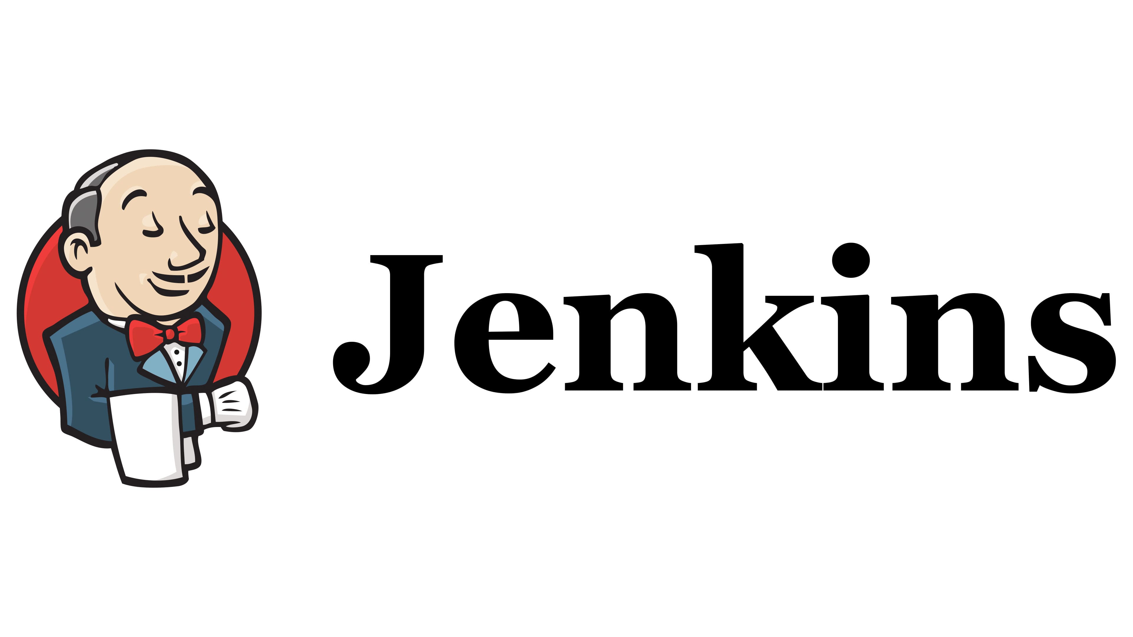
The emblem of Jenkins features a smiling man with thin mustaches, a large nose, closed eyes, and raised eyebrows. His impeccable suit, red bow tie, neatly parted hairstyle, white gloves, and, most importantly, the forward-extended hand with a towel draped over it identify this character as a prim butler. He stands firmly and with dignity, showing a desire to please. Essentially, this is the anthropomorphic embodiment of the automation server, capable of executing any task. The exact designer of the logo is unknown, but the owners of Jenkins credit Frontside Software and an Unknown User (cowboyd) for creating the drawing.
To the right is a black wordmark: the inscription “Jenkins,” executed in a bold grotesque. Smooth curves lend the brand name hidden energy, while straight, sharp angles evoke confidence.
Font and Colors
The font used in the logo has several analogs, the closest being Bitstream Vera Sans Bold by Bitstream and DejaVu Sans Condensed Bold by DejaVu. They share a similar letter form and a large square dot over the “i.”
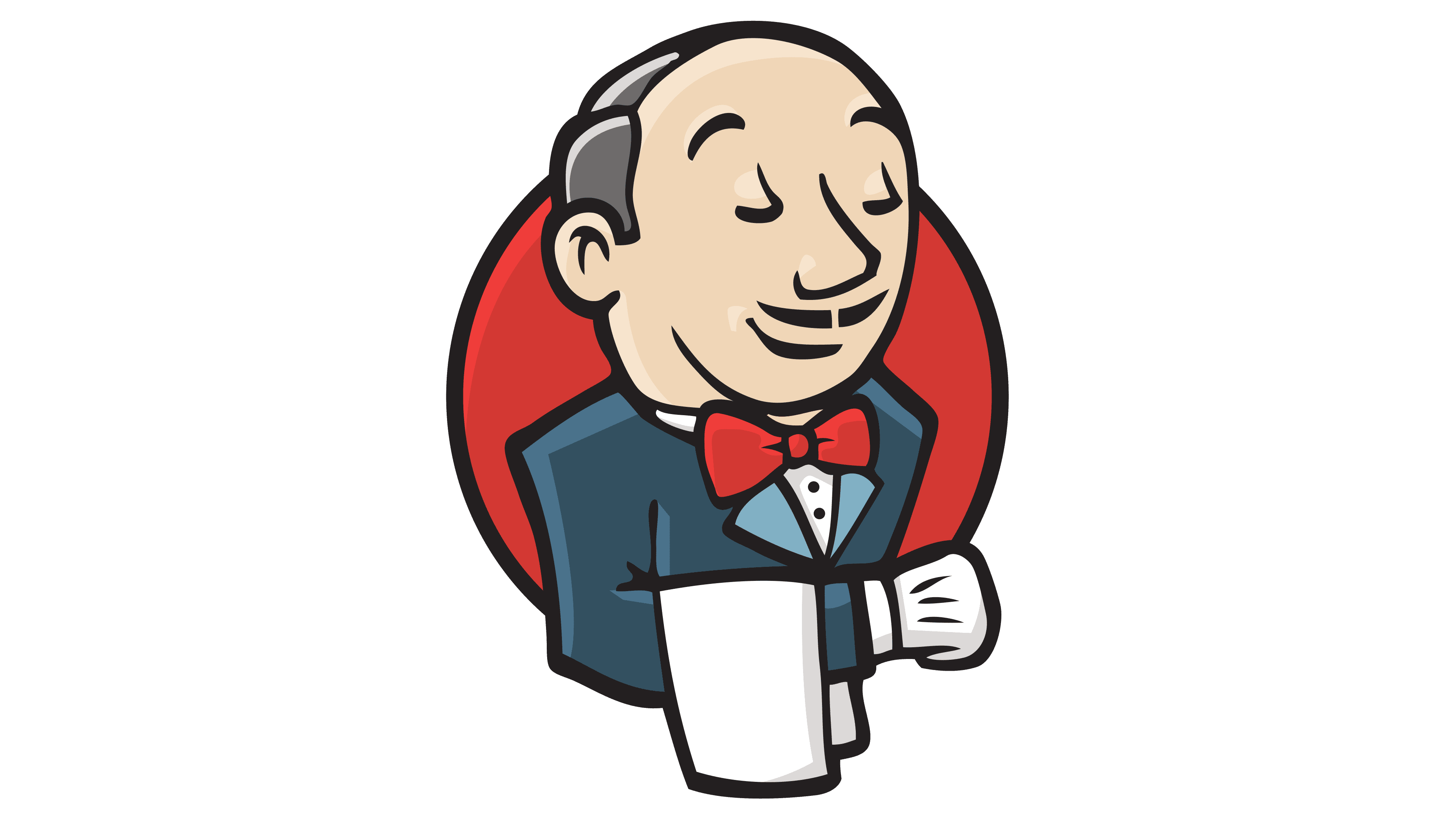
While the inscription is only in black, the drawing’s palette is much more diverse. In addition to black, it includes beige (#F7F1DA), various shades of blue (#355564, #4B758B, #80AFBF), red (#D24939), light gray (#D9D8D6), and dark gray (#757172).