


 John A. Logan College Logo PNG
The John A. Logan logo has undergone several unique transformations over different periods. Despite the changes, it never became simple or ordinary, maintaining progressiveness and a distinctive style at every stage. Each new version of the identity was filled with fresh elements emphasizing development and innovation. The modern version of the logo is no exception. It successfully combines features of previous versions while retaining its distinct identity. The contemporary emblem stands out for its contrast: the blue background creates a sharp visual accent, and the white letters, like stars in the night sky, shine brightly against it.
The logo’s background has clear boundaries, taking the shape of a square, which gives the logo order and stability. The white letters, arranged in a strict line, are characterized by numerous lines and sharp angles, adding expressiveness to the logo. Besides the letters, the logo features a dot, a punctuation mark that has always been part of the identity, though its placement has changed across versions.
John A. Logan College was created in 1967 after voters in Williamson County and parts of Jackson and Franklin counties approved a new community college. Named for Civil War general and Illinois senator John Alexander Logan, it opened in fall 1968 without a permanent campus, using rented classrooms across southern Illinois.
In 1969, the college bought 169 acres near Carterville. Construction started in 1970, and most operations moved there by 1973. Early courses centered on transferable credits for students planning to finish bachelor’s degrees at four-year institutions. During the 1970s, technical and vocational programs expanded in response to local employment needs.
The 1980s brought new buildings, including an events center and library, plus continuing-education courses for adults changing careers or improving job skills. In the 1990s, the college invested in computer labs, classroom technology and distance learning. During the early 2000s, it added a community arts center and developed training programs with regional employers and organizations.
Business, technology and healthcare programs were updated during the 2010s, while online courses increased. The college marked its 50th anniversary in 2017 with fundraising for scholarships and campus improvements. In 2020 and 2021, teaching shifted to hybrid formats. By 2023, the college continued transfer agreements, workforce training, and partnerships with four-year universities, local businesses, and regional groups.
Meaning and History
What is John A Logan?
This community institution, named after a prominent statesman and Civil War general, is located in the heart of southern Illinois. The college offers academic programs, professional training, and community educational initiatives. With its campus in Carterville, the institution provides career-focused education that prepares students for entry-level employment and further studies. The college actively supports adult learners and career changers and plays an important role in helping students transition from high school to four-year universities.
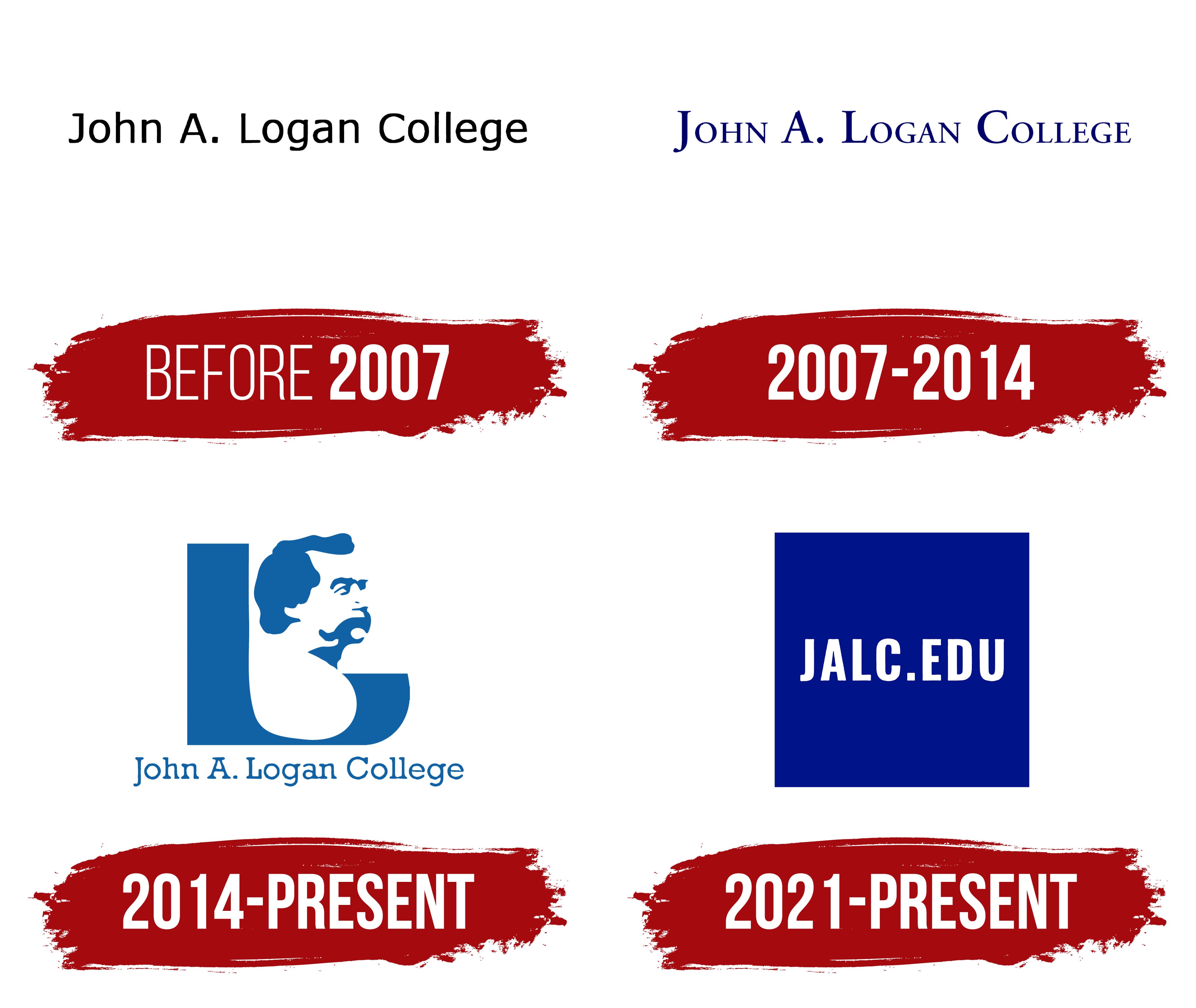
Before 2007

The state educational institution was founded in 1967, but the university accepted its first students only two years later. The organization was named after the famous General John Alexander Logan, whose name was displayed on the first two versions of the logo. The general served for 10 years in Illinois, where the university is located.
In the first version of the logo, the general’s name was depicted in black, straight letters on a white background. The font was chosen based on the characteristics and status of the educational institution. In the center of the logo were John Alexander Logan’s first and last names, with the word “College” added on the right. The notable feature was that “Alexander” was shortened to a single capital letter, “A,” followed by a period. The spacing between the words was doubled, which improved readability and made the letters more elegant and visually refined.
2007 – 2014
In 2007, the logo changed, primarily affecting its color scheme. The white background, which had already become a tradition, remained unchanged, ensuring excellent readability of letters in all fonts and sizes. However, the color of the letters changed: instead of black, blue was chosen.
This shade of blue created an interesting visual effect on the light background at different angles; it could appear either light blue or with a purple tint. The logo maintained a strict and concise style, but one element stood out: the capital letter “J.” It was significantly larger, and its lower part extended below the other lines, adding expressiveness to the logo and symbolizing the university’s progressiveness, confidence, and stability.
2014 – today
One of the most striking, memorable, and unusual logos was the one introduced by the university in 2014. For the first time, the identity of an American educational institution founded in Carterville featured a portrait of the great U.S. General John Alexander Logan. The text block disappeared, leaving only the general’s image and a single letter on the logo.
The logo’s color scheme was rich: all the features of the general’s face were rendered in deep blue shades, giving the image a unique expressiveness. The capital letter “J,” drawn in the same color palette, emphasized the simplicity and unity of the design. The white background, as before, remained, enhancing the contrast and making the image even more noticeable.
Although the perception of this logo was mixed, its recognizability was undeniable. The general’s portrait, as a symbol, became easily memorable because of its expressiveness. John Logan’s serious gaze, directed into the distance, symbolized confidence and a vision of the future, reflecting the university’s prospects for development.
2021 – today

The modern JALC (John A. Logan College) logo is a bright example of minimalism with deep symbolism. The college abandoned the emblem’s excessive graphics and visual elements that could distract from the essence. The white letters on a rich blue background look especially expressive and clear. The blue color, traditionally associated with wisdom, trust, and stability, perfectly conveys the educational institution’s values.
The main feature of this logo is the abbreviation JALC.EDU, where each letter is structured. On one hand, the letters are simple but easily readable and memorable, reflecting the college’s modern approach to education. These letters symbolize simplified access to knowledge, which aligns perfectly with the college’s mission.
The logo’s font is strict, sans-serif, with clear and linear letters. It emphasizes professionalism, reliability, and the college’s appreciation for clarity and precision in its educational approach. There is nothing extra, only what is truly important. The logo’s structure draws attention: a dot between the capital letters separates the college’s name and domain, adding a sense of strictness and formality.
This design approach reflects John A. Logan College’s desire to keep up with the times while preserving traditions and respecting its heritage. Instead of General John A. Logan’s full name, the abbreviation JALC is used. This is like an “encrypted” connection to the past but in a modern, more technological format.
This logo marks a new era for the college, with a focus on access to knowledge, the modernization of educational processes, and readiness for future challenges.