


 University of California Logo PNG
The University of California logo cannot be simple. This university has over 250,000 students and holds a unique reputation in the United States and worldwide. Its status as the largest educational institution in the United States makes it special. For these reasons, the best specialists have worked on its identity at different times, incorporating vibrant elements, letters, and images to convey as much meaningful information as possible.
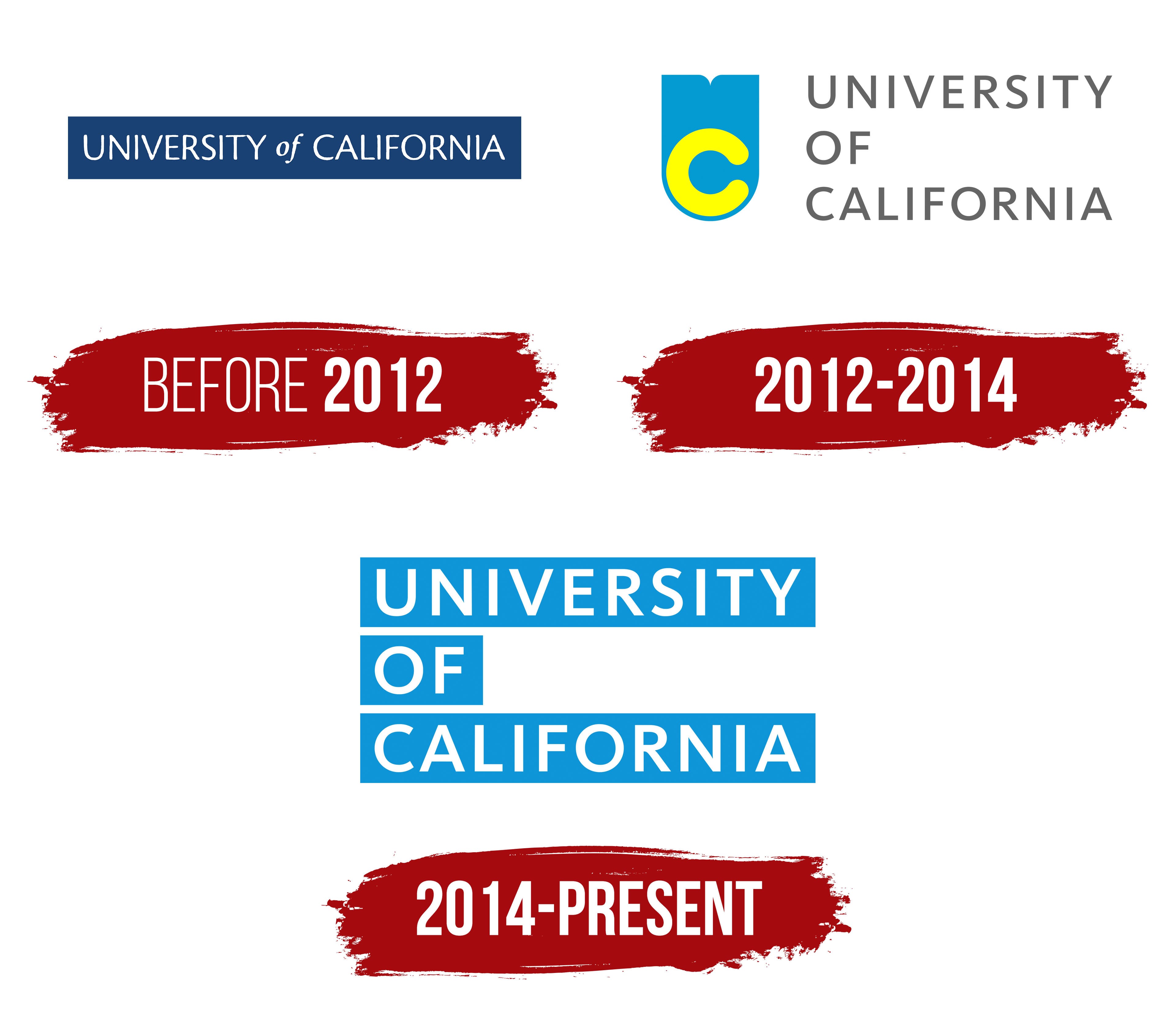
Since 2012, only three versions of the emblems have been known. The latest is considered one of the most original and recognizable. Unlike other institutions that often modify their first logo, the University of California has completely changed its identity three times since its founding in 1868.
The modern logo stands out for its conciseness, combining simplicity, rigor, and authority. Two colors are the minimum, but they are enough to represent the institution harmoniously.
The stylish logo features the words “University of California” in large capital letters against a light blue background. The letters are evenly spaced, making the text easy to read, and arranged in three horizontal rows. The blue background consists of three solid and wide lines, creating the impression of geometric shapes or ribbons fluttering in the wind.
The University of California officially began in 1868, when its first campus was founded in Berkeley through the merger of the public College of Agriculture, Mining, and Mechanical Arts with the private College of California. The system grew from the Morrill Act of 1862, which gave states land grants for institutions focused on agriculture and engineering. Henry Durant, its first president, set early academic standards, and women were admitted in 1873.
The university system expanded during the early 20th century. Medical work developed in San Francisco from 1873, Davis opened in 1908, and UCLA was founded in 1919. Later campuses appeared in Santa Barbara, Riverside, San Diego, Santa Cruz, Irvine, and Merced. During World War II, faculty and students joined defense-related research, including the Manhattan Project. After the war, the GI Bill and California’s population growth pushed enrollment and campus construction.
The 1960s brought student protests, with the Free Speech Movement in Berkeley gaining national attention. In the 1970s, funding cuts and recession created pressure, while research grew in technology and natural sciences. In the 1980s, UC Berkeley and UCSF advanced computer science and biotechnology. In the 1990s, the system broadened its programs and student body, while Merced prepared to become the next campus.
From 2007 to 2022, the system expanded climate research, online education, neuroscience, undergraduate research, quantum computing, admissions reform, genome editing, and interdisciplinary work. Berkeley Earth began in 2007, UC Online appeared in 2012, and the Weill Institute for Neurosciences opened in 2017. In 2019, researchers from Santa Barbara and Google reported progress in quantum technology.
Meaning and History
What is University of California?
UC is a public university system in California, USA. Its campuses, with academic programs and research opportunities, are spread across the state. The system includes world-class universities such as the UC at Berkeley, the UC at Los Angeles, and the UC at San Diego. The UC system is renowned for its commitment to cutting-edge research, public education, and a diverse student body. It offers a wide range of professional, master’s, and undergraduate programs in various fields of study.
Before 2012

The first logo brought significant recognition and popularity to the university. It became the symbol of an organization consisting of 10 campuses. A blue background, resembling a rectangle, served as the foundation for the university’s name. The white letters on this background appeared elegant and formal. The logo was simple but used a technique to capture attention: the word “of” was set in italics, while all the other letters were set in proportion.
The logo appeared reserved and reflected the institution’s high status. The colors emphasized the power of knowledge, and the simplicity proved appropriate and effective.
2012 – 2014

In 2012, the University of California’s identity underwent significant changes. The logo now includes four colors. Previously, it contained only text and background, but now an interesting image and a bright letter “C” have been added, altering the overall perception.
The institution’s name is written in large gray letters on a white background on the right side of the logo. A beautiful light blue element stands out on the left. For many, this might resemble a square or rectangle with an irregular shape and a rounded element, perceived as a flag or shield. A bright letter “C” is placed on it. The logo reflects the leading educational center’s conservative nature while incorporating creative elements highlighting progress, excellent results, and success.
2014 – today

Since 2014, the University of California’s identity has undergone a significant transformation. The logo became simpler while remaining very clear and informative. The university’s name is written in white letters on a blue background. This concise design symbolizes the institution’s high status, which employs over 2,000 faculty members. The logo’s simplicity emphasizes the university’s authority and importance, making it easily recognizable and memorable.
The Seal

Interestingly, while the University of California’s logos changed, its unique seal remained unchanged for 144 years. This symbol was used to identify the university at competitions and academic events. The complex seal, with its graphics and information, was very noticeable and memorable. At its center was an open book with text on both pages, symbolizing knowledge and education.
Above the book, a five-pointed star was drawn in a light-dark tone. The emblem featured three textual elements: the founding date, the motto “Let there be light!,” and the institution’s name. Each element was placed in a specific location, emphasizing the importance of every letter and word. Three outline frames, one ribbon, and 15 rays extending downward from the star were used to draw attention to the seal.