The brand of the online form design platform has been known in the world for 15 years already. Over the years, the company has collected about 10 million users from around the globe. In the current era of digital discoveries, it has become very important not in words but indeed to prove your innovativeness and revolutionary technological solutions.
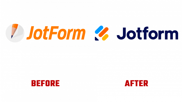
This company followed this path. In 15 long years, the brand decided to refresh its identity and acquire a new memorable image for the first time.
From words to deeds. Interest in the company remains unquenchable. A good advertising campaign helps promote the brand, so it was important to emphasize the rise in Jotform’s profits and the growth of technology. As before, the company maintains a position of simplicity and conciseness, which enhances consumers’ love.
This is reflected in the new logo, which emphasizes the company’s main philosophy – simplicity, accessibility, and consistency.
The message that carries a new look is the power of forms. It is thanks to the clarity and competent selection of forms that the company achieves universal recognition. Thanks to the correct work of designers, you can find your online form for any purpose and any product.
We decided to leave the main design concept – a pencil. We changed the form of presenting the idea, namely in lines, in color, and transformed the brand’s image. Flexible, bright, and colorful, the pencil, composed of simple soft and rounded geometric shapes, emphasizes the diversity of the target audience.
The logo defines the main message transmitted to the community – the power that powerful forms can carry; this tool leads to success. And the new slogan (“We believe powerful forms can be critical”) signifies that highly visually loaded organizations can simplify their problem solving with the proposed solutions. Many clients – commercial and non-profit organizations, small businesses, medical institutions, local authorities – have already appreciated the brand’s products. Now, thanks to the logo in the form of a colored variegated pencil, everything a business needs – everything will be at hand and in the most understandable and accessible form.
A dark, neat typeface with a capital letter of the company name will be easy to remember with a basic graphic element. Blue, red, and orange pencil edges will be associated with success, efficiency, and simplicity.


