Founded in 1991, Kaapelitehdas is a major cultural center in Finland, located in the Ruoholahti district of Helsinki. Kaapelitehdas means “cable factory” in Finnish. This is a whole complex, which includes three museums (Museum of Photography, Theater Museum, and Museum of Hotels and Restaurants), and the large building includes 300 tenants who work in different areas of the industry: cultural galleries, the music industry, advertising agencies, architectural firms, circus artists…
Occupying a huge area of 57,000 square meters, the factory holds fairs, master classes, exhibitions, concerts, and various events on its territory, where separate corners are leased. The endless stream of events and activities does not end, so we can say that this area will not see a quiet life – the Finns love to develop culturally; therefore, the demand for visiting this place will increase.
The factory itself was finally built in 1954 and functioned as an industrial enterprise until 1987. Then property management became the prerogative of Kiinteistö Oy Kaapelitalo, which belongs to the glorious city of Helsinki.
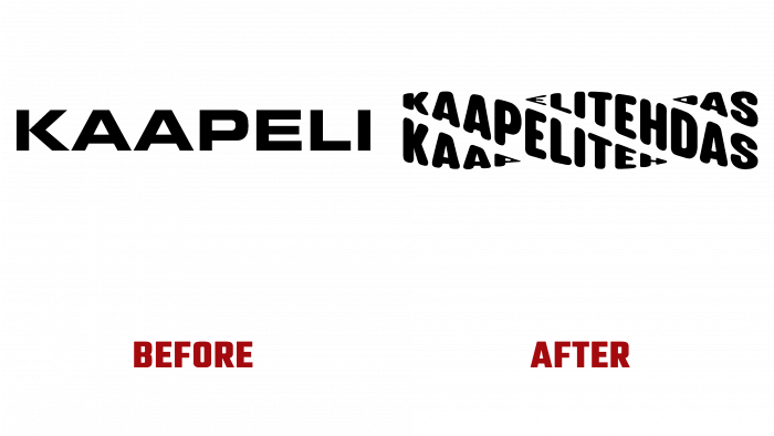
During all this time, the “factory of culture,” as you can allegorically call this brand, gave a lot of joy to visitors. However, if we consider the fact that modernity is reflected in visual design, then the cultural life of the Finns is a little “outdated,” judging by the logo.
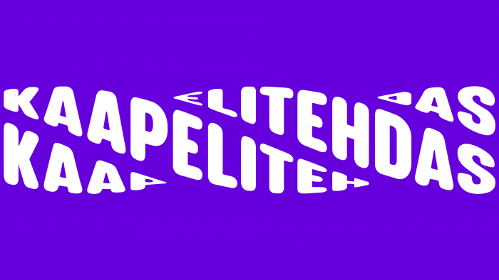
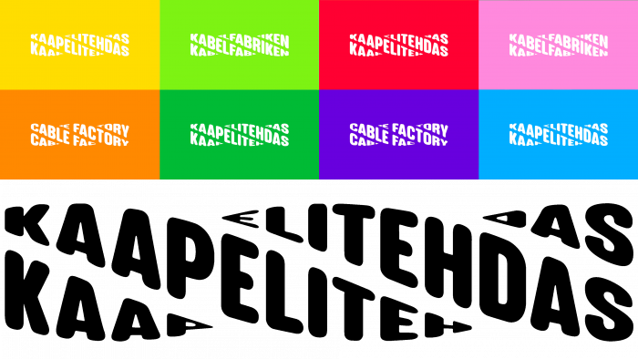
What used to be graphically depicted as simply “Kaapeli” in the logo without a single creative twist now looks like curling cable fibers with crossed doubled “Kaapelitehdas” inscriptions.
The meaning of this image of the cable element is obvious – we are showing what we are dealing with. This is a direct indication of the location of events and various events. Much better than the square letters of the previous logo, without a hint of ideology and conceptuality.
BOND, a creative design company, is great at conveying the idea of the area through the logo. In addition, most likely, by repeating the brand name, the creatives wanted to show that the factory has two sides. First, a tribute to the past, when the factory worked as a production, supplied the city with resources, and gave jobs to the local people. Secondly, in modern times, Kaapelitehdas is the future into which the factory has confidently stepped now, with modern culture, corresponding interests, and hobbies of the population, focusing on rest and pleasant pastime.
As they say, business is time, and fun is an hour. Finally, the factory is resting, and grateful citizens are happy to visit its walls for cultural enrichment. Eco-friendly, joyful, creative.


