Women’s Professional Football Club – Kansas City Current, located in Kansas City, Kansas, began the 2021 season as an expanded NWSL team. The team’s formation began in 2020 after a three-year hiatus for Kansas in the NWSL, most recently in 2017 when a regional football club transferred all of its assets to Utah Royals FC. After three years, the latter was forced to cease, prompting Kansas to rebuild their team for the 2021 season quickly. Because there was not enough time for preparation, it was decided to give the team a temporary name Kansas City NWSL, with temporary identity elements. The development of the main visual image should continue in parallel. And already at the end of October, a new name was announced – Kansas City Current and all-new basic elements were presented – the coat of arms, emblem, corporate colors, which were developed jointly with Willoughby Design.
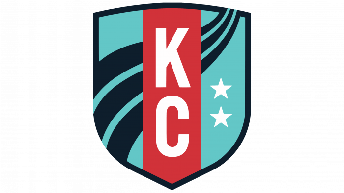
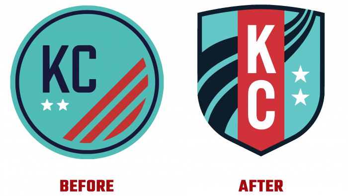
The new coat of arms is a heraldic shield with a black border and the trademark turquoise color of the inner margin. Three black wavy lines of variable size are applied on the inner margin, extending beyond the border frame of the coat of arms. They form a visual demonstration of a stylized river flow that represents the strength and purpose of the team. Two white stars on a turquoise field symbolize pride in representing Kansas and Missouri. The traditional monogram “KS” was carried over from the old emblem, but in a reinterpreted version – in new typography and a vertical design. Such an option should mean an upward and downward winning momentum for the new team, supported by Kansas, who created the foundation for team building while ensuring the support of all women in the region.
The color palette has evolved significantly from the historical version. Having retained the basic colors – turquoise, white, Heartland red, black, the emblem acquired saturation and brightness of shades and a different ratio of their participation in the image. In addition to the contrast and attractiveness of the created image, each of the colors also carries a certain psychological subtext. Turquoise – optimism and hope. Heartland red is a symbolic demonstration of the team’s location in the very heart of the country, as evidenced by the accent effect of a wide red stripe placed in the very center of the coat of arms. The general background on which the demo logo representing the stormy ocean is executed using a rich dark blue color used as the basis for the entire brand identity. It symbolizes strength, determination, and power, which are the main characteristics of a team.


